Best Facebook Ad Templates for Ecommerce
The best ecommerce Facebook ad template is not the one with the most badges, reviews, or polished mockups. It is the structure that fits the product’s explanation burden, order economics, available proof, and the stage of the buying decision.
A new store and a mature catalog should not receive identical advice. This selection engine accounts for product type, AOV, margin, catalog depth, awareness, and post-click continuity before recommending a first build. The most attractive template can still be the wrong first test when it requires proof or production assets the store does not have.
Quick answer: Start with product clarity for simple items, demonstration for explanation-heavy products, proof for hesitant buyers, and catalog structures for genuine choice. Reject any template whose evidence or economics do not fit the store.
How We Evaluate Ecommerce Ad Templates
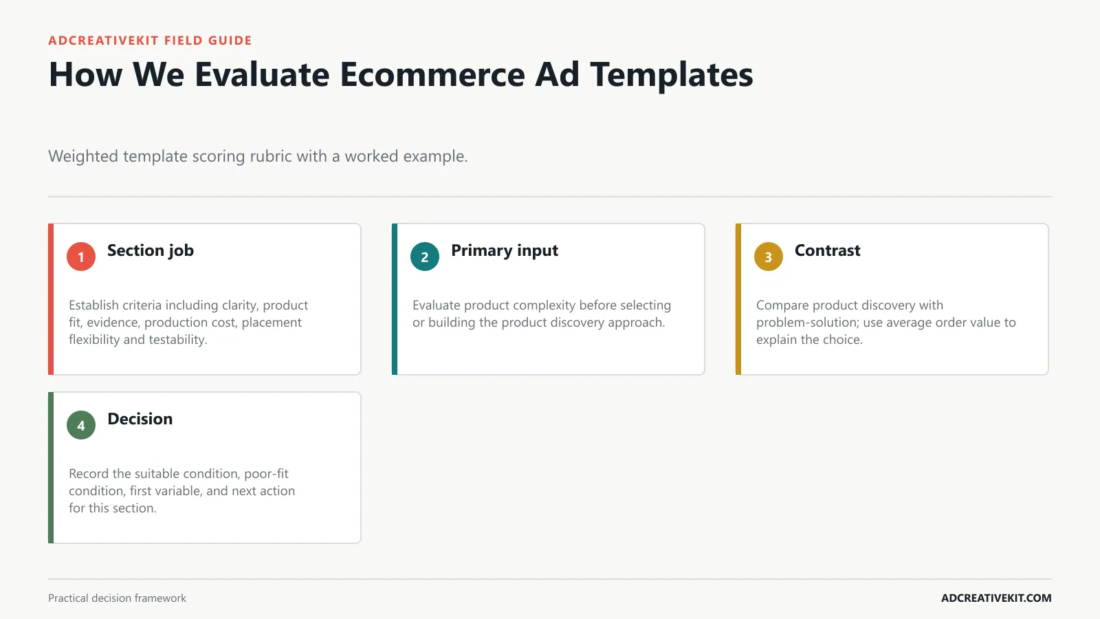
Evaluate a template against the store’s actual constraint: product comprehension, available proof, production effort, margin, destination-page continuity, and the business decision the test must inform. A product discovery ad for a low-consideration item has a different burden than the same structure for a high-AOV product, subscription, or broad catalog.
Best Facebook ad templates for ecommerce are not just pretty layouts. They are repeatable conversion structures. A good template decides what the shopper notices first, which objection gets handled, what proof appears before the click, and what kind of creative test your team can run next.
What to test: Outcome headline vs. pain-removal headline, product-only image vs. product-in-use image, and direct CTA vs. specific CTA.
Layout: Creator or customer photo, quote-style hook, product in context, and one believable reason to believe.
Common failure mode: Overloading the table. Three strong differences beat eight tiny rows nobody reads on mobile.
Layout: Large review line, star rating or customer count, product visual, customer role or context, and CTA.
Common failure mode: Unrealistic or policy-sensitive claims. Health, beauty, finance, and body-related categories need extra care.
Make product complexity explicit before production. Then ask whether average order value belongs in the ad, on the product page, or in a later retargeting message. Trying to settle the entire buying decision in one frame usually weakens the first job.
Use product complexity, AOV, contribution margin, catalog depth, and available assets to eliminate unsuitable templates before production.
| Store condition | Best-first direction | Caution |
|---|---|---|
| Simple, visual product | Product-benefit or problem-solution | Do not crowd the frame with every feature |
| High-consideration product | Demo, mechanism, comparison, or proof | The landing page must continue the evidence path |
| Large catalog | Carousel or category-led creative | Map each product to a relevant destination |
| Tight contribution margin | Mechanism or proof before discount | Judge profit, not platform ROAS alone |
Confirm current requirements in Meta Collection Ads. Use the source for platform or compliance facts, while keeping performance conclusions tied to your own account evidence.
Choose a Template by Product and Funnel Stage
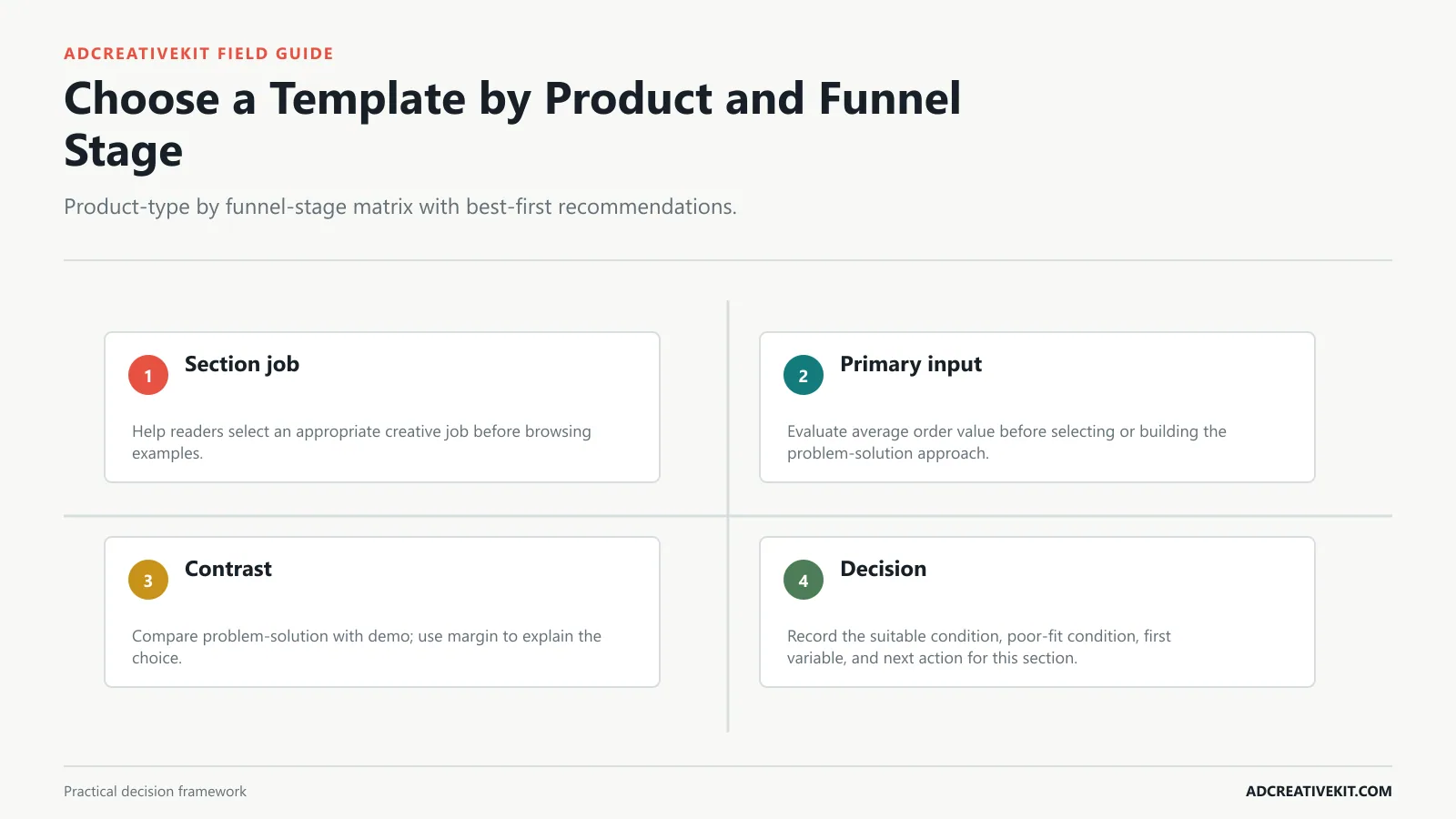
A simple, low-consideration product can begin with a product-benefit or problem-solution layout. Products that are unfamiliar, expensive, tactile, or difficult to explain often need demonstration, comparison, mechanism, or credible social proof first. A problem-solution ad for a low-consideration item has a different burden than the same structure for a high-AOV product, subscription, or broad catalog.
Most ecommerce ad template articles stop at inspiration: product image here, headline there, button at the bottom. That can help with design, but it does not tell you which layout to use for cold traffic, which one fits retargeting, or how to turn one product offer into a clean test batch. This guide breaks down the ecommerce Facebook ad templates worth testing, why each one works, where it fails, and how to build variations without confusing your results.
Common failure mode: Including every feature. This template works because the hierarchy is simple.
Example: "I bought this for vacation and ended up wearing it every day."
Best for: bundles, sales, launch bonuses, free gifts, and product sets.
Example: "4,800+ dog owners use this after rainy walks" is stronger than "Customers love us" because it is specific.
Best for: product viewers, cart abandoners, engaged non-buyers, and repeat buyers.
Make average order value explicit before production. Then ask whether margin belongs in the ad, on the product page, or in a later retargeting message. Trying to settle the entire buying decision in one frame usually weakens the first job.
Add a poor-fit condition to every recommendation; that prevents a popular format from becoming the default when the store lacks the required proof or economics.
Understand checklist
- Confirm whether problem-solution fits the product’s explanation burden.
- Check AOV, margin, and available proof before choosing demo.
- Match the ad promise to the relevant product-page section.
- Define the first store-level decision after the test.
Templates for Cold-Traffic Product Discovery
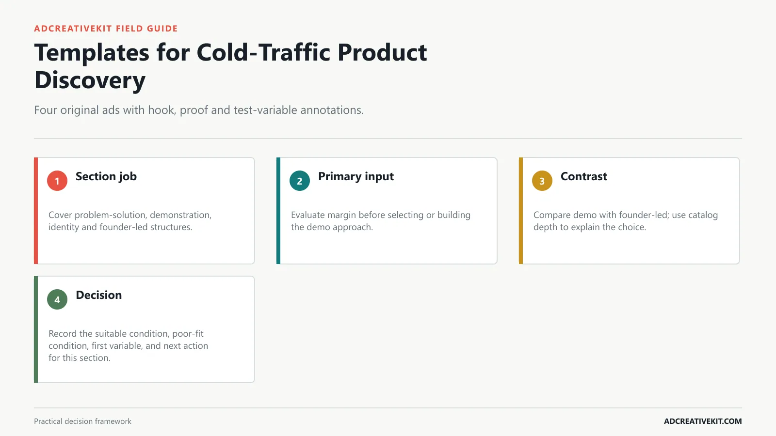
Cold-traffic creative should earn the next step rather than finish the entire sale. Show what the product is, make one relevant outcome clear, and give the shopper a credible reason to inspect the destination. A demo ad for a low-consideration item has a different burden than the same structure for a high-AOV product, subscription, or broad catalog.
TL;DR: Start with product benefit, problem-solution, UGC review, comparison, offer stack, social proof, before-and-after, carousel story, collection/catalog, retargeting reminder, and seasonal sale templates. Cold audiences need hooks and problem recognition. Warm audiences need proof and comparison. Hot audiences need reminders, offers, and objection handling.
Why it works: This template creates recognition before it sells. "Foundation separating by lunch?” is more useful than “Want better skin?" because it points to a real moment.
What to test: Creator face vs. product-only review screenshot, direct quote vs. paraphrased benefit, and review proof at the top vs. beside the product.
Why it works: The offer stack template makes value visible. If price is the objection, the ad needs to show what is included and why the package feels worth acting on now.
What to test: Aggregate rating vs. individual quote, review screenshot vs. designed quote card, and proof-first headline vs. product-first headline.
Make margin explicit before production. Then ask whether catalog depth belongs in the ad, on the product page, or in a later retargeting message. Trying to settle the entire buying decision in one frame usually weakens the first job.
Map the ad’s product, promise, offer, and evidence to the exact destination rather than sending every concept to a generic collection page.
Templates for Product Consideration
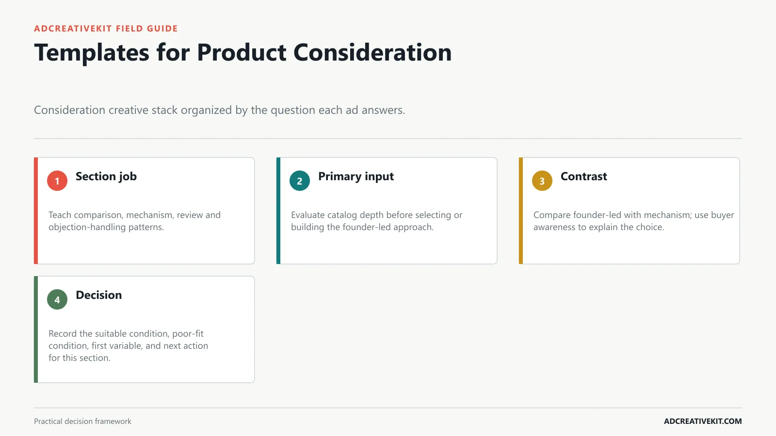
Consideration creative answers the question left open after initial interest. Use comparison for choice, demonstration for mechanism, proof for uncertainty, and objection handling only when evidence shows the objection is real. A founder-led ad for a low-consideration item has a different burden than the same structure for a high-AOV product, subscription, or broad catalog.
A Facebook ad template is not the final ad. It is the structure that holds the message. The same product photo can perform differently depending on whether it appears in a product benefit ad, a comparison ad, a testimonial ad, or a cart reminder. The layout changes the buyer’s first impression and the kind of objection the ad answers.
Layout: Problem headline at the top, friction visual or current state, product as the fix, one "without" line, and CTA.
Common failure mode: Vague praise. "Love this" rarely sells. Pull the sentence that names the use case, objection, or outcome.
Layout: Main offer headline, stacked items, discount or bonus, deadline or availability cue, and CTA.
Common failure mode: Tiny screenshots. Pull the strongest phrase into readable type and use the screenshot as support.
Make catalog depth explicit before production. Then ask whether buyer awareness belongs in the ad, on the product page, or in a later retargeting message. Trying to settle the entire buying decision in one frame usually weakens the first job.
Write the test’s decision rule in advance, including what the team will do with a win, loss, split result, or delivery failure.
Buy checklist
- Confirm whether founder-led fits the product’s explanation burden.
- Check AOV, margin, and available proof before choosing mechanism.
- Match the ad promise to the relevant product-page section.
- Define the first store-level decision after the test.
Templates for Retargeting and Cart Recovery
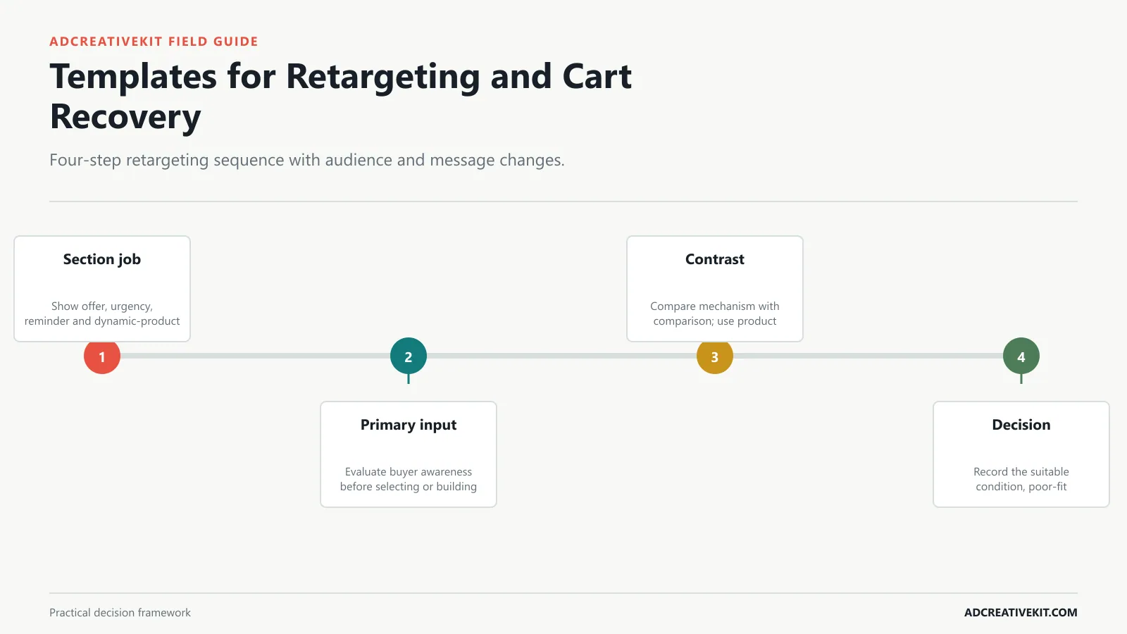
Retargeting should respond to behavior. A product viewer may need reassurance, a cart abandoner may need shipping or return clarity, and a repeat visitor may need a stronger distinction rather than another introductory product ad. A mechanism ad for a low-consideration item has a different burden than the same structure for a high-AOV product, subscription, or broad catalog.
For ecommerce, the strongest templates usually do five jobs: hook attention, clarify the product, add proof, explain the offer, and create a CTA that matches the landing page. Templates speed up production only when the message is still customized. If every product is dropped into the same generic layout with the same vague headline, the template becomes decoration.
Example: "Still rebuilding every sale ad from scratch? Use editable layouts for product offers, bundles, reviews, and retargeting."
Best for: products that replace an old habit, DIY workaround, cheaper alternative, or scattered workflow.
Example: "Summer Set Bundle: linen shirt + shorts + free belt + 20% off today."
Best for: visual transformation categories such as home organization, design, productivity, cleaning, styling, and product setup.
Make buyer awareness explicit before production. Then ask whether product complexity belongs in the ad, on the product page, or in a later retargeting message. Trying to settle the entire buying decision in one frame usually weakens the first job.
A limited-budget store should begin with the fewest concepts needed to answer its largest uncertainty, not with every format in the gallery.
Choose by Ecommerce Business Model
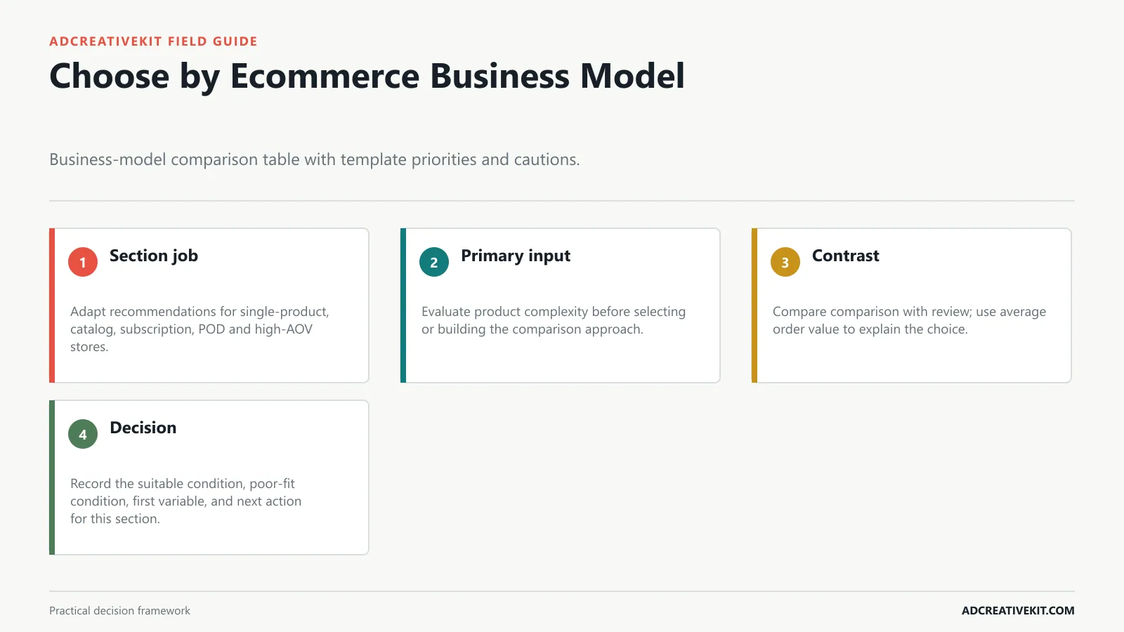
Single-product stores can develop several angles around one hero SKU. Catalog stores need clearer product grouping and destination mapping; subscriptions must explain recurring value, and high-AOV offers generally require a stronger proof path. A comparison ad for a low-consideration item has a different burden than the same structure for a high-AOV product, subscription, or broad catalog.
Best for: simple products, best sellers, new arrivals, and product pages where the value is easy to understand.
What to test: Question headline vs. direct statement, problem-first visual vs. solution-first visual, and time, cost, complexity, or confidence objections.
Why it works: Comparison ads help shoppers choose. The buyer is already evaluating options, so the ad frames the old way against the new way.
What to test: Bonus-led vs. discount-led framing, three included items vs. five, and deadline-led urgency vs. value-led headline.
Why it works: A clear visual contrast can communicate the direction of change at a glance. A shopper can compare "messy to clean" or "blank file to finished ad set" without decoding a long explanation.
Make product complexity explicit before production. Then ask whether average order value belongs in the ad, on the product page, or in a later retargeting message. Trying to settle the entire buying decision in one frame usually weakens the first job.
For discovery, measure whether the ad earns qualified interest without overpromising what the product page must explain.
Understand checklist
- Confirm whether comparison fits the product’s explanation burden.
- Check AOV, margin, and available proof before choosing review.
- Match the ad promise to the relevant product-page section.
- Define the first store-level decision after the test.
Connect this step to the marketing hook formulas so the decision survives the handoff from concept to campaign and post-click experience.
Write Product, Proof and Offer Copy
Build copy in the buyer’s decision order: recognizable product, relevant outcome, evidence, offer terms, and next step. Remove any claim the product page cannot repeat or substantiate. A review ad for a low-consideration item has a different burden than the same structure for a high-AOV product, subscription, or broad catalog.
Why it works: Cold audiences need to answer two questions quickly: what is this, and why should I care? A product benefit template puts the product visual in the center and pairs it with one outcome, not a pile of features.
Common failure mode: Vague pain. Better ads usually name a specific task, not a generic desire.
Layout: Two columns, old way vs. new way, three decisive comparison points, and CTA.
Common failure mode: Turning the ad into a receipt. The stack should feel curated, not crowded.
Layout: Two panels or sequential frames, clear labels, one transformation headline, minimal support copy, and CTA.
Make average order value explicit before production. Then ask whether margin belongs in the ad, on the product page, or in a later retargeting message. Trying to settle the entire buying decision in one frame usually weakens the first job.
For consideration, select proof and comparison formats only when the underlying evidence is specific enough to survive scrutiny.
Confirm current requirements in Meta Photo Ads. Use the source for platform or compliance facts, while keeping performance conclusions tied to your own account evidence.
Match Every Ad to Its Product Page
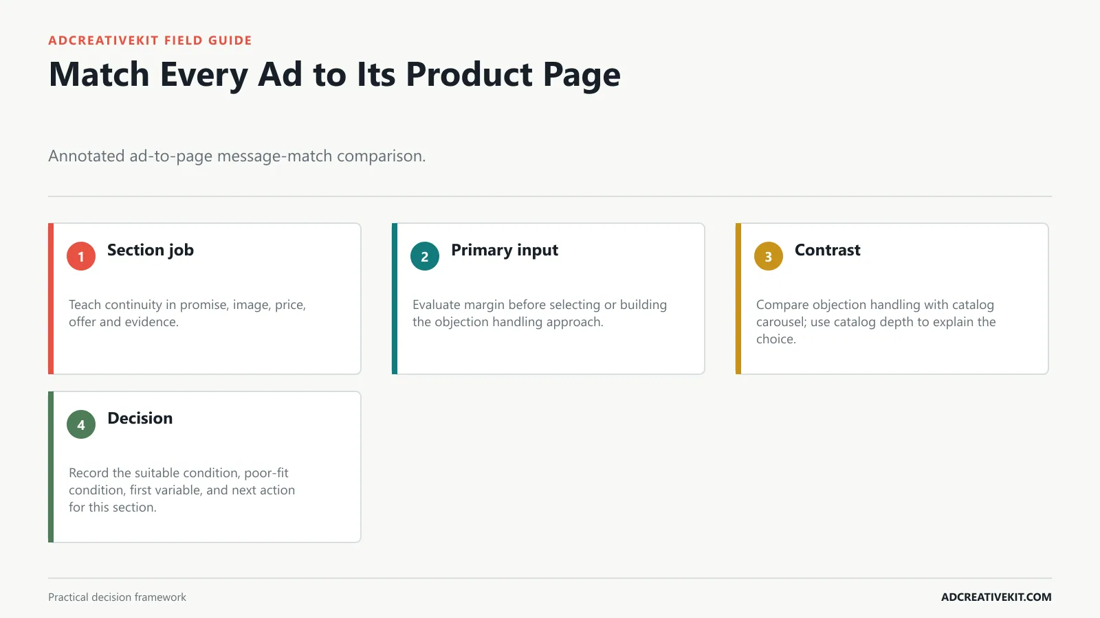
Message match includes the featured product, promise, price or promotion, proof, and destination. When any of those change after the click, the page asks the shopper to restart the evaluation. A objection handling ad for a low-consideration item has a different burden than the same structure for a high-AOV product, subscription, or broad catalog.
Layout: Large product image, benefit headline, one support line, small proof cue, and CTA.
Best for: categories where trust, texture, fit, taste, or daily use matters.
Example: For AdCreativeKit, compare "Blank design file" with "Editable ecommerce ad templates."
Best for: new brands, warm audiences, higher-ticket products, and products where trust is the biggest barrier.
Example: "From pantry chaos to restock-ready" with the product visible in the after state.
Make margin explicit before production. Then ask whether catalog depth belongs in the ad, on the product page, or in a later retargeting message. Trying to settle the entire buying decision in one frame usually weakens the first job.
For retargeting, align the message with the behavior that created the audience rather than repeating the broad prospecting introduction.
Buy checklist
- Confirm whether objection handling fits the product’s explanation burden.
- Check AOV, margin, and available proof before choosing catalog carousel.
- Match the ad promise to the relevant product-page section.
- Define the first store-level decision after the test.
Connect this step to the Facebook ad creative review checklist so the decision survives the handoff from concept to campaign and post-click experience.
Run a Four-Week Ecommerce Creative Test
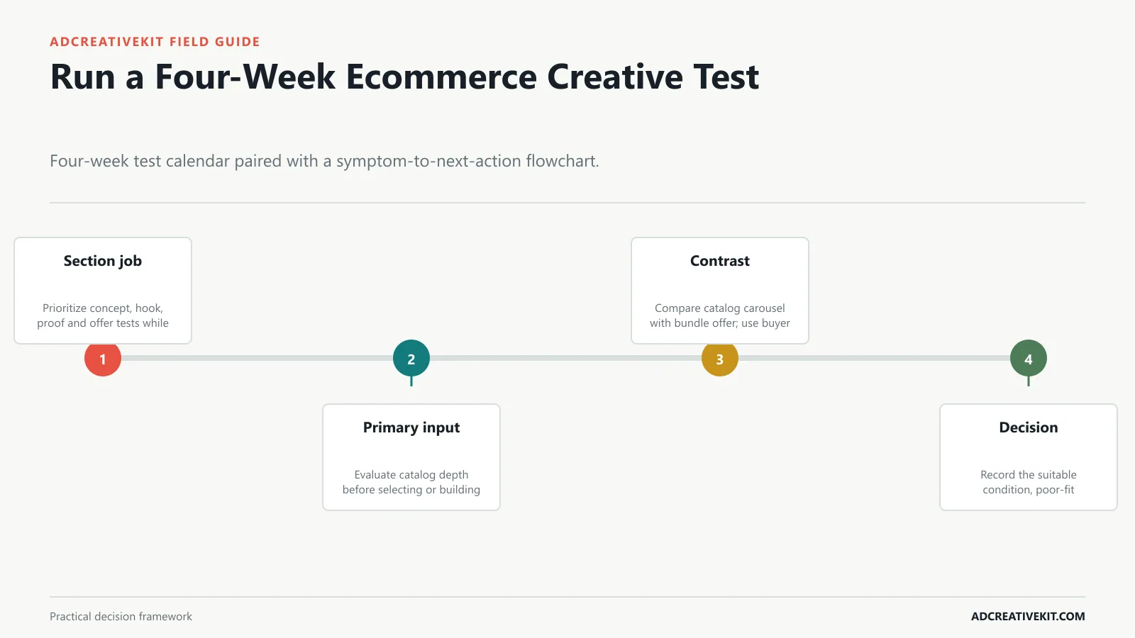
Sequence tests around uncertainty, not a rigid calendar. Start with the concept most likely to change demand, then test hooks, proof, offer framing, and execution details as traffic and economics allow. A catalog carousel ad for a low-consideration item has a different burden than the same structure for a high-AOV product, subscription, or broad catalog.
Example: For skincare, "Hydrated skin without the heavy finish" is stronger than "Daily moisturizer with ceramides" because it names the buyer experience.
Why it works: The UGC review template borrows the language of organic product discovery while keeping the layout reusable. It makes the product feel tested by a real person, not polished into a brand brochure.
What to test: Time savings vs. quality improvement, icon comparison vs. text rows, and workflow comparison vs. product comparison.
Why it works: Social proof reduces risk. A shopper may like the product but hesitate because they do not know whether the brand can be trusted.
What to test: Split screen vs. stacked vertical, literal before/after vs. metaphorical transformation, and transformation headline vs. time-saved headline.
Make catalog depth explicit before production. Then ask whether buyer awareness belongs in the ad, on the product page, or in a later retargeting message. Trying to settle the entire buying decision in one frame usually weakens the first job.
Review the four-week plan after each decision; weak delivery or a changed offer can invalidate the next scheduled comparison.
Frequently asked questions
Which ecommerce template should a new store launch first?
Begin with the customer’s largest unanswered question and the assets the store can substantiate. Simple products may start with a clear product-benefit ad; explanation-heavy products often need demonstration or mechanism.
Does the highest ROAS template always deserve more budget?
Not automatically. Inspect contribution margin, order quality, new-customer mix, attribution, and post-click conversion. A platform ratio can hide discount cost or low-quality demand.
Can one layout work across a catalog?
The component system can repeat, but product imagery, value proposition, proof, and destination must remain specific. Generic claims weaken catalog ads when SKUs solve different jobs.
Let store economics and customer evidence prune the library. A smaller set of suitable templates is more valuable than a large gallery that ignores margin, product complexity, and destination continuity.
Use the Facebook ad creative review checklist before launch, record the hypothesis in the repeatable ad testing system, and inspect post-click continuity with the ecommerce CRO checklist.
Confirm current implementation details in Meta Photo Ads before production.