Static Ad Templates: 15 Layouts and Testing Rules
Static ads have one frame to make an argument. That constraint is their strength: a good layout exposes whether the promise, product, proof, and action can survive a mobile glance without motion or narration.
The twelve layouts in this guide are message systems, not decorative presets. Each is tied to a communication job, layer hierarchy, production check, poor-fit condition, and first variable worth testing. A static layout is not a substitute for a clear angle; adding more badges and labels usually makes an unresolved message harder to read.
Quick answer: Select the layout by the message the buyer must grasp first. Make one element dominant, keep the product recognizable, support claims visibly, and review the actual feed-size export before launch.
What Is a Static Ad Template?
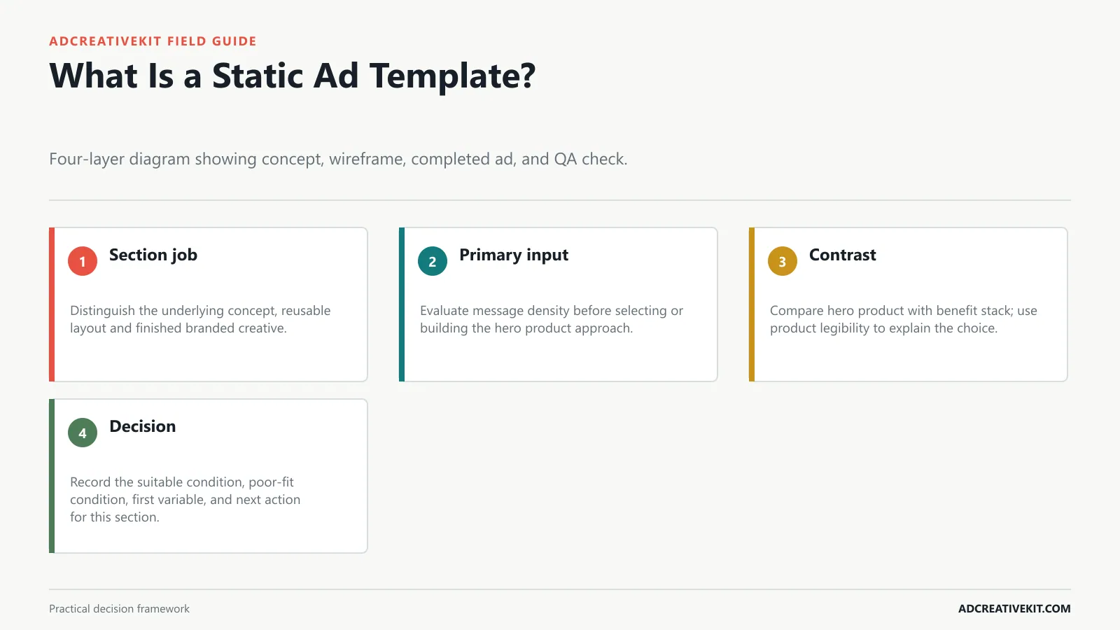
A concept defines the argument, a wireframe defines reading order, and the finished ad applies the brand and assets. Keeping those layers distinct lets a team reuse a layout without pretending every product needs the same message. Build it around a dominant promise, a recognizable product, a credible support element, and a visible action rather than treating every text layer as equally important.
Static ad templates still matter because they make creative testing cleaner. They are not just designed boxes for product photos. A useful static ad template gives one ad a clear job: show the product, name the pain, prove the claim, explain the offer, or bring a warm visitor back.
Proof: use reviews, ratings, numbers, screenshots, guarantees, or product context.
Why it works: Comparison is cognitively efficient. The viewer understands change quickly.
Why it works: It helps buyers decide when they already have two options in mind.
Example: "Your static ad needs 5 things: hook, visual, benefit, proof, CTA."
Pick one offer. Do not test a discount, bundle, product, layout, and audience all at once.
For a hero product layout, inspect message density at thumbnail size. The benefit stack layout may be a better choice when product legibility carries the argument.
Keep concept, wireframe, and completed execution separate so a reusable layout does not become a repeated message.
| Visual layer | Required job | Removal test |
|---|---|---|
| Primary line | State one relevant promise | Can a phone-size viewer repeat it? |
| Product | Make the advertised object recognizable | Does the crop remain clear at placement size? |
| Support | Add proof or necessary offer context | Does it increase belief or only add noise? |
| Action | Describe the honest next step | Does the destination continue the same promise? |
Confirm current requirements in Meta Photo Ad Best Practices. Use the source for platform or compliance facts, while keeping performance conclusions tied to your own account evidence.
Choose a Static Format for the Creative Job
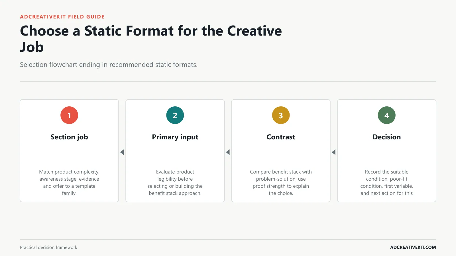
Choose the static format by its job: introduce a benefit, expose a problem, demonstrate a visible change, present proof, compare choices, explain an offer, or resolve a specific objection. Build it around a dominant promise, a recognizable product, a credible support element, and a visible action rather than treating every text layer as equally important.
Most static ads fail because they solve only the design problem. They look finished, but the offer is unclear, the product is too small, the proof is vague, or the media buyer cannot tell which variable is being tested. This guide breaks down 15 static ad template layouts for Facebook, Instagram, and Meta-style placements, with examples, testing ideas, and the situations where each layout tends to work best.
Landing page match: the post-click page should repeat the same promise quickly.
Layout: Split screen or two-panel grid, clear labels, transformation headline, CTA.
Layout: Two columns, old way vs. new way, 3 to 5 comparison points, CTA.
Why it works: Organized previews communicate volume, variety, and completeness.
Build three to five layouts around that offer. Product benefit, problem-solution, social proof, comparison, and offer stack make a strong first batch.
For a benefit stack layout, inspect product legibility at thumbnail size. The problem-solution layout may be a better choice when proof strength carries the argument.
Show the blank structure beside a completed example; readers can then see which parts are strategic roles and which are product-specific assets.
Product checklist
- Shrink the benefit stack layout to a realistic feed preview.
- Remove any element that does not strengthen product legibility.
- Check contrast, crop, and reading order.
- Create a problem-solution alternative only when it answers a different barrier.
15 Static Ad Templates Worth Testing
Treat the gallery as a menu of hypotheses rather than a list to launch at once. Select the smallest set that covers meaningfully different reasons to click. Build it around a dominant promise, a recognizable product, a credible support element, and a visible action rather than treating every text layer as equally important.
TL;DR: Test product benefit, problem-solution, before-and-after, offer stack, social proof, comparison, feature breakdown, price and value, checklist, bundle preview, retargeting reminder, and seasonal promotion layouts. Choose the layout based on funnel stage and buyer objection, then test one major variable at a time.
Why it works: Cold audiences need to understand the product and the reason to care in one glance.
What to test: Split-screen vs. stacked vertical, literal vs. metaphorical before/after.
What to test: Time savings vs. quality improvement, icons vs. text rows.
Layout: Grid or layered preview, category labels, quantity/scope statement, CTA.
Keep one control element consistent. Use the same product image when testing headlines, or the same headline when testing layouts.
For a problem-solution layout, inspect proof strength at thumbnail size. The feature callout layout may be a better choice when offer complexity carries the argument.
Include crop, disclosure, claim, contrast, and phone-size checks in the production file instead of leaving them for the media buyer.
Anatomy of a High-Clarity Static Ad
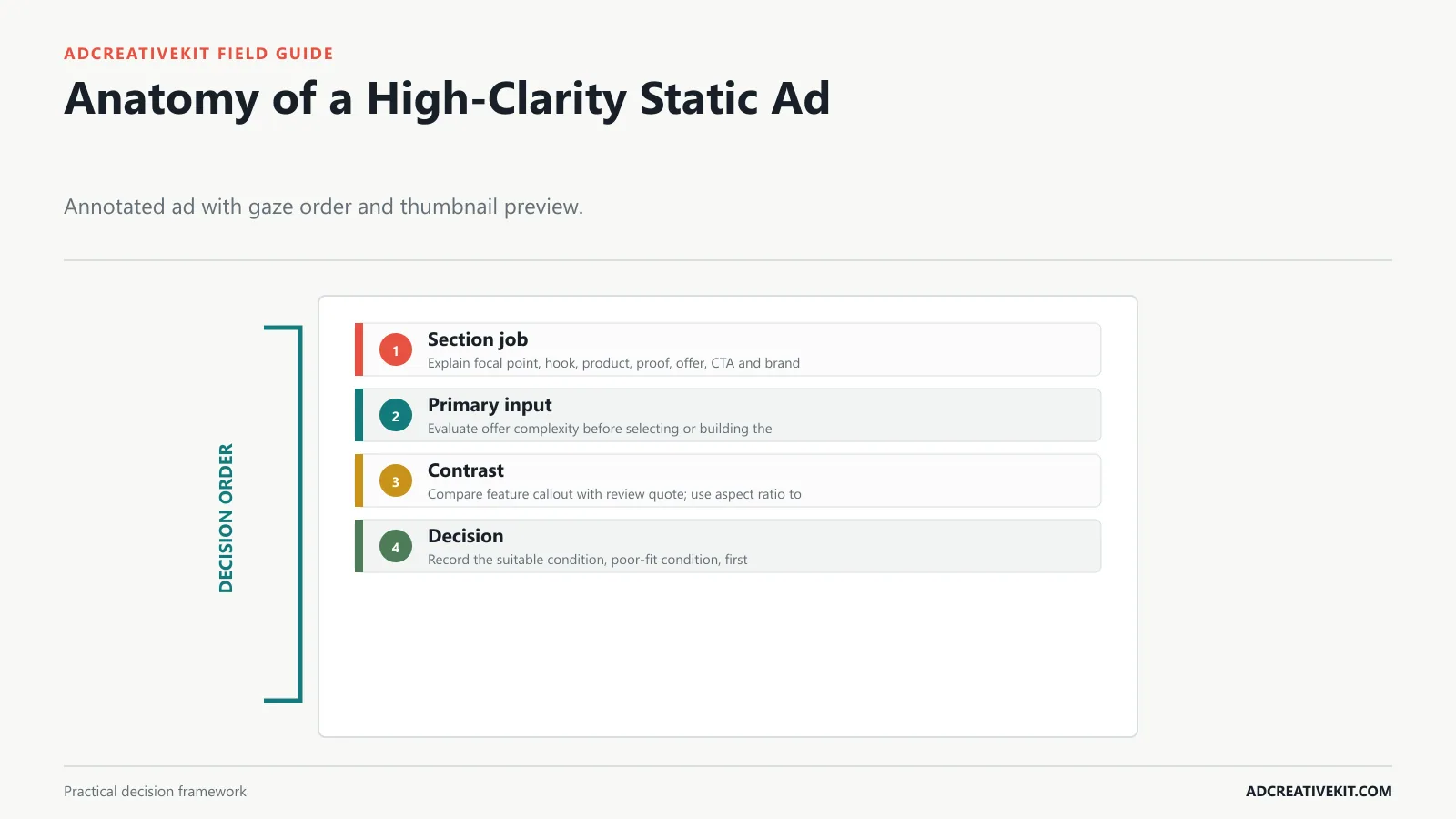
Build a clear gaze path from promise to product to evidence to action. If two elements compete for first attention at thumbnail size, simplify the hierarchy before adjusting styling. Build it around a dominant promise, a recognizable product, a credible support element, and a visible action rather than treating every text layer as equally important.
Static ad templates are reusable single-image ad structures for feed ads, square placements, vertical story-style creatives, carousel cards, retargeting reminders, and campaign graphics. They usually include a visual, hook, benefit, proof element, offer, CTA, and brand cue.
Layout: Large product image, benefit headline, support line, proof cue, CTA.
Common failure mode: Overstating results or using unrealistic transformations.
Layout: Product visual, 3 to 5 feature blocks, icons or screenshots, CTA.
What to test: Grid preview vs. layered mockups, quantity-led vs. outcome-led headline.
Use early metrics as signals. CTR and landing page views show attention. CPA and purchase rate show business impact.
For a feature callout layout, inspect offer complexity at thumbnail size. The review quote layout may be a better choice when aspect ratio carries the argument.
Connect each layout to a controlled variable and a diagnosis rule so the library creates learning as well as production speed.
Action checklist
- Shrink the feature callout layout to a realistic feed preview.
- Remove any element that does not strengthen offer complexity.
- Check contrast, crop, and reading order.
- Create a review quote alternative only when it answers a different barrier.
Static Ad Sizes and Safe Zones
Placement adaptations need deliberate crops and text reflow. Keep critical product details, disclosures, and CTA cues away from interface overlays, then preview the exported asset in its intended placement. Build it around a dominant promise, a recognizable product, a credible support element, and a visible action rather than treating every text layer as equally important.
The template is not the strategy by itself. It is the container for the strategy. A good template makes messaging decisions easier to organize and test.
What to test: Outcome headline vs. pain-removal headline, product-only image vs. product-in-use image.
Layout: Offer headline, included items, price/discount/bonus, deadline, CTA.
Example: Square layouts, story layouts, hook templates, landing page assets, email templates.
Why it works: Warm viewers already know the product exists. They need trust, price, timing, or complexity handled.
Iterate from the winner. If comparison wins, create three more comparison ads with different hooks or proof points.
For a review quote layout, inspect aspect ratio at thumbnail size. The before-after layout may be a better choice when message density carries the argument.
Reserve the main visual hierarchy for the product and promise; secondary details should support comprehension rather than compete with it.
Write Copy for Each Static Template
The headline should carry one decisive idea. Supporting copy can qualify the promise, proof can make it believable, and the CTA should accurately describe the destination. Build it around a dominant promise, a recognizable product, a credible support element, and a visible action rather than treating every text layer as equally important.
Static ads are fast to produce, easy to compare, and useful for isolating variables. Video can carry demonstration and personality, but static ads are often the fastest way to test whether an offer, headline, product angle, or proof point deserves more production budget.
Why it works: People respond faster when the ad names a problem they already recognize.
Example: "550+ editable campaign assets" with Meta ads, emails, landing pages, and hooks.
What to test: 3 features vs. 5, feature names vs. benefit translations.
Layout: Reminder headline, objection handler, product visual, proof/guarantee/bonus, CTA.
Performance note: static ad templates improve production speed, structure, and testing consistency. They do not guarantee revenue, ROAS, conversion rate, profitability, platform approval, or lower ad costs.
For a before-after layout, inspect message density at thumbnail size. The comparison layout may be a better choice when product legibility carries the argument.
Use current platform guidance as the specification source and treat template dimensions as editable defaults that require rechecking.
Product checklist
- Shrink the before-after layout to a realistic feed preview.
- Remove any element that does not strengthen message density.
- Check contrast, crop, and reading order.
- Create a comparison alternative only when it answers a different barrier.
Connect this step to the repeatable ad testing system so the decision survives the handoff from concept to campaign and post-click experience.
Customize Without Losing Mobile Clarity
Customization is complete only after a phone-size review. Check contrast, type size, product recognition, claim context, brand restraint, and whether the offer remains understandable without reading the caption. Build it around a dominant promise, a recognizable product, a credible support element, and a visible action rather than treating every text layer as equally important.
Static templates also work well for retargeting. A warm visitor does not always need a full video. Sometimes they need a sharper reminder, a review quote, a guarantee, or a clearer offer.
Layout: Problem headline, friction visual, product as fix, objection-reducing line, CTA.
Why it works: A review, rating, or customer count can make the offer feel safer.
Why it works: Clear price can qualify clicks when value is easy to understand.
What to test: Trust angle vs. urgency angle, guarantee cue vs. bonus cue.
Static ad templates are reusable single-image layouts for ads. They help structure the hook, visual, benefit, proof, offer, and CTA.
For a comparison layout, inspect product legibility at thumbnail size. The how-it-works layout may be a better choice when proof strength carries the argument.
Write copy to fit the chosen hierarchy instead of shrinking a paragraph until it technically fits the frame.
Confirm current requirements in Meta Ad Creative Guidance. Use the source for platform or compliance facts, while keeping performance conclusions tied to your own account evidence.
Build a Static Creative Test Matrix
Name variants by concept and changed variable, then hold the product, offer, audience, and destination comparable. A matrix is useful when it prevents accidental multi-variable changes. Build it around a dominant promise, a recognizable product, a credible support element, and a visible action rather than treating every text layer as equally important.
Visual hierarchy: the viewer should know what to read first, second, and third.
Example: "Still making every Black Friday creative from a blank Canva file?"
Example: "Finally, ad templates that are actually structured for testing."
Layout: Price or discount as anchor, bundle preview, value line, guarantee, CTA.
What to test: Event-led vs. offer-led headline, deadline vs. limited stock.
Yes, when the message is clear, the offer is relevant, and the creative is readable on mobile. Static ads are especially useful for testing hooks and offers quickly.
For a how-it-works layout, inspect proof strength at thumbnail size. The bundle layout may be a better choice when offer complexity carries the argument.
Inspect exported assets at placement size and preserve a clean control before producing the next variant.
Action checklist
- Shrink the how-it-works layout to a realistic feed preview.
- Remove any element that does not strengthen proof strength.
- Check contrast, crop, and reading order.
- Create a bundle alternative only when it answers a different barrier.
Connect this step to the ecommerce CRO checklist so the decision survives the handoff from concept to campaign and post-click experience.
Diagnose Performance and Check Compliance
Read weak attention, click, and post-click behavior as different clues rather than proof of one cause. Finish with a policy, spelling, crop, link, price, and landing-page continuity review. Build it around a dominant promise, a recognizable product, a credible support element, and a visible action rather than treating every text layer as equally important.
Offer clarity: the buyer should understand what is included and why to click.
What to test: Question vs. statement, problem-first visual vs. solution-first visual.
What to test: Direct quote vs. aggregate review count, screenshot vs. designed quote card.
Why it works: It gives value before the click and makes the product feel like the shortcut.
For platform-specific layouts, connect this with Meta ad templates , Facebook ad templates , and Canva ad templates .
Most static ad templates should include a strong hook, product or outcome visual, benefit, proof or trust cue, offer context, and CTA.
For a bundle layout, inspect offer complexity at thumbnail size. The sale layout may be a better choice when aspect ratio carries the argument.
Pair performance diagnosis with a preflight review so tracking, links, claims, and destination mismatches are not misread as layout failure.
Frequently asked questions
How much text should a static ad contain?
There is no universal word count. Use the least text needed to make the promise and support legible on a mobile preview. Move explanation to the caption or page when it competes with the primary message.
Are static ads only useful for retargeting?
No. A simple product, strong visual, clear offer, or distinctive problem can work in prospecting. The deciding factor is whether one frame can carry the required explanation credibly.
What should be changed first in a static variant?
Choose the variable tied to the hypothesis: hook, product crop, proof, offer framing, or hierarchy. Avoid changing all of them and calling the outcome a clean learning.
Keep the strongest static layouts as tested message architectures. Their value is the clarity of the argument and the learning attached to it, not the permanence of a particular font, badge, or color.
Use the Facebook ad creative review checklist before launch, record the hypothesis in the repeatable ad testing system, and inspect post-click continuity with the ecommerce CRO checklist.
Confirm current implementation details in Meta Ad Creative Guidance before production.