Ecommerce CRO Checklist: 300+ Checks with a Priority-Driven Google Sheets Template
An ecommerce CRO checklist is useful only when it helps you decide what to fix first. A store can fail 40 checks and still have one checkout error that matters more than the other 39 combined. That is why this guide pairs a practical, 300+ point spreadsheet with a priority system, funnel diagnostics, and a 30-day action plan.
The spreadsheet covers nine working areas: homepage, product page, collection page, contact page, about page, checkout, cart, FAQ, and blog. Each tab lets you record progress, difficulty, impact, priority, evaluation, and notes. The goal is not to make every row green. The goal is to find the conversion leaks most likely to affect revenue, fix them in a sensible order, and measure whether the experience improved.
Start here: duplicate the spreadsheet, audit the weakest funnel stage first, mark only what you can verify, and create a short implementation queue. Do not redesign the entire store because a checklist says that a feature is “best practice.”
What Is an Ecommerce CRO Checklist?
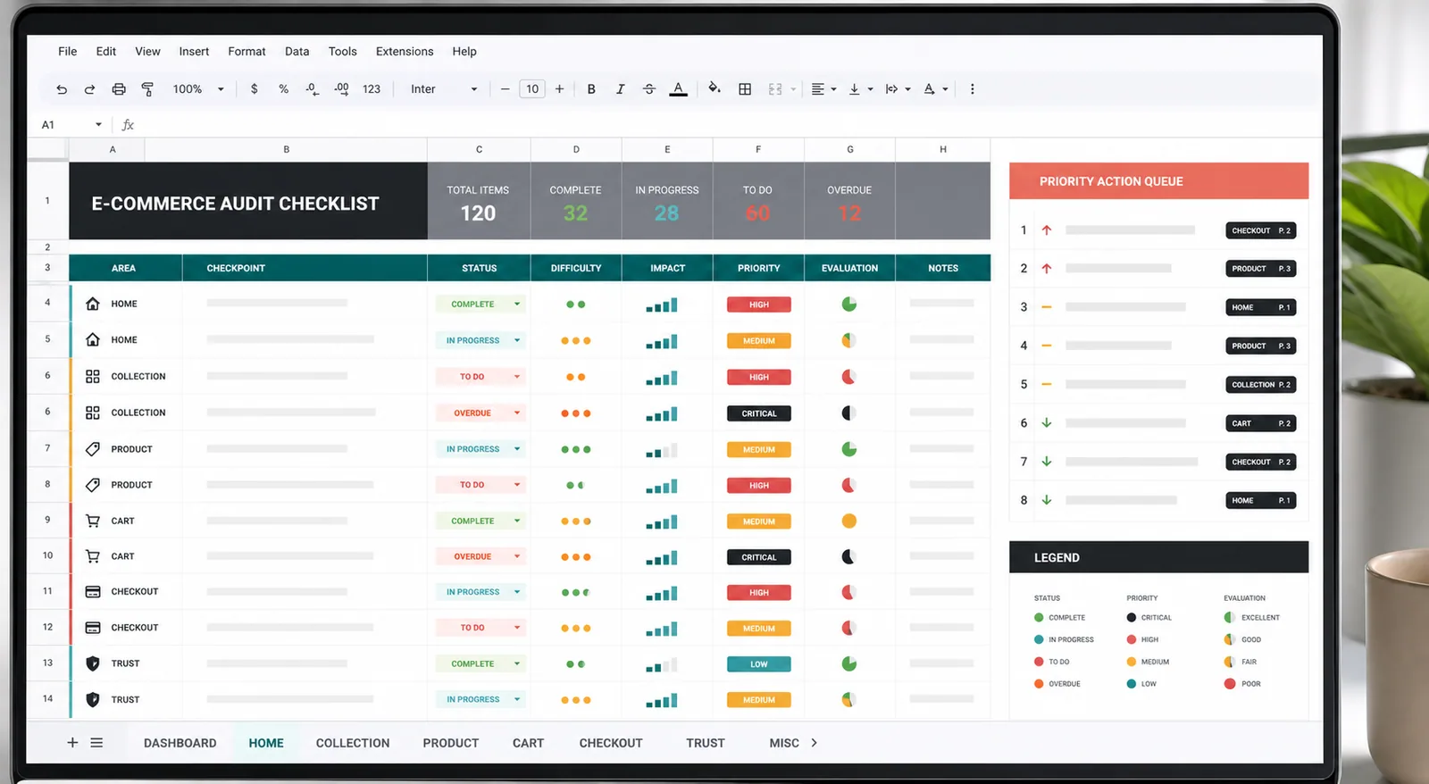
An ecommerce CRO checklist is a structured way to inspect the customer journey for preventable friction. It covers more than design. A complete audit considers product discovery, offer clarity, content, mobile usability, accessibility, performance, cart behavior, checkout, analytics, trust, and the continuity between acquisition campaigns and landing pages.
This spreadsheet contains more than 300 checks across nine audit tabs and works for Shopify, WooCommerce, and custom ecommerce stores. Its value is not a universal “conversion score.” It gives owners, marketers, designers, and developers a shared evidence log and a practical queue for deciding what to investigate, fix, or test next.
Why This CRO Checklist Is Priority-Driven
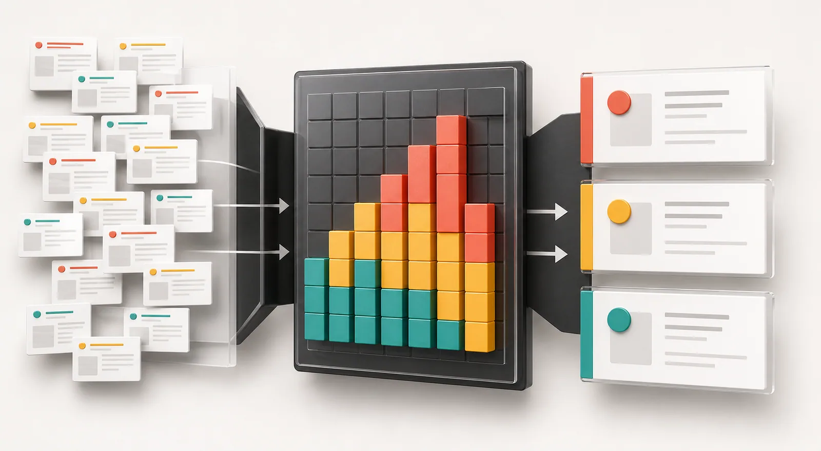
Most CRO articles give every recommendation the same visual weight. “Change the button copy” sits beside “fix a broken payment method,” even though the business impact can be completely different. A serious audit separates an observation from a priority.
The spreadsheet gives you the fields needed to do that:
- Progress: To do, in progress, done, or not applicable.
- Difficulty: A 1–3 estimate of the effort, coordination, and technical risk involved.
- Impact: Your estimate of how strongly the issue could affect a meaningful customer action.
- Priority: The final decision about when the work belongs in your queue.
- Evaluation: Good, can be improved, bad, or not relevant.
- Notes: Evidence, screenshots, affected devices, URLs, analytics observations, and implementation details.
Use four priority levels
| Level | Use it when | Typical ecommerce examples |
|---|---|---|
| P0: Critical | A customer cannot complete a core action, data is unreliable, or money is being lost now. | Payment failure, unusable mobile checkout, incorrect price, broken add-to-cart, missing purchase tracking. |
| P1: High | The issue is close to purchase, affects many visitors, and has credible evidence behind it. | Unexpected fees, unclear delivery date, hidden guest checkout, variant confusion, weak product information near the CTA. |
| P2: Planned | The opportunity is meaningful but needs more effort, research, or traffic to validate. | New collection filters, product comparison tools, a revised review layout, a new bundle presentation. |
| P3: Backlog | The idea is cosmetic, low confidence, low reach, or disconnected from the current bottleneck. | Decorative animation, minor icon changes, a new badge without evidence that customers need it. |
A practical decision rule is: fix broken journeys first, then high-impact low-effort friction, then larger experiments, then polish. If two items appear equal, favor the one closer to purchase or the one supported by stronger evidence. Record that evidence in Notes: for example, “mobile checkout error observed on Safari,” “shipping question appears in 18 support tickets,” or “product-page exit rate rose after the variant redesign.”
This is the same principle behind a disciplined ad testing matrix: a test earns attention because it answers an important question, not because it is easy to produce.
1. Diagnose the Funnel Before Auditing Individual Elements
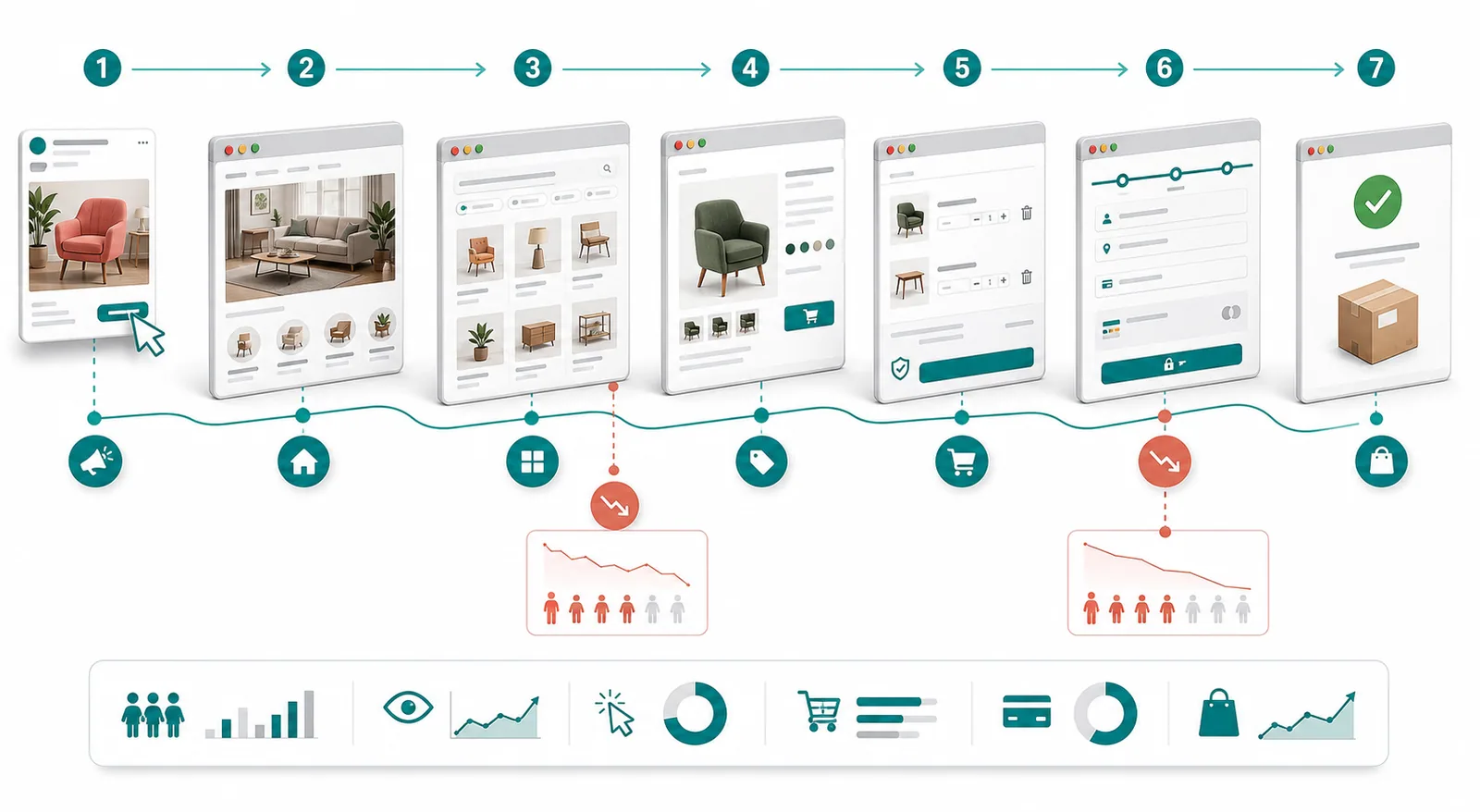
Start with behavior, not opinions. Map the path shoppers actually take: landing page or homepage, collection, product view, add to cart, begin checkout, and purchase. Then compare the transitions by device, traffic source, and new versus returning visitors.
Google Analytics funnel exploration can show where users complete or abandon defined steps, while path exploration helps reveal unexpected journeys. The important part is not producing a beautiful chart. It is identifying the transition that deserves investigation.
| Symptom | Possible causes to investigate | First evidence to collect |
|---|---|---|
| High landing-page exits from paid traffic | Message mismatch, slow load, weak mobile layout, unclear offer, low-intent targeting. | Results by campaign and device, page recording, ad-versus-page comparison. |
| Collection views but few product views | Poor filters, weak thumbnails, unclear pricing, confusing categories, irrelevant sorting. | Search terms, filter usage, product-card clicks, mobile tap behavior. |
| Product views but low add-to-cart rate | Insufficient product proof, variant friction, unclear fit, price objection, hidden shipping or returns. | Top exit products, support questions, review themes, user tests. |
| Strong add-to-cart but weak checkout start | Unexpected costs, distracting cart, coupon hunting, weak delivery information, trust concerns. | Cart exits, coupon interactions, shipping calculator use, session recordings. |
| Checkout starts but few purchases | Payment failure, forced account, excessive fields, unclear errors, limited payment methods. | Step-level abandonment, error logs, device/browser breakdown, test orders. |
Do not interpret every exit as a UX failure. Some visitors are researching, comparing prices, checking availability, or simply not ready to buy. Your audit should focus on friction the store can realistically reduce. That distinction keeps teams from redesigning pages to solve behavior that no interface can eliminate.
Audit action: choose one weak transition, write a one-sentence diagnosis, and open only the spreadsheet tabs connected to that transition. If product view to add-to-cart is weak, begin with Product Page, not Blog.
2. Audit Discovery: Homepage, Navigation, Search, and Collection Pages

The homepage is not required to explain every product. Its job is to orient visitors, communicate what the store sells, establish enough trust to continue, and provide clear routes into the catalog. Collection pages then help shoppers narrow choices without losing context.
Homepage checks that deserve priority
- Can a first-time visitor understand the product category and primary benefit within a few seconds?
- Is the main CTA specific about what happens next?
- Are best sellers, use cases, or product categories easier to find than promotional noise?
- Are shipping, returns, guarantees, and support claims accurate and accessible?
- Does the mobile hero preserve product visibility and CTA clarity without forcing a long scroll?
- Do announcement bars communicate one useful message rather than rotating several competing offers?
Navigation, search, and collection checks
- Use category names that match how customers describe products, not internal merchandising language.
- Make search easy to find and test common misspellings, attributes, and non-product questions such as shipping or returns.
- Prioritize filters that change buying decisions: size, compatibility, color, price, material, use case, or availability.
- Keep selected filters visible and easy to remove on mobile.
- Show the product information needed to choose a click: image, product name, price, relevant variant cues, and honest badges.
- Test empty results, zero-result search, out-of-stock products, and slow network conditions.
Performance belongs in the same audit. Google’s current Core Web Vitals focus on loading, interaction responsiveness, and visual stability through LCP, INP, and CLS. Use field-based Core Web Vitals guidance as a diagnostic baseline, then investigate the templates and devices producing the weakest experience.
Be careful with universal recommendations. A large search bar may matter for a catalog with thousands of SKUs and add little value to a store with six products. A “New Arrivals” section is useful only when newness influences the purchase. Mark an item N/A when it does not fit the business model. A smaller relevant checklist is better than a complete but thoughtless one.
Priority shortcut: elevate issues that prevent product discovery for a large segment. A broken mobile filter is usually more important than changing the homepage testimonial style.
3. Run a Deeper Product Page CRO Audit
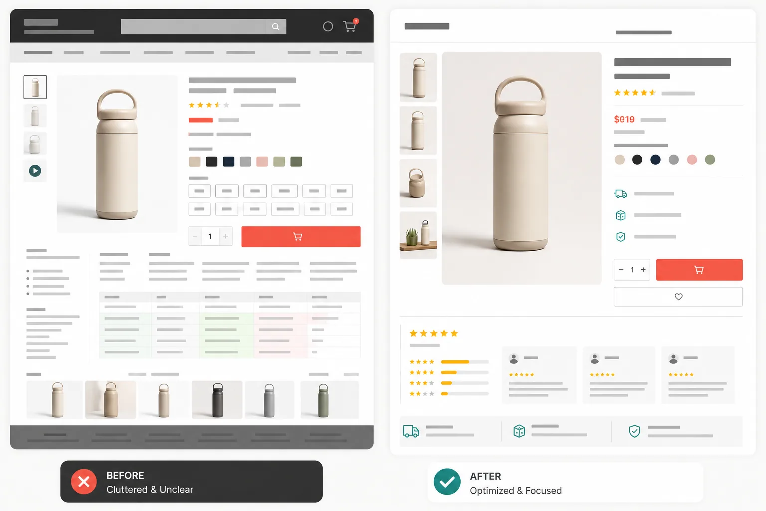
The Product Page tab is the deepest part of the spreadsheet, with more than 100 checks covering copy, social proof, images, product information, mobile behavior, technical quality, and conversion support. Do not implement them as a template. Use them to investigate the questions a shopper must answer before adding the product to cart.
Question 1: Do I understand the product?
- Use a descriptive product title and a concise benefit-led summary.
- Show the product clearly from relevant angles, at an honest scale, and in context.
- Give each important variant an accurate image and label.
- Make dimensions, materials, compatibility, ingredients, care, or installation information easy to scan.
- Explain who the product is for and when it may not be the right choice.
Question 2: Is the offer clear?
- Keep price, subscription terms, bundle contents, and discount conditions unambiguous.
- Place the main CTA beside the decision information rather than separating it from variants or price.
- Show availability honestly. Never manufacture low-stock messages or countdown timers.
- Explain what happens after the click, especially for customized, digital, subscription, or preorder products.
Question 3: What risk is stopping me?
- Put realistic delivery information near the buying decision.
- Summarize returns, exchanges, warranty, and support in plain language.
- Use reviews that help customers decide: verified context, photos where relevant, recurring advantages, and recurring limitations.
- Answer common objections close to the section where they arise instead of hiding everything in a distant FAQ.
- Test keyboard access, zoom, contrast, tap targets, and error feedback as part of the buying experience.
When a product page has low add-to-cart performance, resist changing five elements at once. Form a specific hypothesis: “Customers hesitate because delivery timing is hidden,” or “Mobile shoppers cannot tell which image belongs to the selected variant.” The hypothesis tells you what evidence to collect and what outcome to measure.
For creative teams, the same discipline appears in a Facebook ad creative review checklist: clarity, proof, and a believable next step matter before visual polish.
4. Audit Cart and Checkout Friction
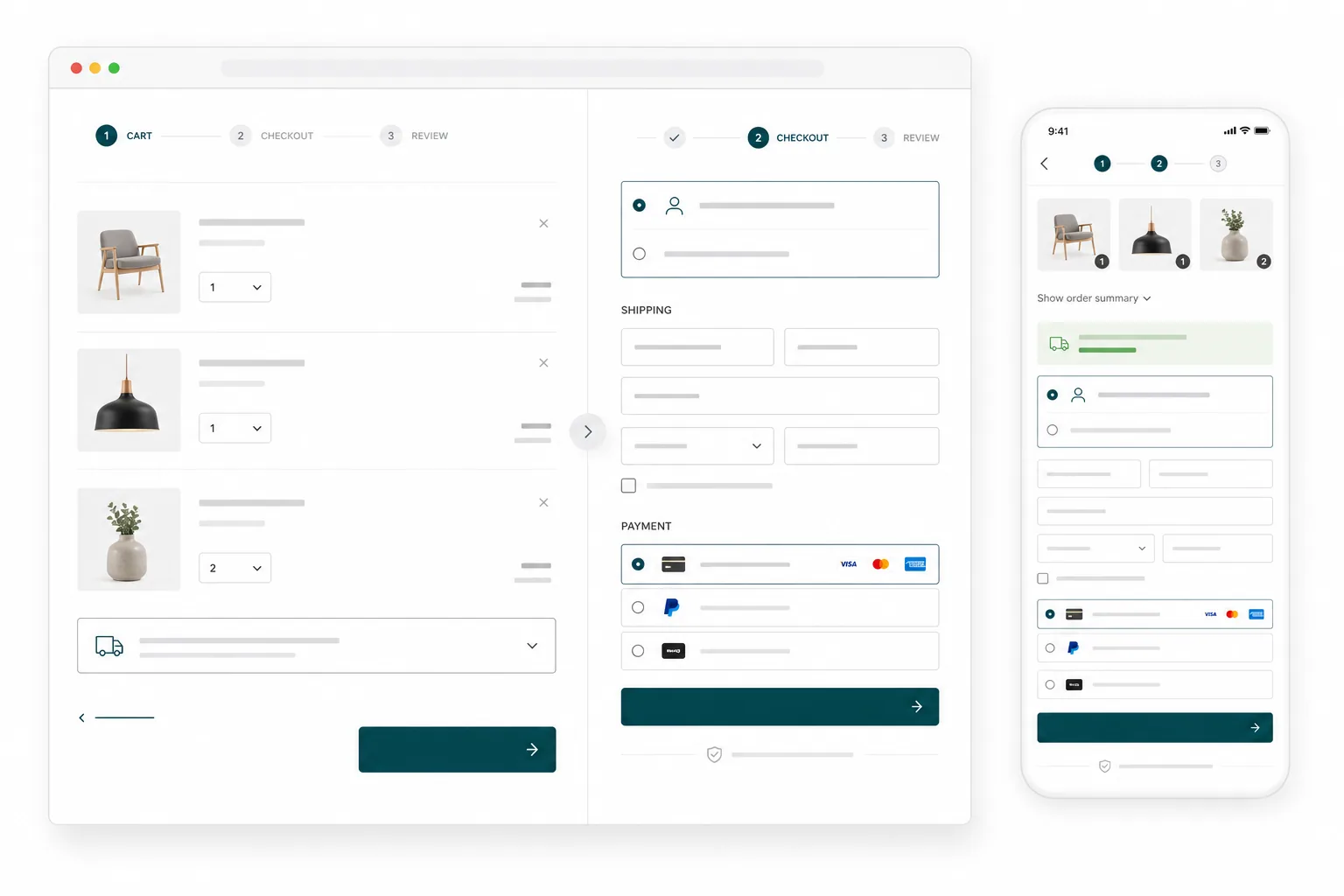
Cart and checkout deserve special treatment because the shopper has already expressed intent. Small frictions here can affect every acquisition channel. Baymard’s checkout research repeatedly identifies late extra costs, forced account creation, and an overly difficult checkout as preventable reasons for abandonment.
Cart audit
- Confirm that the selected product, variant, quantity, price, and image are correct.
- Make quantity changes and removal predictable, with immediate total updates.
- Show discounts, estimated shipping, taxes, and fees as early and accurately as possible.
- Keep the path to checkout visually dominant.
- Use cross-sells only when they are relevant and do not interrupt checkout intent.
- Avoid making the coupon field so prominent that shoppers leave to search for a code.
Checkout audit
- Offer a visible guest checkout path when the business allows it.
- Ask only for information needed to process the order, prevent fraud, or meet legal requirements.
- Use autofill-compatible fields, appropriate mobile keyboards, and clear inline validation.
- Preserve entered information after an error.
- Explain payment failures without exposing sensitive details or blaming the customer.
- Test every payment method, discount type, shipping destination, and important browser/device combination.
- Make the final total and purchase action unmistakable before order submission.
Run a real test order. Analytics can show where abandonment happens, but it cannot always reveal an expired payment configuration, a keyboard covering the CTA, an address validator rejecting legitimate entries, or a discount that changes the wrong line item.
Classify functional checkout defects as P0. Treat clear, evidence-backed friction as P1. Put optional order bumps, visual trust treatments, and experimental reassurance copy behind the core purchasing path.
5. Add the Check Most CRO Lists Miss: Ad-to-Landing-Page Match
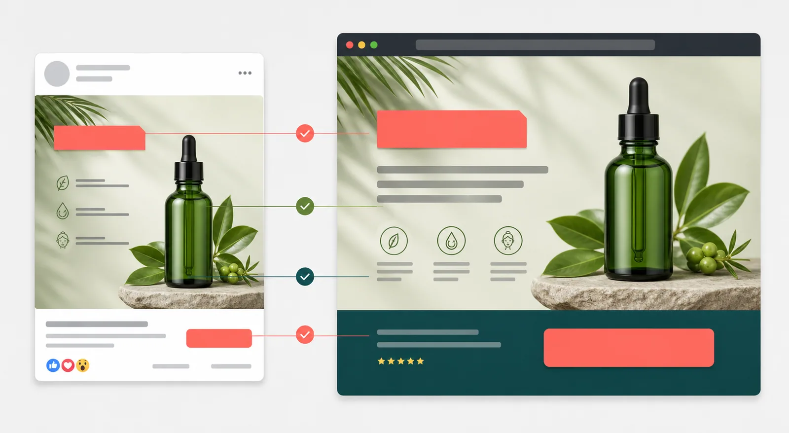
A site can pass a general CRO audit and still underperform paid traffic. The problem may be continuity: the ad earns a click with one product, promise, image, discount, or use case, then the landing page makes the visitor reconstruct the offer.
For each important campaign, compare these elements side by side:
| Ad element | Landing-page check | Failure signal |
|---|---|---|
| Product or category | The same item or clearly relevant collection appears immediately. | The visitor must search again after clicking. |
| Primary promise | The headline and opening content continue the same benefit or problem. | The page leads with a different value proposition. |
| Offer | Price, discount, bundle, and eligibility are consistent. | The promotion is missing, expired, or qualified only after the click. |
| Visual | The product, color, use case, and creative context remain recognizable. | The page looks like a different campaign or item. |
| CTA | The next step matches the intent created by the ad. | A “shop the bundle” ad lands on a generic homepage. |
| Proof | The page supports the claim with relevant detail, demonstration, reviews, or policy. | The strongest claim exists only in the ad. |
Add the campaign name, landing URL, device, and mismatch to the Notes column. Prioritize mismatches on high-spend or high-click campaigns first. This connects CRO work to acquisition economics instead of treating the website as an isolated project.
Use the comparison alongside your static ads versus UGC-style ads testing plan and repeatable ad testing system. A creative test is easier to interpret when the post-click experience preserves the variable you intended to test.
6. How to Use the Ecommerce CRO Checklist Spreadsheet
Step 1: Make a working copy
Open the spreadsheet and make a copy for your store. Name it with the store, market, and audit date. If mobile and desktop experiences differ significantly, record the device in Notes or create separate copies.
Step 2: Define the baseline
Record the period and core funnel counts before changing anything: sessions, product views, add-to-carts, checkout starts, purchases, revenue, and any key error rate you can measure. Segment by device and important acquisition channel. A baseline prevents a normal weekly fluctuation from being mistaken for a win.
Step 3: Audit one journey
Choose a real product and complete the journey as a customer. Start from a search result, ad, homepage, or collection; select a variant; add to cart; apply a valid promotion if relevant; and place a test order. Repeat on mobile. Mark only what you observed.
Step 4: Write evidence in Notes
A useful note is specific: “iPhone Safari: size dropdown closes after one tap,” “12 of 30 support tickets ask about delivery timing,” or “paid-social visitors land on a generic collection despite a product-specific ad.” Avoid notes such as “doesn’t convert” or “make better.”
Step 5: Assign priority and owner
Set P0–P3 using the rules above. In Notes, add the owner and next action if your copy does not include a dedicated Owner field. Limit the active queue. Ten “high priority” projects in progress usually means no true priority exists.
Step 6: Convert recommendations into hypotheses
Use this format: Because we observed [evidence], we believe [change] will improve [customer behavior or metric] for [segment]. We will know by measuring [primary metric] and [guardrail].
Example: “Because mobile shoppers repeatedly open the shipping accordion before adding to cart, we believe showing a delivery estimate beside the CTA will improve mobile add-to-cart rate without increasing refund requests.”
Step 7: Close the loop
After implementation, record the release date, test period, result, and decision. Marking an item Done should mean the change was shipped and checked, not merely assigned. If the change did not help, keep the learning. CRO is a measurement process, not a collection of permanent design rules.
7. A Practical 30-Day Ecommerce CRO Action Plan
| Week | Goal | Actions | Deliverable |
|---|---|---|---|
| Week 1 | Diagnose and verify | Validate analytics, build the funnel, test critical journeys, review support themes, and audit the weakest stage on mobile and desktop. | A documented baseline and a list of evidence-backed issues. |
| Week 2 | Ship critical fixes and quick wins | Resolve P0 defects, implement one to three P1 low-effort changes, QA tracking, and confirm the experience across devices. | A clean release log with screenshots and measurement dates. |
| Week 3 | Launch a focused experiment | Choose one meaningful hypothesis, define the primary metric and guardrails, prepare variants, and verify that the test changes only the intended variable. | A test brief and live experiment or staged rollout. |
| Week 4 | Measure and plan the next cycle | Review directional and final results, check customer feedback, document learnings, re-score the backlog, and select the next bottleneck. | A decision: adopt, iterate, reverse, or gather more evidence. |
For low-traffic stores, do not force statistical conclusions from a short test. Combine analytics with usability tests, support conversations, search queries, error logs, and customer interviews. Fix obvious defects directly; reserve controlled experiments for changes where the outcome is genuinely uncertain.
Common Ecommerce CRO Checklist Mistakes
- Treating best practices as laws. Reviews, sticky CTAs, urgency, video, and personalization can help in the right context and harm clarity in another.
- Starting with the homepage because it is visible. Start with the weakest valuable transition in the funnel.
- Changing many variables at once. You may improve the page and learn nothing about why.
- Ignoring mobile, browser, and traffic-source differences. An average can conceal the segment with the real problem.
- Using artificial urgency. False scarcity and misleading countdowns damage trust and make the audit less customer-centered.
- Measuring only conversion rate. Watch revenue per visitor, average order value, refunds, cancellations, support contacts, and performance guardrails where relevant.
- Calling a task complete before QA. Verify the change, analytics event, edge cases, and actual purchase path.
- Building a permanent backlog. Re-score ideas when the offer, traffic mix, season, product, or customer evidence changes.
For landing-page-specific work, use this checklist with the landing page optimization guide. For acquisition follow-up after cart abandonment, connect the findings to relevant ecommerce retargeting ad templates.
Ecommerce CRO Checklist FAQ
What is an ecommerce CRO checklist?
An ecommerce CRO checklist is a structured audit of the customer journey, including discovery, product evaluation, cart, checkout, trust, content, and technical experience. The best versions also capture evidence, effort, impact, priority, and results.
How many checks are in this spreadsheet?
The workbook contains more than 300 checks across nine audit tabs, with the largest section dedicated to product pages. Not every check applies to every business, so use N/A freely and prioritize relevance over completion percentage.
Which page should I audit first?
Audit the stage connected to the largest credible conversion leak. If many shoppers view products but few add to cart, start with product pages. If checkout starts are strong but purchases are weak, start with checkout and payment QA.
Should every failed check become an A/B test?
No. Broken functionality, accessibility defects, inaccurate information, and tracking failures generally need direct correction and QA. Use experiments when there are multiple reasonable solutions and enough traffic or evidence to compare outcomes.
How often should an ecommerce CRO audit be repeated?
Review critical journeys after major theme, app, checkout, pricing, promotion, or analytics changes. A broader quarterly audit is a practical starting cadence for many stores, with continuous monitoring of errors and funnel performance.
Does a CRO checklist guarantee a higher conversion rate?
No checklist can guarantee an uplift. It can improve the quality of diagnosis, expose preventable friction, and create a disciplined testing queue. Results still depend on the product, offer, traffic quality, customer demand, implementation, and measurement.
Does this checklist work for Shopify and WooCommerce?
Yes. The checklist is platform-agnostic and focuses on customer behavior, content, usability, and funnel mechanics. Platform-specific implementation will differ, but the audit questions apply to Shopify, WooCommerce, and custom storefronts.
Is the ecommerce CRO checklist spreadsheet free?
Yes. Open the Google Sheets link, make a copy, and adapt it to your store, products, customers, and measurement process.
Turn the Audit Into Your Next Action
The advantage of this ecommerce CRO checklist is not its size. It is the path from observation to action: diagnose the weak funnel stage, document evidence, score the issue, ship the most valuable fix, and measure the outcome. That is how a spreadsheet becomes a conversion program instead of another abandoned download.