Facebook Ad Creative Review Checklist: P0-P3 Preflight
Creative review becomes slow and subjective when every comment appears equally important. A spelling preference can consume the meeting while a mismatched price, unsupported claim, unreadable Story crop, or wrong destination survives. The P0-P3 system creates a shared language for consequence. It preserves the existing post’s detailed static, video, carousel, message-match, and QA guidance while making the launch decision faster and more defensible.
Quick answer: Review ads in consequence order: P0 blockers stop launch; P1 issues threaten comprehension or conversion; P2 items protect test quality and operations; P3 covers optional polish. This prevents teams from debating decoration while claims, destinations, crops, or tracking remain broken.
What a mockup can and cannot validate: The assembled preview can expose message repetition, weak reading order, unsafe crops, missing disclosures, offer mismatches, and the wrong destination. It cannot predict click-through rate, acquisition cost, auction delivery, fatigue, or guaranteed Meta approval. Use the mockup as a prelaunch quality-control record, then use live delivery to evaluate performance.
Important implementation claims in this guide are grounded in primary guidance, including Meta ad review policy guidelines and Meta Advertising Standards. The frameworks below translate those requirements into decisions a working creative or growth team can review.
Use the P0-P3 Creative Review System
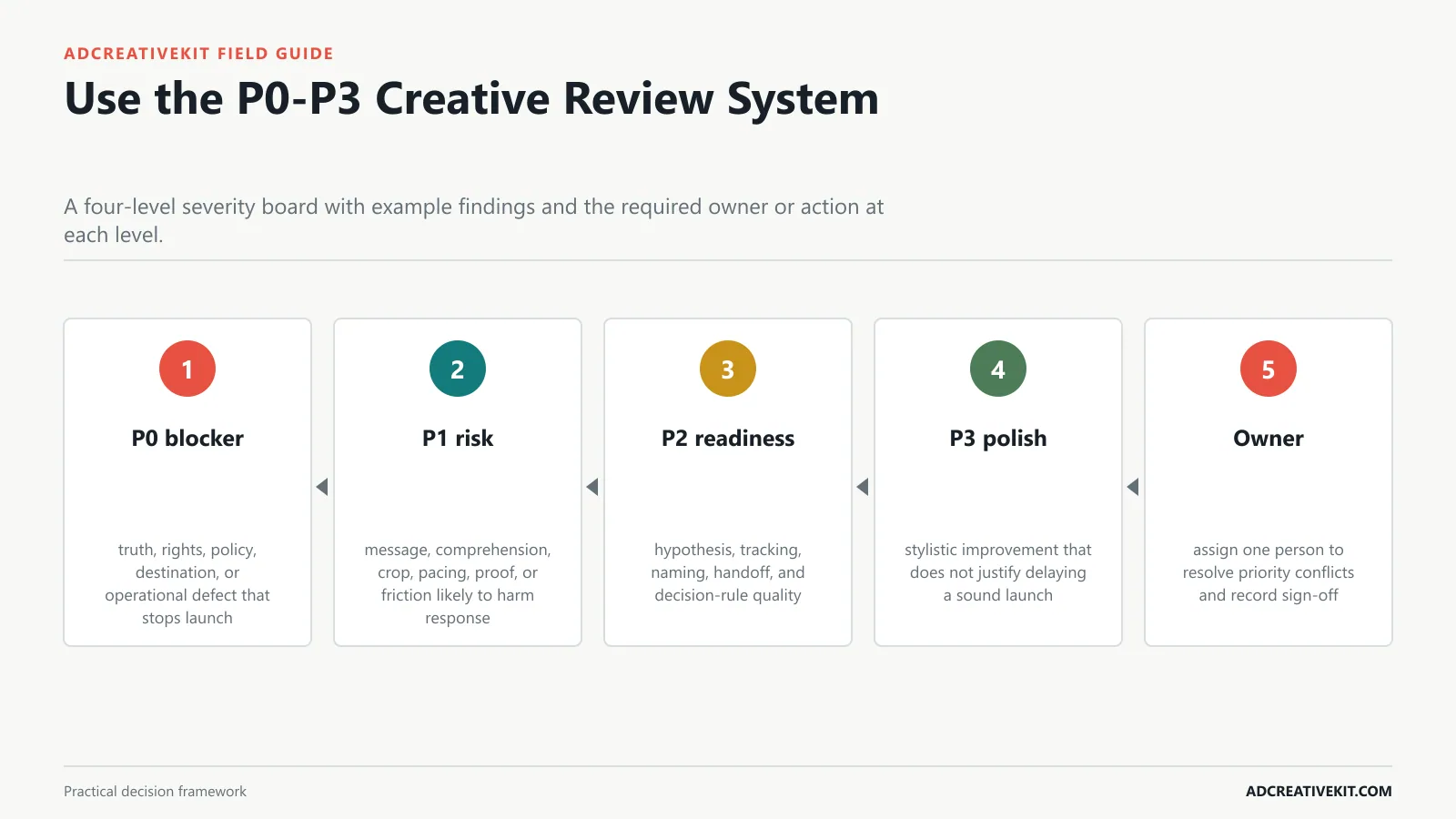
Define blockers, performance risks, test opportunities, and polish so teams fix the most consequential issues first.
Priority triage
Begin with p0 blocker: truth, rights, policy, destination, or operational defect that stops launch. Then inspect p1 risk: message, comprehension, crop, pacing, proof, or friction likely to harm response.
- P0 blocker: truth, rights, policy, destination, or operational defect that stops launch.
- P1 risk: message, comprehension, crop, pacing, proof, or friction likely to harm response.
- P2 readiness: hypothesis, tracking, naming, handoff, and decision-rule quality.
- P3 polish: stylistic improvement that does not justify delaying a sound launch.
- Owner: assign one person to resolve priority conflicts and record sign-off.
P0: Verify Truth, Rights, and Policy
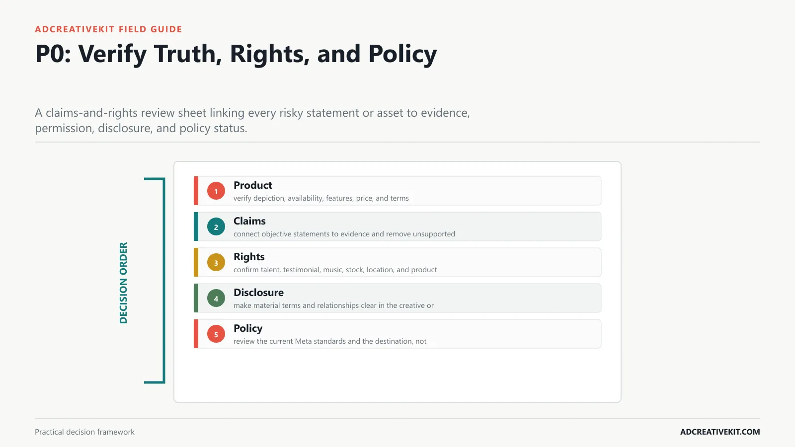
Check product accuracy, claims, evidence, permissions, testimonials, music, disclosures, restricted content, and destination compliance.
Launch blocker
Begin with product: verify depiction, availability, features, price, and terms. Then inspect claims: connect objective statements to evidence and remove unsupported certainty.
- Product: verify depiction, availability, features, price, and terms.
- Claims: connect objective statements to evidence and remove unsupported certainty.
- Rights: confirm talent, testimonial, music, stock, location, and product permissions.
- Disclosure: make material terms and relationships clear in the creative or proximate context.
- Policy: review the current Meta standards and the destination, not creative in isolation.
| Launch blocker element | Practical requirement | Review question |
|---|---|---|
| Product | verify depiction, availability, features, price, and terms | Record the observable evidence, any failure, and the owner of the next action. |
| Claims | connect objective statements to evidence and remove unsupported certainty | Record the observable evidence, any failure, and the owner of the next action. |
| Rights | confirm talent, testimonial, music, stock, location, and product permissions | Record the observable evidence, any failure, and the owner of the next action. |
| Disclosure | make material terms and relationships clear in the creative or proximate context | Record the observable evidence, any failure, and the owner of the next action. |
| Policy | review the current Meta standards and the destination, not creative in isolation | Record the observable evidence, any failure, and the owner of the next action. |
P0: Confirm the Ad and Landing Page Agree
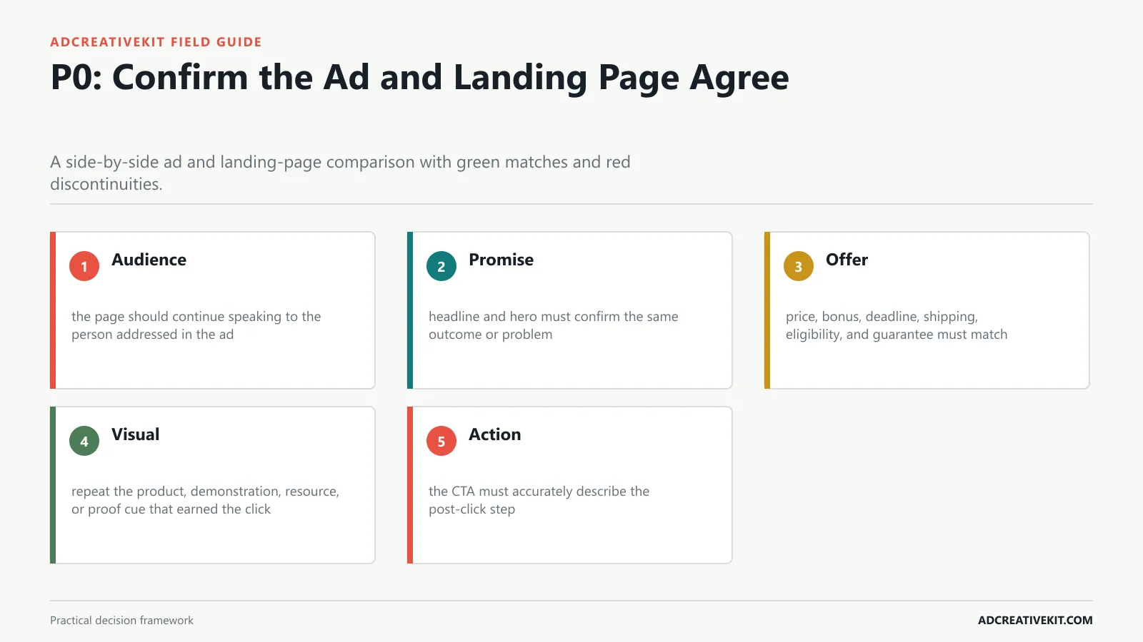
Review audience, promise, offer, price, product, CTA, visual continuity, and post-click expectations.
Destination continuity
Begin with audience: the page should continue speaking to the person addressed in the ad. Then inspect promise: headline and hero must confirm the same outcome or problem.
- Audience: the page should continue speaking to the person addressed in the ad.
- Promise: headline and hero must confirm the same outcome or problem.
- Offer: price, bonus, deadline, shipping, eligibility, and guarantee must match.
- Visual: repeat the product, demonstration, resource, or proof cue that earned the click.
- Action: the CTA must accurately describe the post-click step.
For the adjacent workflow, use the repeatable ad testing system. When this section reveals a broader conversion or production issue, continue with the UGC script templates.
P1: Review the Message in Scroll Order
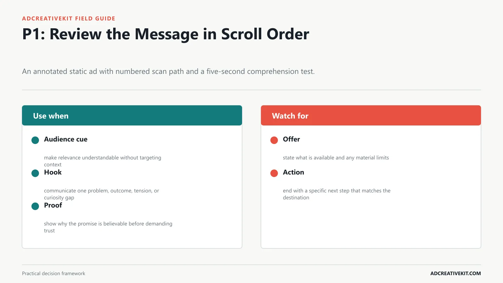
Test whether the audience, problem or outcome, proof, offer, and action are understandable without internal context.
Scroll-order review
Begin with audience cue: make relevance understandable without targeting context. Then inspect hook: communicate one problem, outcome, tension, or curiosity gap.
- Audience cue: make relevance understandable without targeting context.
- Hook: communicate one problem, outcome, tension, or curiosity gap.
- Proof: show why the promise is believable before demanding trust.
- Offer: state what is available and any material limits.
- Action: end with a specific next step that matches the destination.
P1: Review Static Design and Mobile Legibility
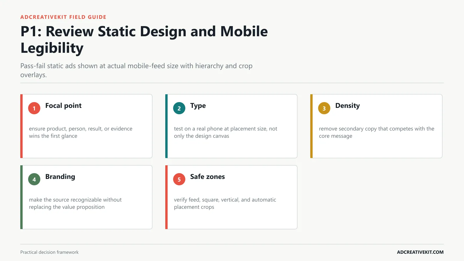
Check focal point, contrast, type size, text density, product clarity, branding, safe zones, and cropping.
Phone-size review
Begin with focal point: ensure product, person, result, or evidence wins the first glance. Then inspect type: test on a real phone at placement size, not only the design canvas.
- Focal point: ensure product, person, result, or evidence wins the first glance.
- Type: test on a real phone at placement size, not only the design canvas.
- Density: remove secondary copy that competes with the core message.
- Branding: make the source recognizable without replacing the value proposition.
- Safe zones: verify feed, square, vertical, and automatic placement crops.
P1: Review Video and UGC Frame by Frame
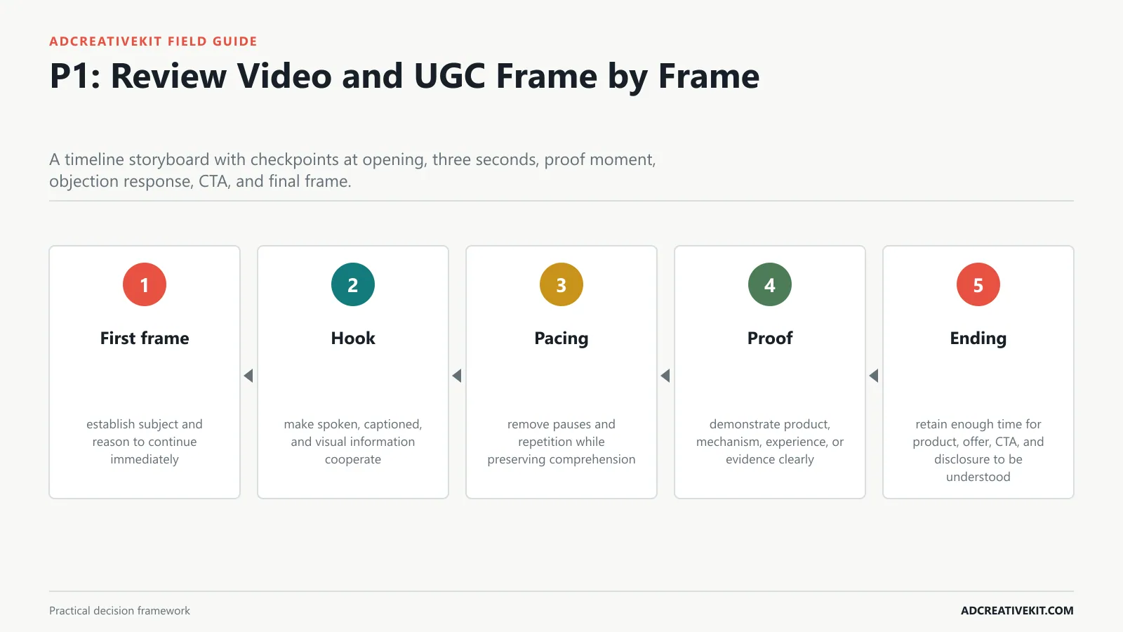
Evaluate first frame, hook, pacing, captions, sound-off clarity, proof, product demonstration, CTA, and ending.
Frame review
Begin with first frame: establish subject and reason to continue immediately. Then inspect hook: make spoken, captioned, and visual information cooperate.
- First frame: establish subject and reason to continue immediately.
- Hook: make spoken, captioned, and visual information cooperate.
- Pacing: remove pauses and repetition while preserving comprehension.
- Proof: demonstrate product, mechanism, experience, or evidence clearly.
- Ending: retain enough time for product, offer, CTA, and disclosure to be understood.
For the adjacent workflow, use the ad testing matrix. When this section reveals a broader conversion or production issue, continue with the repeatable ad testing system.
P1: Review Carousel and Placement Variants
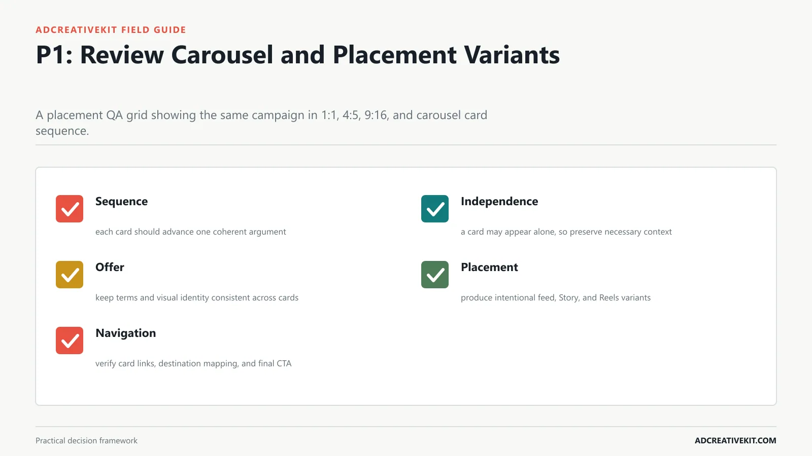
Ensure sequence logic, card independence, consistent offer, safe-zone behavior, and correct crops across feed, Story, and Reels.
Placement review
Begin with sequence: each card should advance one coherent argument. Then inspect independence: a card may appear alone, so preserve necessary context.
- Sequence: each card should advance one coherent argument.
- Independence: a card may appear alone, so preserve necessary context.
- Offer: keep terms and visual identity consistent across cards.
- Placement: produce intentional feed, Story, and Reels variants.
- Navigation: verify card links, destination mapping, and final CTA.
P2: Confirm Test Readiness
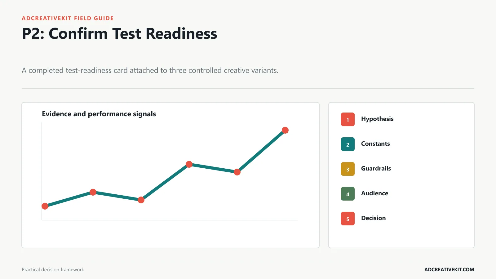
Name the hypothesis, primary variable, constants, success metric, guardrails, audience, landing page, and decision rule.
Experiment review
Begin with hypothesis: identify evidence, primary variable, expected response, and metric. Then inspect constants: hold the elements necessary for interpretation.
- Hypothesis: identify evidence, primary variable, expected response, and metric.
- Constants: hold the elements necessary for interpretation.
- Guardrails: define quality, profitability, complaint, or policy boundaries.
- Audience: document exclusions, overlap, stage, and landing page.
- Decision: predefine scale, iterate, retest, stop, and inconclusive outcomes.
For implementation details, consult FTC truth-in-advertising guidance. Requirements and platform behavior change, so review the current primary documentation before launch rather than relying on a static checklist alone.
P2: Check Tracking, Naming, and Handoff
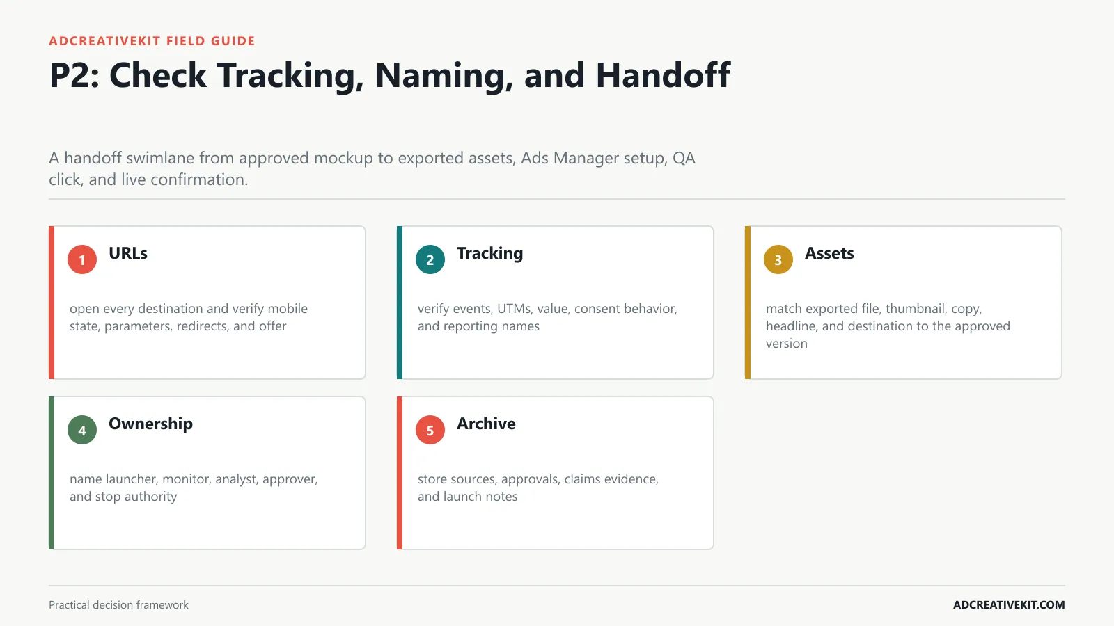
Verify URLs, UTMs, pixel events, asset IDs, versions, approvals, source files, owners, and launch notes.
Operations review
Begin with urls: open every destination and verify mobile state, parameters, redirects, and offer. Then inspect tracking: verify events, UTMs, value, consent behavior, and reporting names.
- URLs: open every destination and verify mobile state, parameters, redirects, and offer.
- Tracking: verify events, UTMs, value, consent behavior, and reporting names.
- Assets: match exported file, thumbnail, copy, headline, and destination to the approved version.
- Ownership: name launcher, monitor, analyst, approver, and stop authority.
- Archive: store sources, approvals, claims evidence, and launch notes.
| Operations review element | Practical requirement | Review question |
|---|---|---|
| URLs | open every destination and verify mobile state, parameters, redirects, and offer | Record the observable evidence, any failure, and the owner of the next action. |
| Tracking | verify events, UTMs, value, consent behavior, and reporting names | Record the observable evidence, any failure, and the owner of the next action. |
| Assets | match exported file, thumbnail, copy, headline, and destination to the approved version | Record the observable evidence, any failure, and the owner of the next action. |
| Ownership | name launcher, monitor, analyst, approver, and stop authority | Record the observable evidence, any failure, and the owner of the next action. |
| Archive | store sources, approvals, claims evidence, and launch notes | Record the observable evidence, any failure, and the owner of the next action. |
For the adjacent workflow, use the creative brief template. When this section reveals a broader conversion or production issue, continue with the ad testing matrix.
Run the Final Five-Minute Preflight
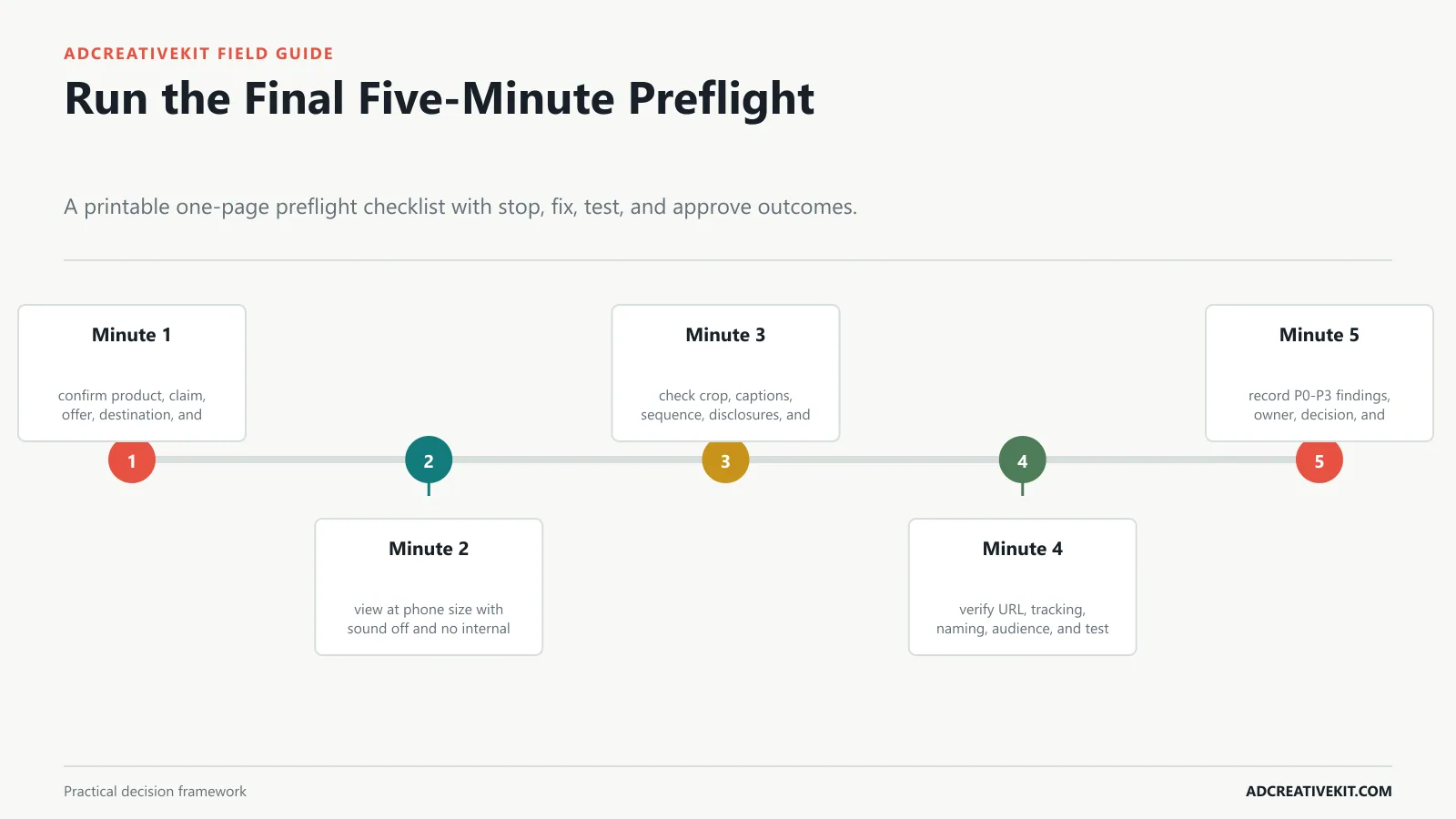
Condense the full framework into a fast sign-off and define when a reviewer must stop launch.
Final sign-off
Begin with minute 1: confirm product, claim, offer, destination, and policy status. Then inspect minute 2: view at phone size with sound off and no internal explanation.
- Minute 1: confirm product, claim, offer, destination, and policy status.
- Minute 2: view at phone size with sound off and no internal explanation.
- Minute 3: check crop, captions, sequence, disclosures, and CTA.
- Minute 4: verify URL, tracking, naming, audience, and test variable.
- Minute 5: record P0-P3 findings, owner, decision, and sign-off.
Worked Placement Review
Imagine a square product ad that looks clear on the design canvas. In the assembled feed preview, the headline repeats the image overlay; in Stories, the product is covered by interface controls; and the landing page shows a different bundle price. Classify the price mismatch as P0, the unsafe Story crop as P1, and the repeated headline as P1 or P3 depending on whether it damages comprehension.
Run the comprehension check with a reviewer who has not seen the brief. Show the mockup briefly, hide it, and ask who the ad was for, what was offered, what evidence they noticed, and what action followed. Wrong recall is more diagnostic than “I like it.” Record each placement and approved version separately so a corrected vertical asset cannot be confused with the rejected square crop.
Frequently asked questions
Who should review Facebook ad creative?
Use one accountable reviewer plus specialists for strategy, brand, claims, media, and production where risk warrants them.
Should every placement use the same asset?
Reuse the concept, but create intentional aspect-ratio and sequencing variants when automatic crops or interaction patterns would weaken comprehension.
What should stop an ad from launching?
Stop for inaccurate claims or offers, missing rights, policy risk, broken destinations, unreadable required disclosures, incorrect tracking, or an asset-version mismatch.
Turn this guide into an operating asset
Save the framework with the evidence, owner, date, and decision attached. That turns a one-time article into a repeatable review system and prevents future teams from treating an old output as a universal rule.