Facebook Carousel Ad Templates for Ecommerce
A carousel is not a row of square ads. It is either a storefront of independent choices or a sequence in which each card advances one argument. Confusing those models produces repetition, weak links, and card-order problems.
The blueprints below assign a job, headline, visual, destination, and testing variable to each card. They also distinguish manually ordered narratives from product sets that can tolerate optimization. Automatic card reordering can undermine a narrative whose meaning depends on seeing the cards in a deliberate sequence.
Quick answer: Decide first whether shoppers should browse or follow a story. Map every card to a customer question and destination, make card one understandable alone, and protect sequence order whenever later cards require earlier context.
Facebook Carousel Ad Templates for Ecommerce
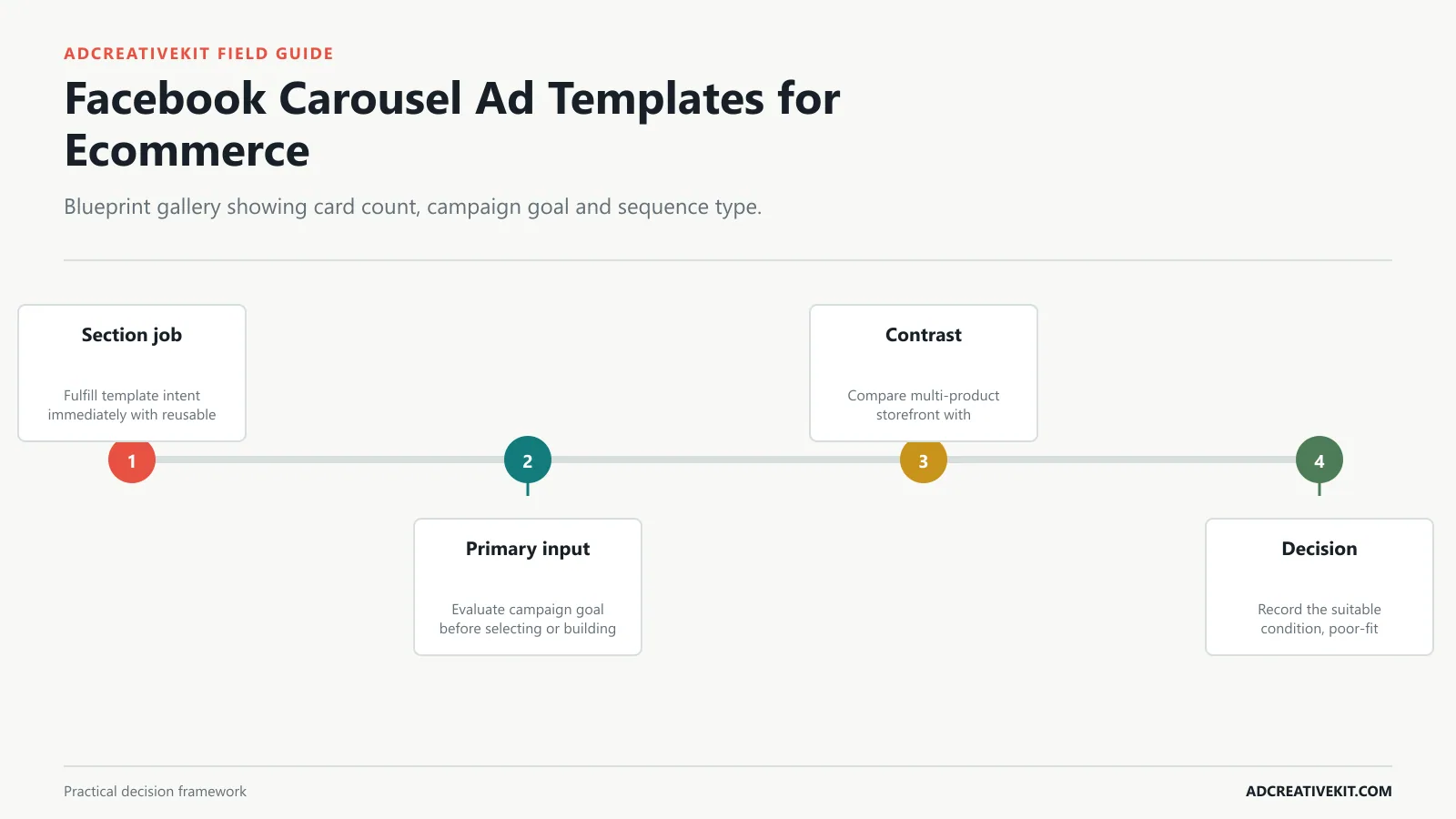
Choose a blueprint by sequence type: multi-product storefront, single-product explanation, problem-to-solution story, proof sequence, or retargeting path. Each card needs a distinct job and a destination that continues its promise. The multi-product storefront blueprint should define what card one promises, what each middle card adds, and where the final card sends the shopper.
Facebook carousel ads work best when the cards act like a sequence. The first card earns attention, the middle cards build understanding, and the final card gives a clear next step. Treat the format like a story, not a product gallery.
A carousel ad can fail for different reasons than a single-image ad. Sometimes the first card is weak. Sometimes the sequence is confusing. Sometimes the final card asks for the click before the buyer understands the offer. This is why carousel review should look at the card sequence, not only the ad-level result.
Sometimes. If the product is visually obvious, product-first can work. If the product needs context, start with the problem or desired outcome.
Judge campaign goal at card level and product count across the whole strip. A strong individual card can still damage the sequence when it repeats a previous job or deep-links to a page that cannot continue its claim.
Assign a purpose to every card and remove cards that repeat the same claim without adding product choice, explanation, evidence, or action.
| Carousel job | Message role | Destination rule |
|---|---|---|
| First card | Frame the product set or story | Link to the page that continues the opening promise |
| Middle cards | Add choice, mechanism, feature, or evidence | Deep-link only when the card and page remain consistent |
| Proof card | Resolve a material uncertainty | Use a destination carrying the same evidence and context |
| Final card | Summarize the accurate next step | Do not introduce a new offer at the end |
Confirm current requirements in Meta Carousel Ads. Use the source for platform or compliance facts, while keeping performance conclusions tied to your own account evidence.
Carousel Specs and Card Requirements
Confirm the platform’s current card, media, text, URL, and placement requirements before production. Specifications can change, so the editable master should not be treated as the permanent source of truth. The single-product features blueprint should define what card one promises, what each middle card adds, and where the final card sends the shopper.
TL;DR: A strong ecommerce carousel gives each card one job: hook, product, benefit, proof, objection, offer, or CTA. Do not make every card a separate poster. Use the sequence to explain why the product matters.
If you are not sure where to start, use a five-card sequence. Five cards are enough to teach, prove, and ask for action without turning the ad into a long brochure.
A Facebook carousel should feel like a short guided path, not a folder of separate images. Give each card a role, test the order, and use the format when sequence helps the buyer understand the offer.
Judge product count at card level and sequence dependency across the whole strip. A strong individual card can still damage the sequence when it repeats a previous job or deep-links to a page that cannot continue its claim.
Create a destination map beside the storyboard so each headline and URL continues the promise made on its card.
Progress checklist
- Write the job of every single-product features card.
- Map product count to the first-card promise.
- Check continuity through sequence dependency.
- Decide whether sequence order may be optimized.
Choose a Sequence by Campaign Goal
A catalog goal emphasizes choice and product mapping; an education goal emphasizes progression; a proof goal sequences evidence; and a promotion goal makes terms and eligible products clear. The problem-solution story blueprint should define what card one promises, what each middle card adds, and where the final card sends the shopper.
The most common carousel mistake is treating the format as a catalog. Five cards, five product shots, five repeated “shop now” prompts. That can work for browsing, but it rarely teaches the buyer anything.
Card 1: Hook. Name the problem, outcome, or product promise in one clear idea.
Use this carousel guide with the product launch carousel templates , Facebook ad creative review checklist , and ad testing matrix template so each slide sequence connects to a clear test and review process.
Judge sequence dependency at card level and card destination across the whole strip. A strong individual card can still damage the sequence when it repeats a previous job or deep-links to a page that cannot continue its claim.
Compare storefront and narrative sequences explicitly: independent SKU cards tolerate reordering, while an explanation sequence may not.
Multi-Product Storefront Template
Use the opening card to frame the collection, middle cards to differentiate products, and the final card to clarify the next step. Send each product card to its relevant page when the experience supports deep links. The review sequence blueprint should define what card one promises, what each middle card adds, and where the final card sends the shopper.
A better carousel uses progression. Card one creates curiosity. Cards two through four build the buying argument. The final card makes the click feel natural. This is why carousel ads can be useful for ecommerce products that need explanation, comparison, proof, or range.
Card 4: Proof or objection handling. Use reviews, comparison, guarantee, or feature evidence.
Judge card destination at card level and first-card strength across the whole strip. A strong individual card can still damage the sequence when it repeats a previous job or deep-links to a page that cannot continue its claim.
Decide whether automatic ordering is compatible with the story before launch; settings and availability should be confirmed in the current Ads Manager interface.
Click checklist
- Write the job of every review sequence card.
- Map card destination to the first-card promise.
- Check continuity through first-card strength.
- Decide whether sequence order may be optimized.
Single-Product Feature Template
For a single product, make each card advance the decision: outcome, mechanism, feature, proof, objection, or CTA. Repeating the same hero image wastes the format’s sequencing advantage. The comparison blueprint should define what card one promises, what each middle card adds, and where the final card sends the shopper.
The sequence does not have to be exactly five cards. But every card should earn its space. If card three says the same thing as card two, cut it or give it a different job.
This structure is especially useful for bundles, product launches, comparison campaigns, and retargeting audiences that need more than one frame of explanation.
Judge first-card strength at card level and campaign goal across the whole strip. A strong individual card can still damage the sequence when it repeats a previous job or deep-links to a page that cannot continue its claim.
Record card-level clicks alongside downstream quality so the strongest opener is not mistaken for the best buying path.
Problem-Solution Story Template
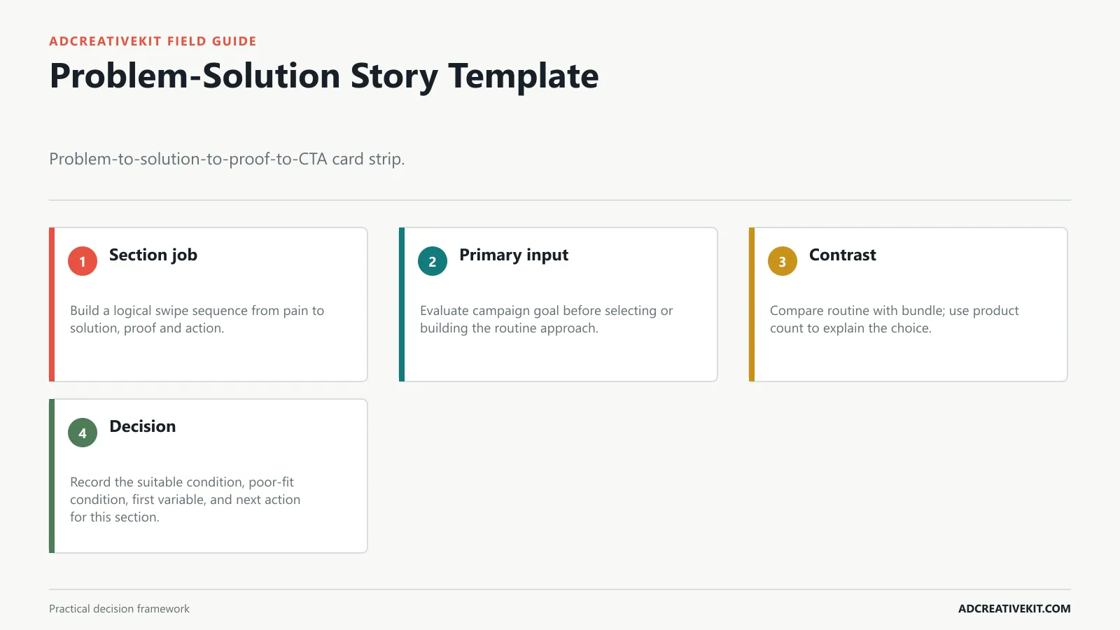
A narrative carousel depends on order. Establish the problem without sensationalizing it, introduce the product as the mechanism, provide evidence, and end on a destination-matched action. The routine blueprint should define what card one promises, what each middle card adds, and where the final card sends the shopper.
Order: bundle promise, item one, item two, item three or bonus, savings/CTA.
Do not test ten carousel structures at once. Start with one sequence and change the variable that matters most.
Judge campaign goal at card level and product count across the whole strip. A strong individual card can still damage the sequence when it repeats a previous job or deep-links to a page that cannot continue its claim.
Confirm current card specifications and placement behavior before export because platform requirements can change after a template is created.
Progress checklist
- Write the job of every routine card.
- Map campaign goal to the first-card promise.
- Check continuity through product count.
- Decide whether sequence order may be optimized.
Connect this step to the repeatable ad testing system so the decision survives the handoff from concept to campaign and post-click experience.
Review and Social-Proof Template
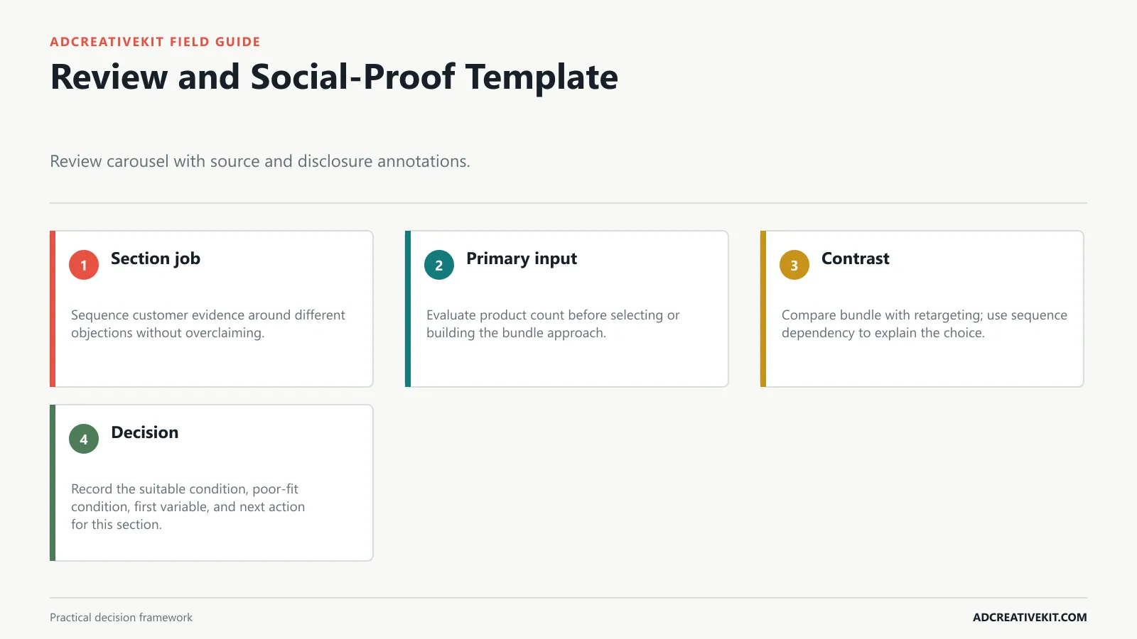
Proof cards should identify their source and remain readable without misleading crops. Customer statements, ratings, and before-after evidence need permission, context, and substantiation. The bundle blueprint should define what card one promises, what each middle card adds, and where the final card sends the shopper.
Order: before state, why it happens, product or process, after state, CTA.
The carousel format becomes powerful when the team treats card order as strategy. Each card should move the shopper one step closer to understanding why the product is worth clicking.
Judge product count at card level and sequence dependency across the whole strip. A strong individual card can still damage the sequence when it repeats a previous job or deep-links to a page that cannot continue its claim.
Make the chosen sequence serve one campaign goal; mixing catalog choice and linear storytelling can create contradictory card jobs.
Confirm current requirements in Meta Ad Creative Guidance. Use the source for platform or compliance facts, while keeping performance conclusions tied to your own account evidence.
Design the First Card and Swipe Cues
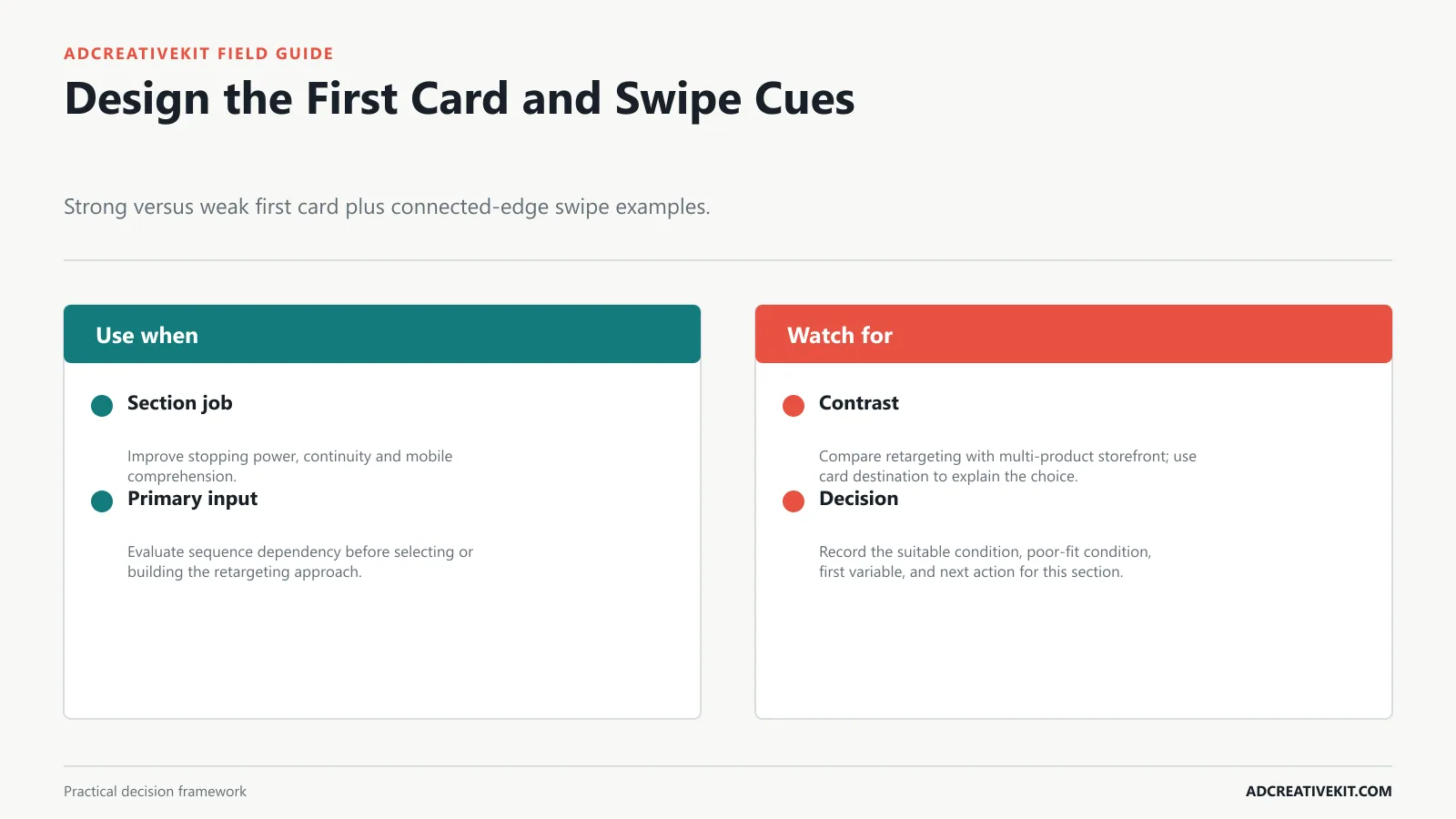
The first card must work as an entry point, while edge treatments or visual continuity can suggest a sequence. Do not let decorative swipe cues compete with the product and promise. The retargeting blueprint should define what card one promises, what each middle card adds, and where the final card sends the shopper.
Order: collection promise, product one, product two, product three, shop collection CTA.
It is a reusable multi-card structure where each card has a specific job, such as hook, product, benefit, proof, offer, or CTA.
Judge sequence dependency at card level and card destination across the whole strip. A strong individual card can still damage the sequence when it repeats a previous job or deep-links to a page that cannot continue its claim.
Use middle cards to advance product understanding rather than restating the opening hook in different colors.
Click checklist
- Write the job of every retargeting card.
- Map sequence dependency to the first-card promise.
- Check continuity through card destination.
- Decide whether sequence order may be optimized.
Connect this step to the ecommerce CRO checklist so the decision survives the handoff from concept to campaign and post-click experience.
Map Destinations and Test the Carousel
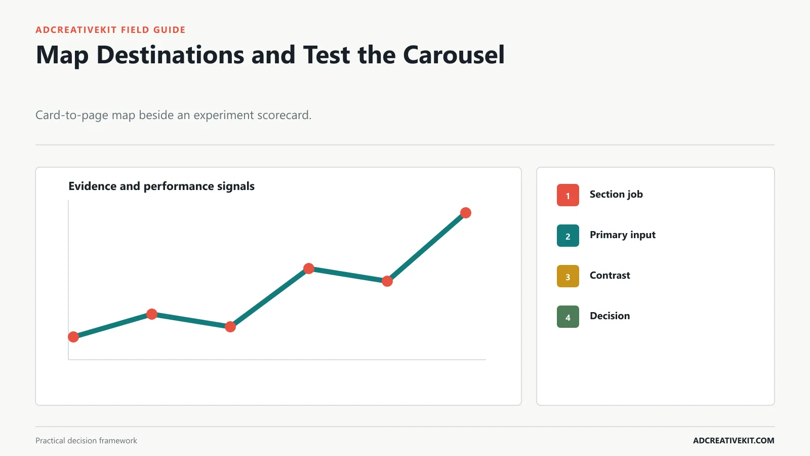
Map every card to its headline, URL, destination state, and measurement tag before launch. When the story depends on order, avoid settings that may reorder cards; when cards are independent, test ordering deliberately. The multi-product storefront blueprint should define what card one promises, what each middle card adds, and where the final card sends the shopper.
Carousel ads give you a useful testing advantage: you can learn from individual card behavior. If card one gets attention but card two loses people, the problem may be the bridge between hook and product. If the proof card gets more clicks than the product card, the next version may need proof earlier.
Start with four to six cards. That is usually enough to explain the product without turning the ad into a long catalog.
Judge card destination at card level and first-card strength across the whole strip. A strong individual card can still damage the sequence when it repeats a previous job or deep-links to a page that cannot continue its claim.
Test first-card strength and destination mapping separately when traffic allows, since either can change the observed path.
Frequently asked questions
How many cards should an ecommerce carousel use?
Use the number required to complete the browsing or persuasion job without repetition. Product count, narrative length, and card quality matter more than a universal optimum.
Should every carousel card link to the same page?
Not necessarily. Storefront cards can deep-link to matching products, while a sequential single-product story may use one destination. The card promise and destination must remain continuous.
When should automatic card ordering be disabled?
Keep manual order when later cards depend on earlier context. Optimization may suit independent product cards, but it can break a problem-to-solution or step-by-step narrative.
Review the carousel in preview order and click every destination. The sequence is complete only when each swipe adds meaning and each landing page continues the promise of its card.
Use the Facebook ad creative review checklist before launch, record the hypothesis in the repeatable ad testing system, and inspect post-click continuity with the ecommerce CRO checklist.
Confirm current implementation details in Meta Ad Creative Guidance before production.