Sale Banner Templates: A Placement-First Design Guide
Sale banner templates do not have one universal job. An announcement bar is read while someone is already shopping. A homepage hero must orient a visitor. A display ad must earn a qualified click in a small space. A storefront sign must work from a distance. Treating them as the same rectangle creates either too much information or too little.
Quick answer: Start with placement and viewing behavior, then choose the dimensions and sale layout. Build the message in decision order, create a deliberate mobile version, repeat the promise on the destination, and evaluate banners with conversion quality and margin rather than clicks alone.
Choose the Sale Banner by Placement
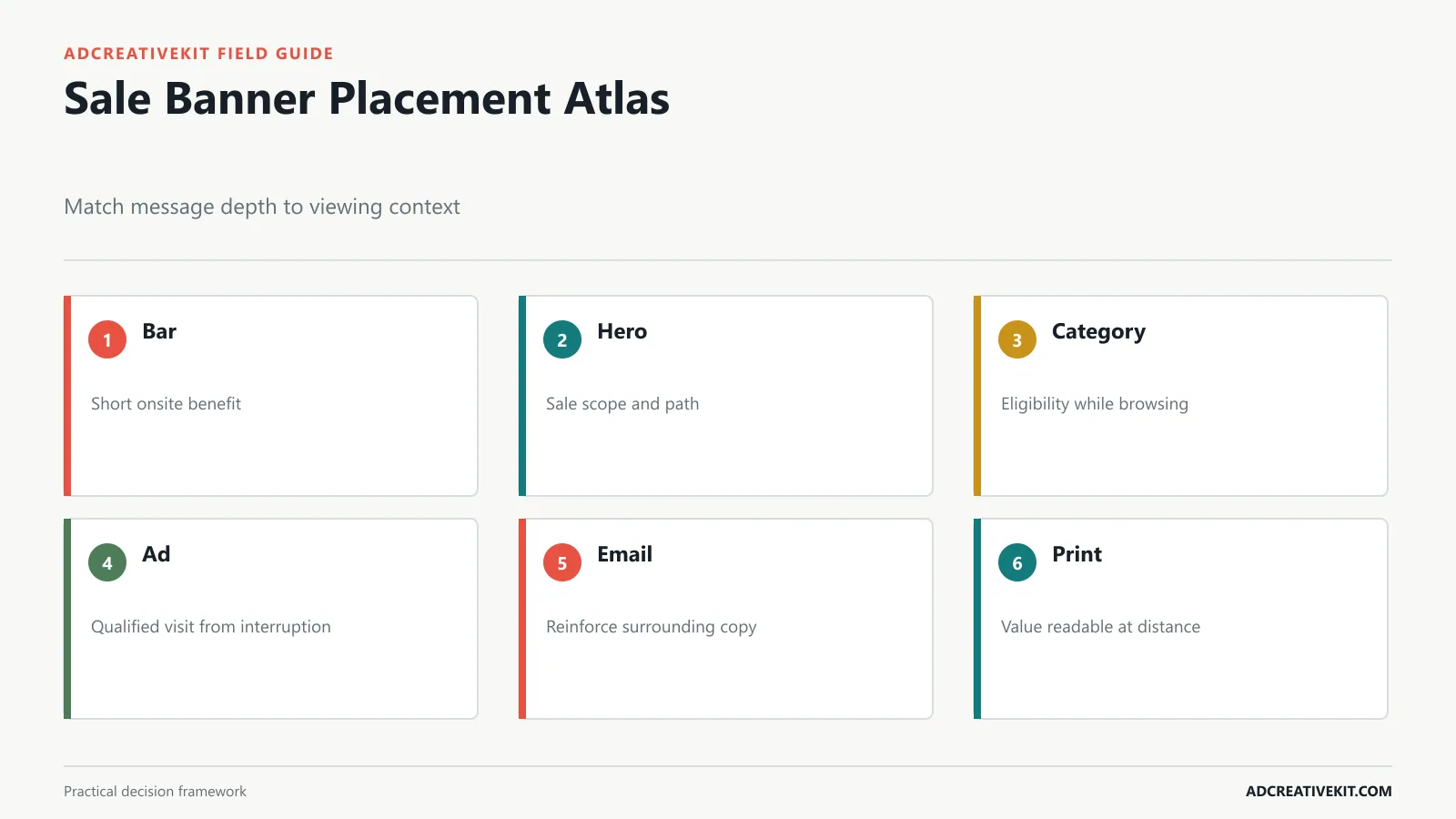
A website announcement bar supports the current shopping session, so it should state one short benefit and link to details. A homepage hero can establish product scope, sale reason, value, and CTA. A category banner should preserve navigation and identify which items qualify. Email banners support surrounding copy and should not contain every condition. Paid-social and display banners need an independent message because they may be seen without context.
| Placement | Viewer context | Primary job | Common mistake |
|---|---|---|---|
| Announcement bar | Already on site | State current benefit | Long terms in tiny text |
| Homepage hero | Orienting to store | Explain sale scope and path | Decorative seasonal scene |
| Category banner | Browsing products | Clarify eligibility | Obstructing navigation |
| Paid ad | Interrupted elsewhere | Earn a qualified visit | Assuming prior context |
| Email header | Reading campaign message | Reinforce the offer | Embedding all copy in image |
| Print or signage | Viewing from distance | Make value and direction visible | Screen-sized type |
Write a placement sentence before design: “This category banner helps skincare shoppers identify eligible sets and reach the filtered collection.” That sentence makes it easier to remove anything unrelated.
Use the Correct Sale Banner Size
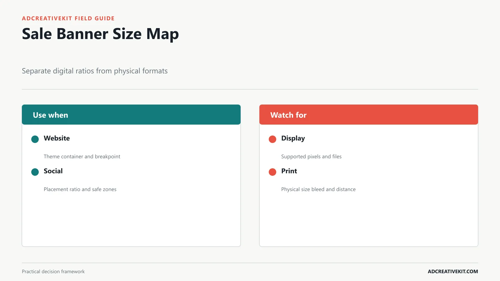
There is no single “sale banner size.” Website dimensions depend on the theme and breakpoint. Social sizes depend on the placement. Uploaded display ads use defined pixel dimensions, while responsive ads use asset ratios and combinations. Print uses physical units, bleed, resolution, and viewing distance.
Ask the channel owner for the current specification and design against the real container. Google publishes uploaded display ad specifications, including supported dimensions and formats. For responsive display, its best-practice guidance explains asset variety and previews. Do not mix a pixel checklist for ads with inches or millimeters for print.
For websites, identify desktop and mobile containers, maximum file weight, focal-point behavior, text rendered in HTML versus image, and whether the content management system crops automatically. Export at sufficient density for sharp rendering, then compress responsibly. A heavier image can delay the very shopping experience the banner is meant to promote.
Build the Offer Hierarchy in Decision Order
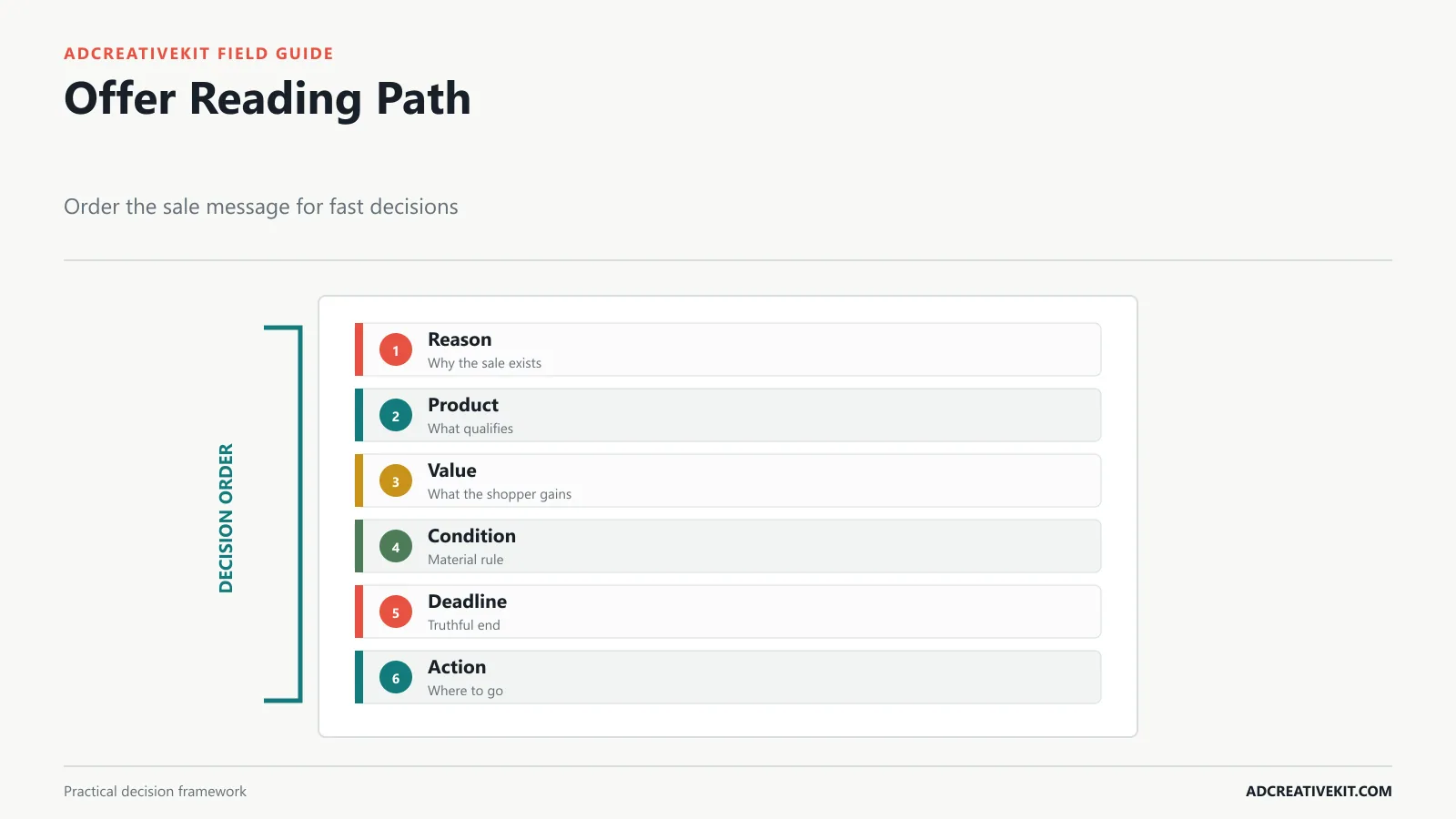
Lead with the sale reason or customer outcome, then show the product or category, value, material condition, deadline, and action. The discount is not always the headline. A clearance banner may need the category and final-sale status. A bundle may need the included products. A threshold offer must show the required spend. A gift promotion must show the gift and availability rule.
Use one dominant message and one support layer. Conditions can be smaller, but they must remain readable and cannot contradict the headline. “Up to 50% off selected styles” should not be reduced visually to “50% off.” The FTC’s truth-in-advertising resources emphasize that claims should be truthful, non-deceptive, and supported.
Review the banner at realistic size for three seconds, then ask what the sale covers, what the value is, and what happens next. If the answers depend on close reading, simplify the design or move supporting detail to the page.
Select a Layout for the Sale Type
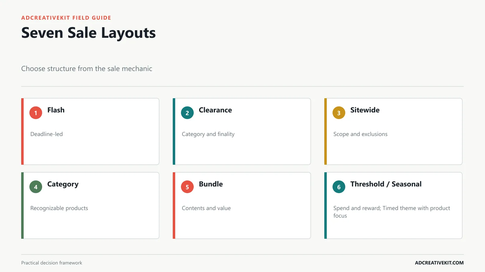
Flash sale: prioritize exact end time, product scope, and a direct path. Clearance: show category or products and any final-sale condition. Sitewide: clarify exclusions and avoid implying universal eligibility if exceptions are material. Category sale: make the category recognizable. Bundle: show what is included and the combined value. Threshold: pair the required amount with the reward. Seasonal: use seasonal cues to organize the campaign, not to cover the products.
Choose a structure from the sale mechanic rather than forcing every offer into a centered discount badge. Product-led layouts are useful when the merchandise drives desire. Type-led layouts are useful when the offer itself is the main news. Split layouts can join a product and concise offer, but they need careful mobile adaptation.
For a broader offer-selection framework, use the promotional templates guide. For Cyber Week timing and mechanics, use the Black Friday ad template playbook.
Adapt the Banner for Mobile
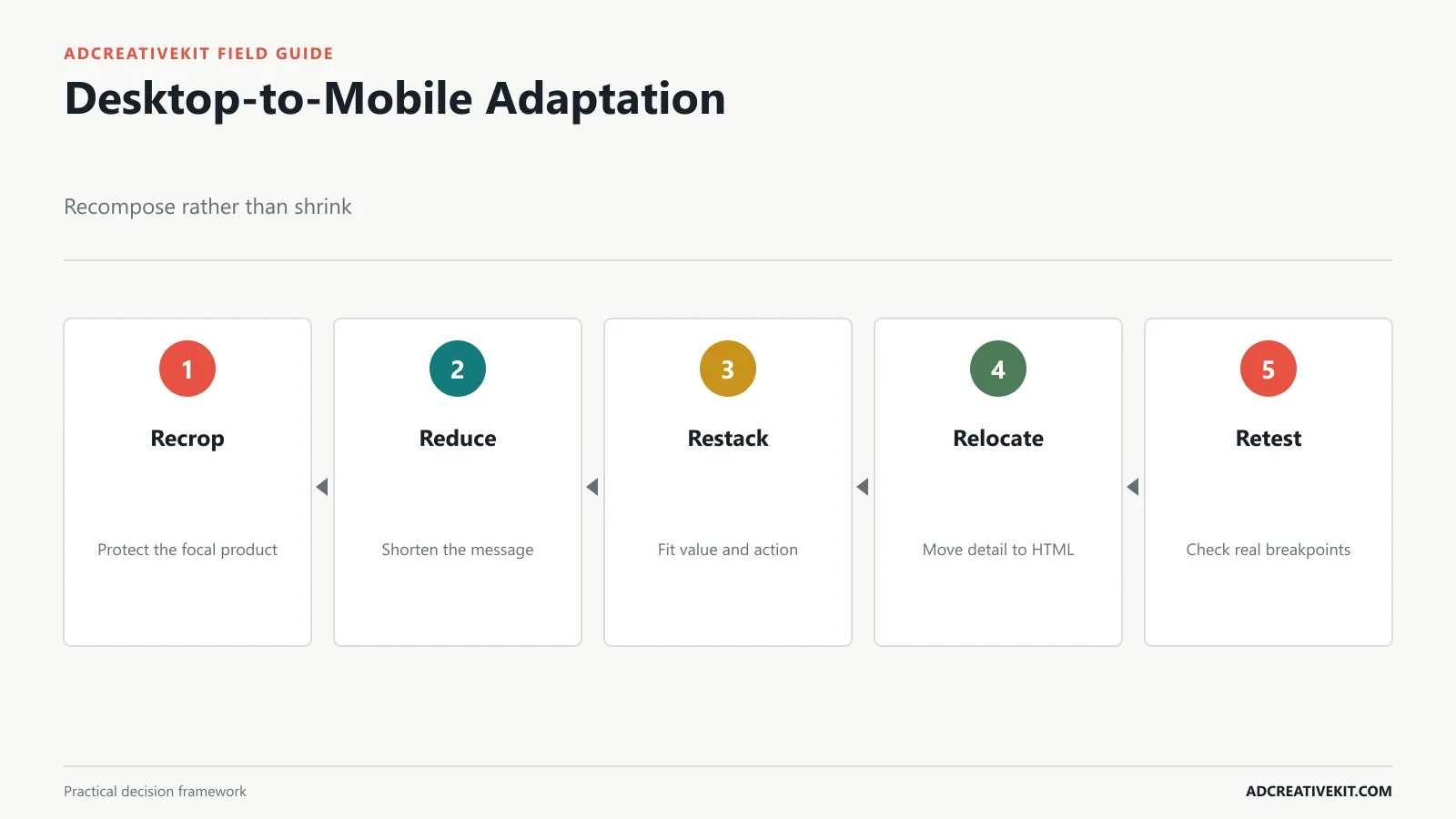
Mobile banners have less width, different folds, and competing interface elements. Create a separate composition when the container changes meaningfully. Re-crop the product, shorten the headline, stack the value and CTA, move conditions into nearby HTML text, and remove decoration that competes with the offer.
Protect the focal point through breakpoints. A subject placed on the right of a desktop hero may disappear behind centered mobile cropping. Use art-directed image variants or defined focal positioning. Test common phone widths, text scaling, and landscape orientation. Confirm that the banner does not push products or navigation so far down that the page’s primary task becomes harder.
Keep text in live HTML when practical so it can reflow, remain accessible, and be updated without generating a new image. When text is part of the image, preserve contrast and provide an equivalent nearby message. W3C’s accessible design tips cover contrast, understandable content, and adaptable presentation.
Avoid Sale Banner Design Failures
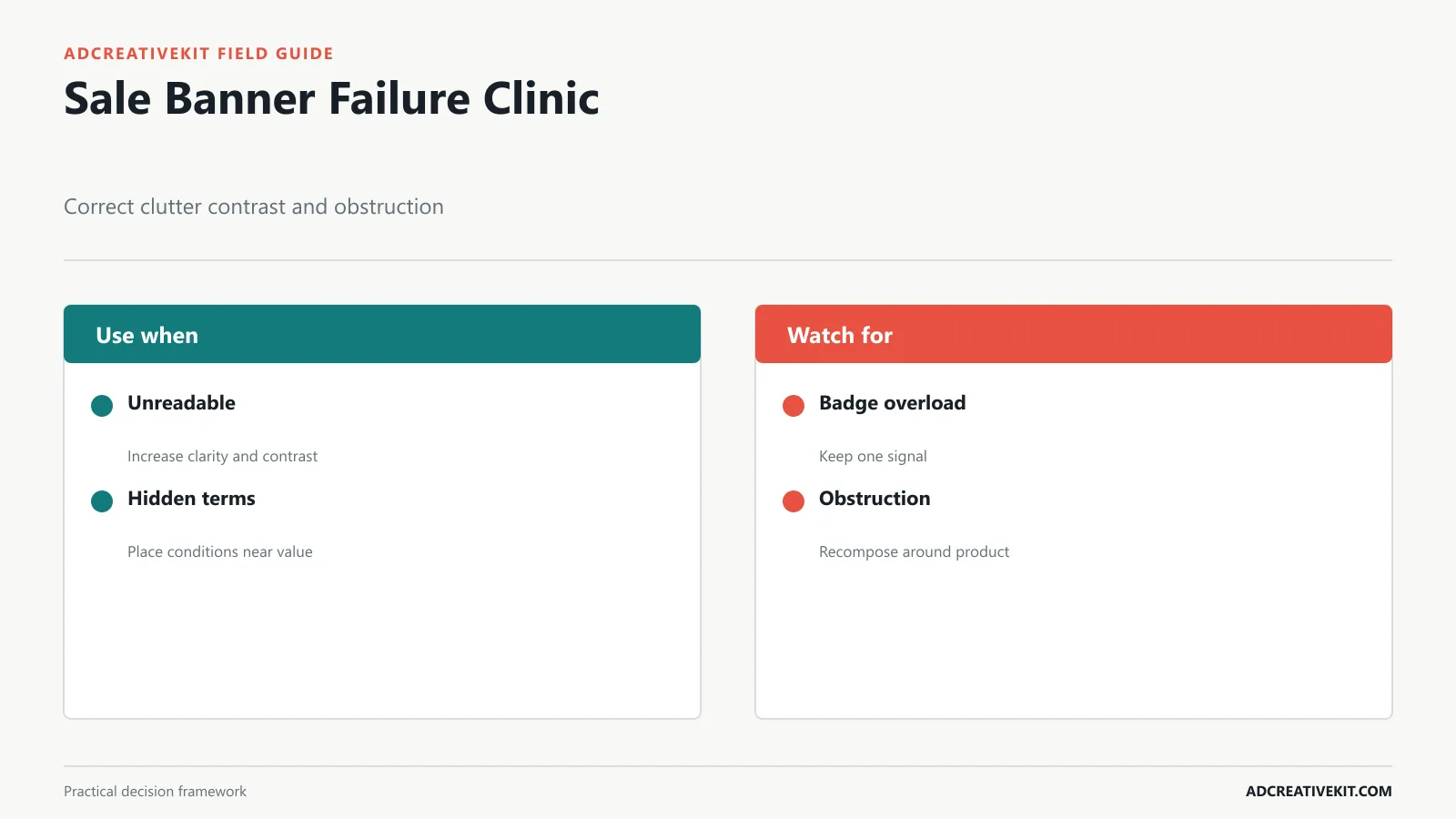
Unreadable value: decorative type or low contrast obscures the offer. Use a clear typeface, strong contrast, and fewer competing weights. Hidden condition: the qualification disappears. Place the material condition near the value. Badge overload: every message appears urgent. Keep one primary signal. Product obstruction: text covers what the customer needs to inspect. Recompose rather than squeezing.
False scale: product combinations imply size or quantity inaccurately. Preserve honest visual relationships. Generic seasonal styling: the campaign becomes visually interchangeable with competitors. Retain brand roles and recognizable product imagery. No exit state: expired creative remains live. Schedule removal and prepare a fallback.
Review in four modes: full desktop, realistic mobile, grayscale, and beside the destination. These reveal hierarchy, crop, contrast, and promise continuity. The ad creative review checklist can be adapted for paid sale banners.
Match the Banner to the Destination
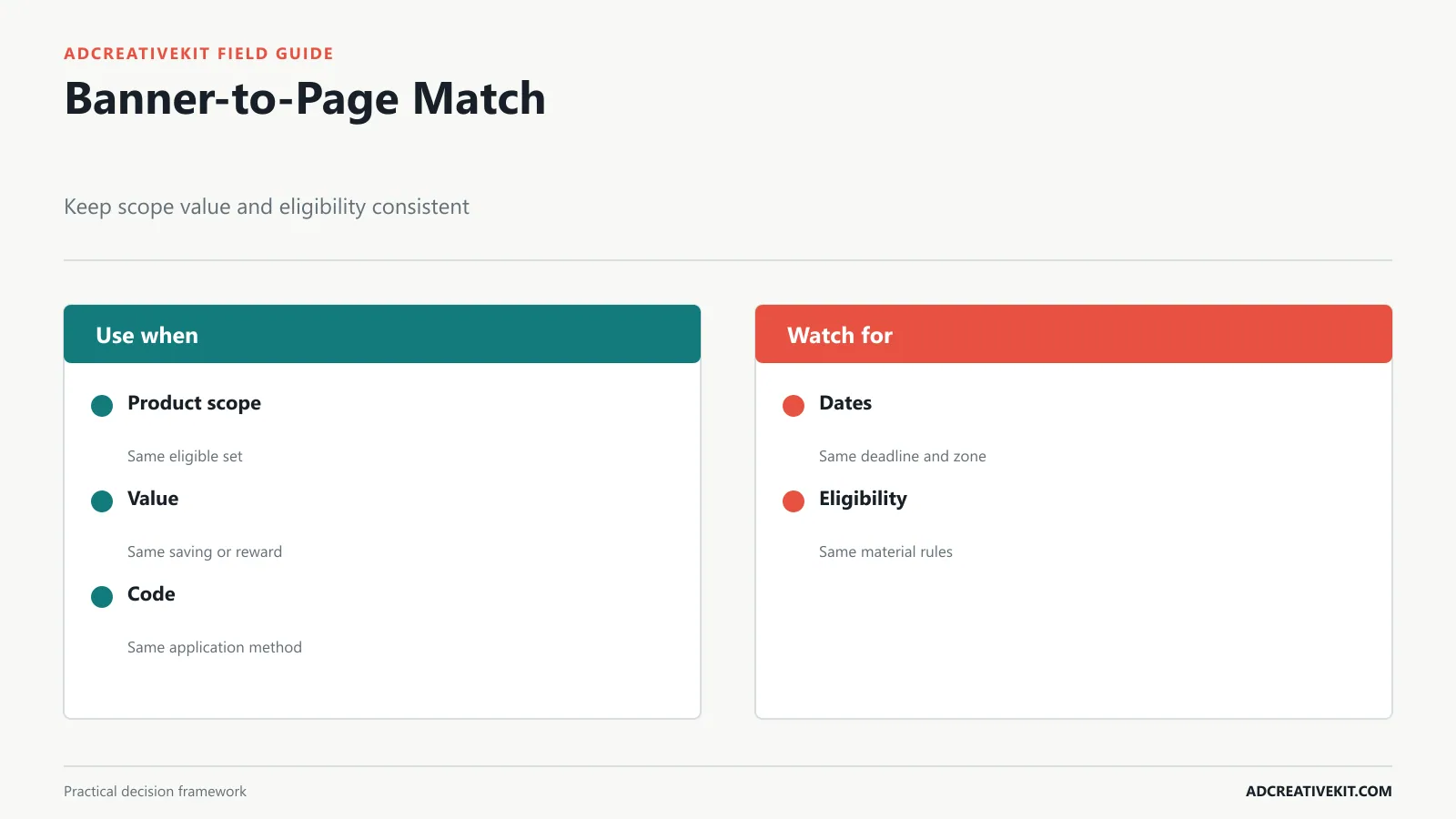
Repeat the product scope, value, code behavior, dates, and eligibility on the destination. If the banner promotes a bundle, link to that bundle rather than a generic collection. If the offer is automatically applied, show that state. If a code is required, make it easy to copy and explain where it is entered.
Keep unavailable or excluded products from dominating the first screen. Explain stock limits and substitutions honestly. Validate the entire path on mobile: click, page load, filtering, product selection, cart, code, shipping threshold, and checkout. A visually successful banner can still create poor traffic if the destination forces the customer to rediscover the offer.
Use tracking that identifies placement and creative without changing the underlying promise. Annotate offer changes, because a revised discount or product set makes before-and-after creative comparisons less clean.
Test and Review Sale Banner Performance
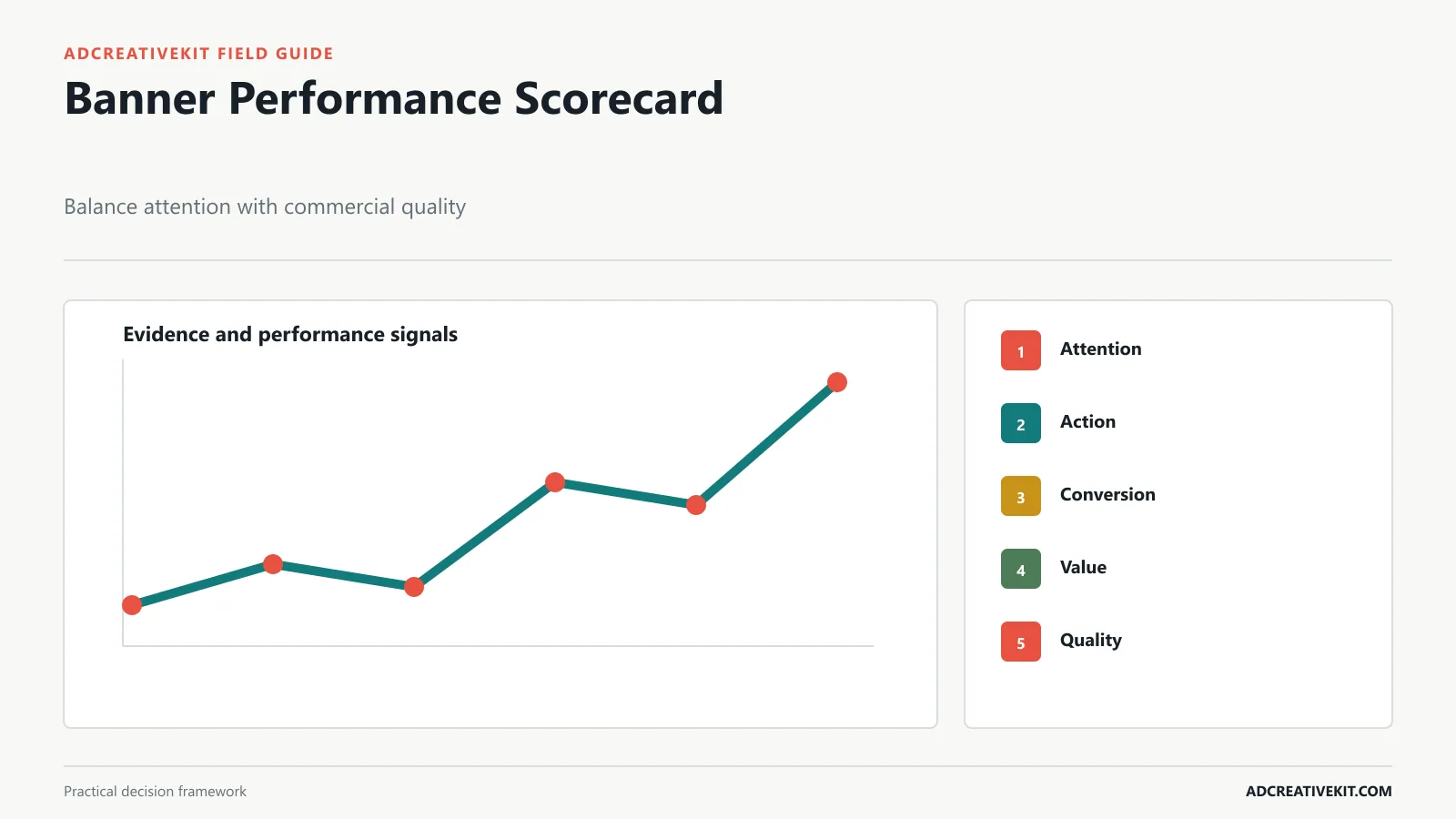
Define a focused hypothesis such as: “Showing the eligible category beside the discount will reduce unqualified clicks and increase category conversion.” Keep the offer stable while testing hierarchy, product selection, proof, CTA, or layout. If you change the discount at the same time, you are testing the commercial mechanic and creative together.
Read click-through rate as an attention and expectation signal. Add qualified landing visits, product views, conversion rate, average order value, contribution margin, returns, and new-customer mix. A banner that earns more clicks through an exaggerated headline may perform worse after the click.
Segment by placement and device because the same creative can solve different tasks. Record dates, audience, traffic source, page, offer state, primary metric, guardrails, and decision. Preserve losing tests when they contain a useful lesson; deleting them encourages the same idea to be repeated later.
A reusable sale-banner production brief
For every banner, record placement, container dimensions, responsive behavior, audience context, sale mechanic, eligible products, primary message, material condition, deadline, CTA, destination, product assets, text rendered in HTML, image text, file-weight target, tracking, owner, approver, and expiry state. These constraints determine composition and should arrive before design.
Add a breakpoint sketch for important website banners. Mark the focal point, protected product area, live-text zone, maximum headline length, and which decorative elements disappear on smaller screens. For paid placements, add safe zones and a reference screenshot of the real interface. This prevents late-stage resizing from becoming emergency redesign.
Worked example: a threshold banner system
A store offers free shipping over $60. The announcement bar can say “Free standard shipping on $60+ orders” and link to terms. The homepage hero may show a relevant product set and “Build your routine and unlock free shipping at $60.” A retargeting ad can remind a shopper of the product they viewed while stating the same threshold. The cart message can show progress without claiming the reward before qualification.
All versions share the threshold and shipping method, but each serves a different reading context. The website should calculate progress accurately and explain exclusions. If the test compares threshold prominence, keep the threshold itself stable and measure not only banner clicks but basket building, checkout completion, margin, and customer frustration.
Create a banner learning archive
After the campaign, annotate the brief with actual crops, customer questions, unqualified-click signals, page issues, and the decision from each test. Store screenshots in context, because the image file alone does not show navigation, nearby copy, or interface overlays. Preserve the active offer state and device mix.
Reuse a structure only when the next placement and offer create a similar reading task. A visually familiar hero may still need a different hierarchy when a simple percentage promotion becomes a bundle, clearance event, or shipping threshold.
Banner decision rules by reading distance
For a one-second external impression, keep product or category, value, and action dominant. For an onsite hero, add enough context to route the shopper. For an announcement bar, remove imagery unless it contributes information. For print viewed across a room, measure type from the real distance instead of scaling a website design.
If the condition materially changes the offer, it belongs in the visible message or immediately adjacent text. If a mobile crop removes the product, commission or select another image. If the banner links to a page where the offer cannot be found in the first meaningful view, repair the destination before increasing traffic. These rules keep production decisions tied to customer comprehension.
Frequently asked questions
What is the best size for a website sale banner?
Use the dimensions and crop behavior of the actual theme container at each breakpoint. There is no universal website hero size.
Should sale banner text be inside the image?
Use live HTML text when practical. It is easier to update, reflow, translate, and make accessible. If text is embedded, provide an equivalent message nearby.
How many messages should a banner contain?
One primary message, one useful support layer, and the necessary condition. Move secondary explanation to the destination.
To extend one sale idea into feed, story, carousel, email, and landing-page assets without losing message consistency, continue with the campaign template system.