Canva Ad Templates: How to Choose, Edit, and Test Them
Canva ad templates can shorten production time, but a polished layout is not automatically a useful ad. The template still has to answer a buyer question, fit the placement, communicate one clear promise, and create a test your team can learn from. Otherwise, it is only a faster way to make attractive variations that say the same thing.
Quick answer: Choose a Canva ad template by its communication job, not its visual style. Edit the message before the decoration, create deliberate versions for each placement, change one meaningful variable per test, and record the result. That turns a template library into a repeatable creative system.
Choose a Canva Ad Template by Job, Not Style
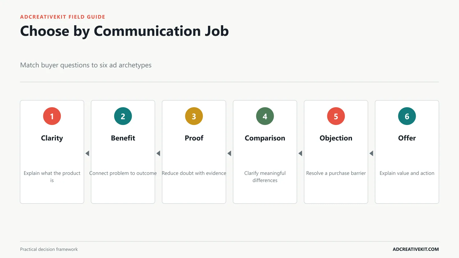
Template galleries encourage selection by color, trend, or visual mood. Performance work starts somewhere else: what must the audience understand next? A cold prospect may need a problem-and-benefit ad. A product-aware shopper may need proof, comparison, or an offer. A returning visitor may only need a reminder that resolves a final objection.
| Buyer question | Template job | Useful structure | Avoid |
|---|---|---|---|
| What is this? | Product clarity | Large product, category label, one benefit | Abstract imagery |
| Why should I care? | Benefit | Problem, outcome, product bridge | Feature lists |
| Can I trust it? | Proof | Claim plus review, fact, or demonstration | Unsupported badges |
| Why this option? | Comparison | Two to four meaningful differences | Unreadable charts |
| Why now? | Offer | Value, condition, deadline, CTA | False urgency |
Write the learning question before opening Canva: “Does benefit-led framing outperform product-led framing for new visitors?” This prevents the team from selecting three templates that look different but test no strategic difference. For more layout examples, compare the structures in the static ad templates guide.
The Anatomy of a High-Clarity Canva Ad
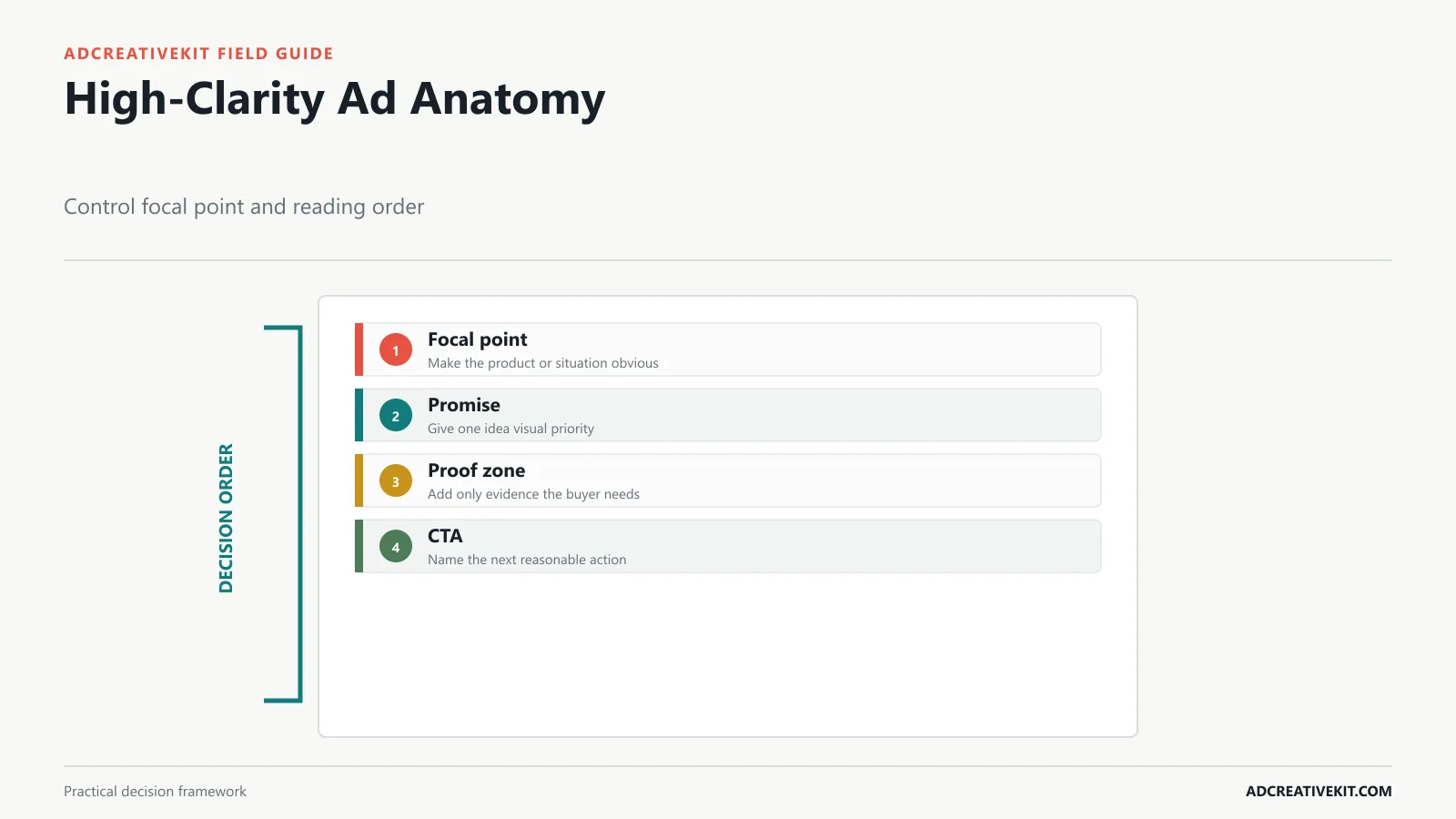
A useful template establishes hierarchy. In a quick mobile scan, the viewer should identify the product or situation, understand the main promise, and recognize the next action. Hook, product, benefit, proof, offer, and CTA are modules, not six mandatory lines. Include only the modules needed for the ad’s job.
Give the primary idea the greatest visual weight. Keep supporting text close to the element it explains. Protect breathing room around the product and CTA. Proof should be legible and specific; if a review is too long, select one accurate sentence and preserve its meaning. The Meta photo-ad guidance likewise emphasizes a clear focal point, restrained text, and high-quality imagery.
Use the thumbnail test before approving the layout. Zoom out until the canvas resembles its real feed size. If the product becomes unrecognizable, the headline merges with decoration, or the condition disappears, the hierarchy is not finished. Accessibility also matters: do not place essential information only inside an image when the surrounding ad copy can communicate it, and use meaningful alternatives where the platform supports them. The W3C image tutorial explains how an image’s purpose should determine its text alternative.
Select the Right Size for Each Placement
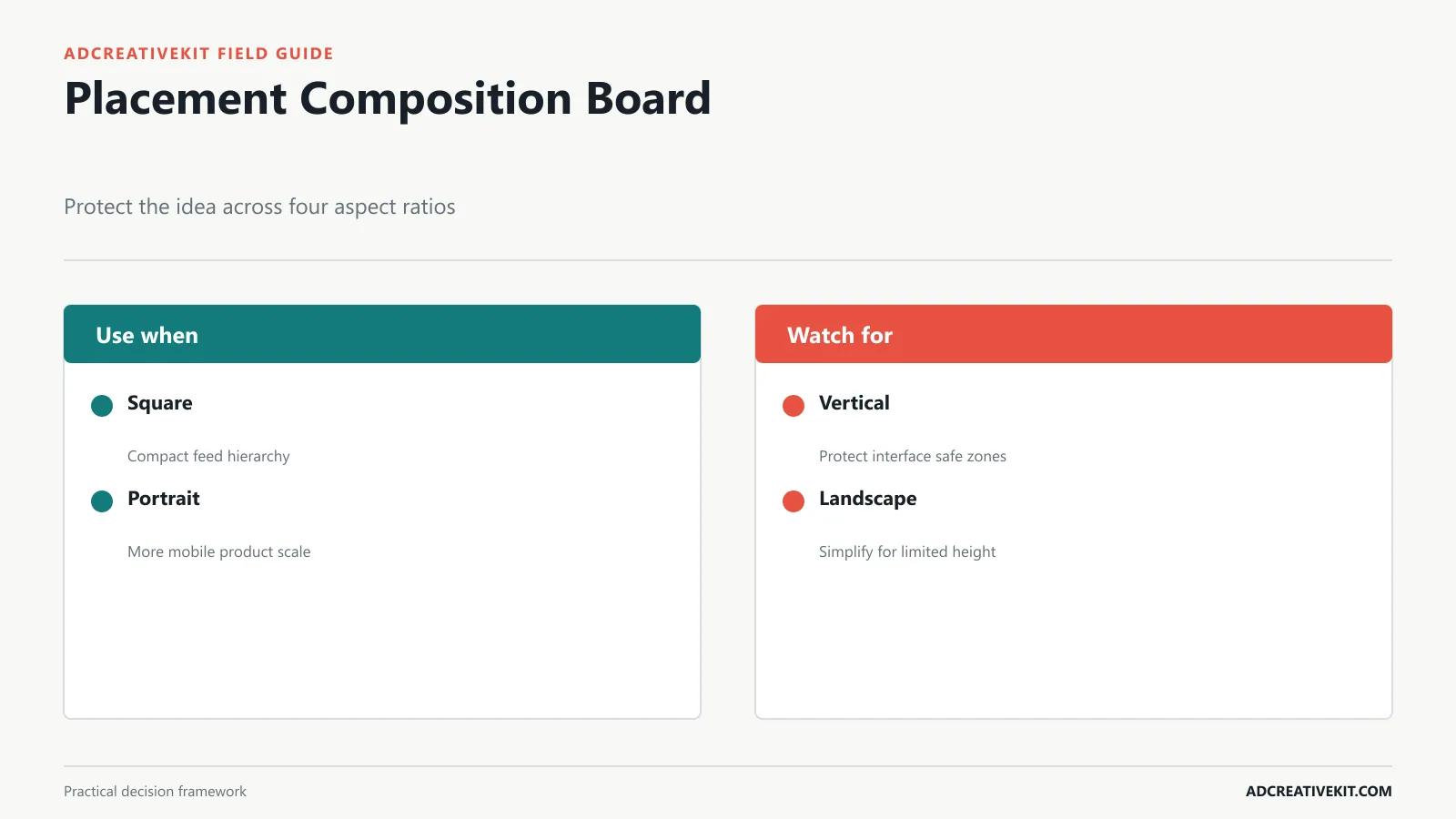
Build from a campaign idea, then art-direct each important placement. Square is flexible for feeds and libraries. Portrait gives the product more mobile screen area. Full vertical can support stories and short-form placements, but interface overlays demand generous safe space. Landscape works in display and some video environments, where text and product often compete for less height.
Do not assume Canva’s resize feature has completed the job. Check whether the focal point moved, the headline wrapped awkwardly, the CTA entered an interface zone, or a lifestyle crop removed important context. Google’s current responsive display requirements specify distinct horizontal, square, and vertical image assets, reinforcing the need to review every composition.
| Format | Typical use | Composition check |
|---|---|---|
| 1:1 square | Feed and adaptable social use | Keep hierarchy compact and centered |
| 4:5 portrait | Mobile feed | Use height for product scale, not extra copy |
| 9:16 vertical | Story and short-form surfaces | Protect top and bottom interface areas |
| 1.91:1 landscape | Display and wide placements | Simplify text and protect the focal subject |
Customize the Message Before the Decoration
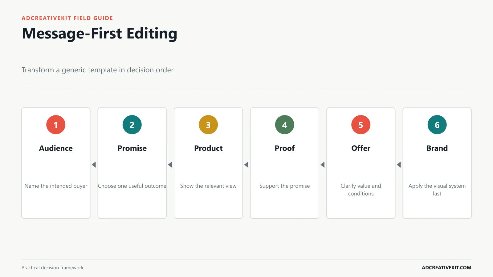
Replace the strategic content first. Define the audience, promise, product image, proof, offer, CTA, and destination. Only then adjust color, typography, shapes, and decorative elements. This sequence exposes a bad template early: if the real message cannot fit without shrinking type or hiding the product, choose a different structure.
Make every element specific. “Feel better today” is weaker than a supported benefit tied to the product and use case. A random five-star icon is weaker than a real review, demonstration, ingredient fact, warranty, or delivery promise. The CTA should describe the next reasonable step, and the landing page should repeat the ad’s key promise. Use the marketing hooks framework when the template needs a sharper opening idea.
Never import claims from a sample template without verification. Placeholder percentages, testimonials, countdowns, or “best” claims can become advertising liabilities. The FTC advertising guidance is a useful primary reference for truthful claims, endorsements, and disclosures.
Build a Controlled Variant Set
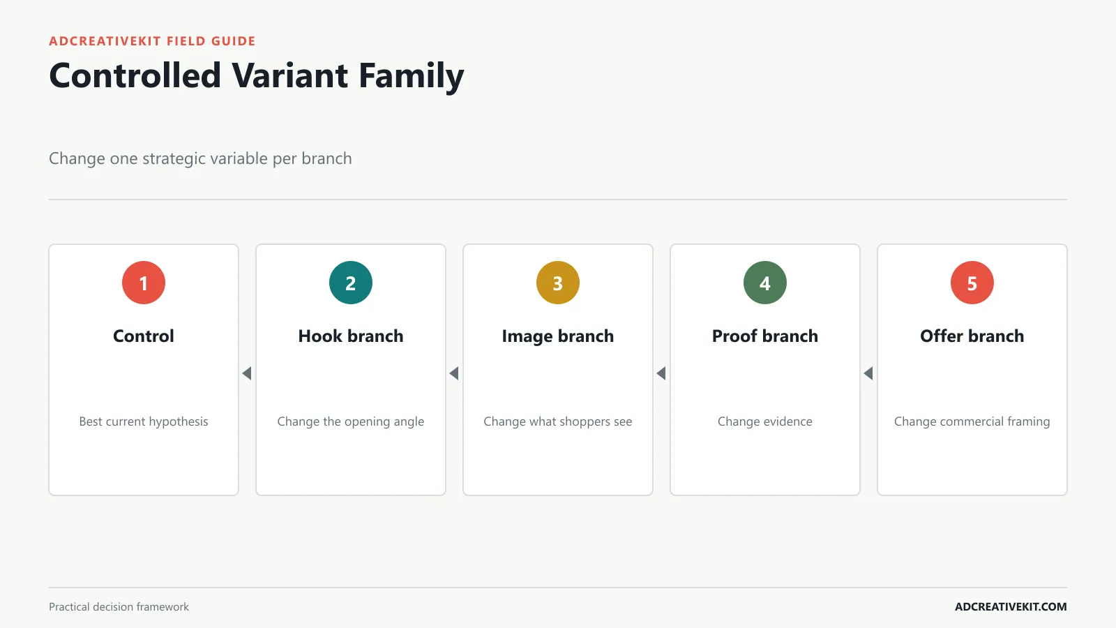
Start with one control that represents the best current hypothesis. Duplicate it into branches that change one meaningful variable: hook, product image, proof, or offer. Do not simultaneously replace the layout, headline, color, product crop, and CTA and then call the winner a design lesson. You will know that a bundle of changes won, but not why.
Label every branch with the question it tests. For example: H1 problem hook, I1 in-use image, P1 review proof, and O1 free-shipping offer. Keep non-test elements stable where practical. If a placement requires a different composition, treat that as production adaptation rather than a new strategic concept.
Record audience, placement, dates, spend or sample, primary metric, guardrails, and decision. Click-through rate can indicate attention, but conversion quality, acquisition cost, average order value, and downstream behavior determine whether the message attracted the right customer. The ad creative A/B testing guide provides a fuller experiment workflow.
Prevent Generic, Crowded, and Off-Brand Ads
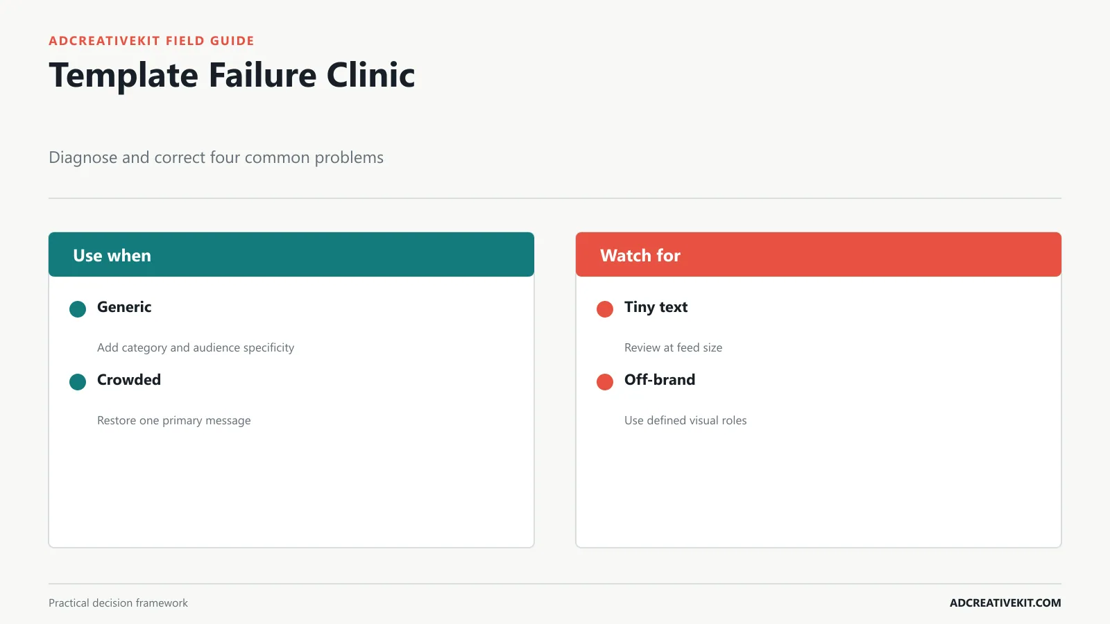
Generic: the design could advertise any product. Fix it with a distinctive product view, audience-specific use case, credible proof, and language that reflects the category. Crowded: every fact has equal weight. Fix it by choosing one job and moving secondary information to the caption or landing page. Off-brand: a fashionable template overrides recognition. Fix it by using defined color roles, type hierarchy, image treatment, and voice rather than pasting a logo onto someone else’s aesthetic.
Other common failures include tiny mobile text, decorative badges that resemble evidence, insufficient contrast, obstructed products, and conditions hidden below the visual. Review in grayscale to expose weak hierarchy. Review at mobile size to expose legibility. Review beside the landing page to expose message mismatch. A template is ready only when it works in context, not when the canvas looks balanced at full-screen editor size.
Export, Name, and Hand Off Assets Cleanly
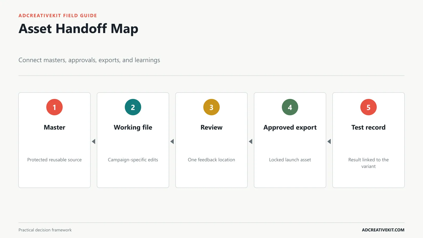
Create one protected master and duplicate working files for campaigns. Separate editable sources, review exports, approved files, and archived versions. A useful filename can follow campaign-audience-angle-variable-placement-version, such as summer-prospecting-benefit-H1-feed-v03. Avoid names such as final-final2, which hide what changed.
Export according to the destination, preserving sufficient resolution without unnecessary file weight. Open every exported file outside Canva to catch font substitution, compression, transparency, animation, or crop problems. Before paid or commercial use, verify the license and source information for stock photos, illustrations, fonts, music, branded content, and third-party marks; Canva’s current Content License Agreement explains that different content categories can carry different restrictions. Assign owners for message accuracy, design, rights, policy, destination, and final launch. Keep review comments in one location and lock the approved version. This is especially important when several people use the same template library.
Use a Pre-Launch Canva Ad QA Checklist
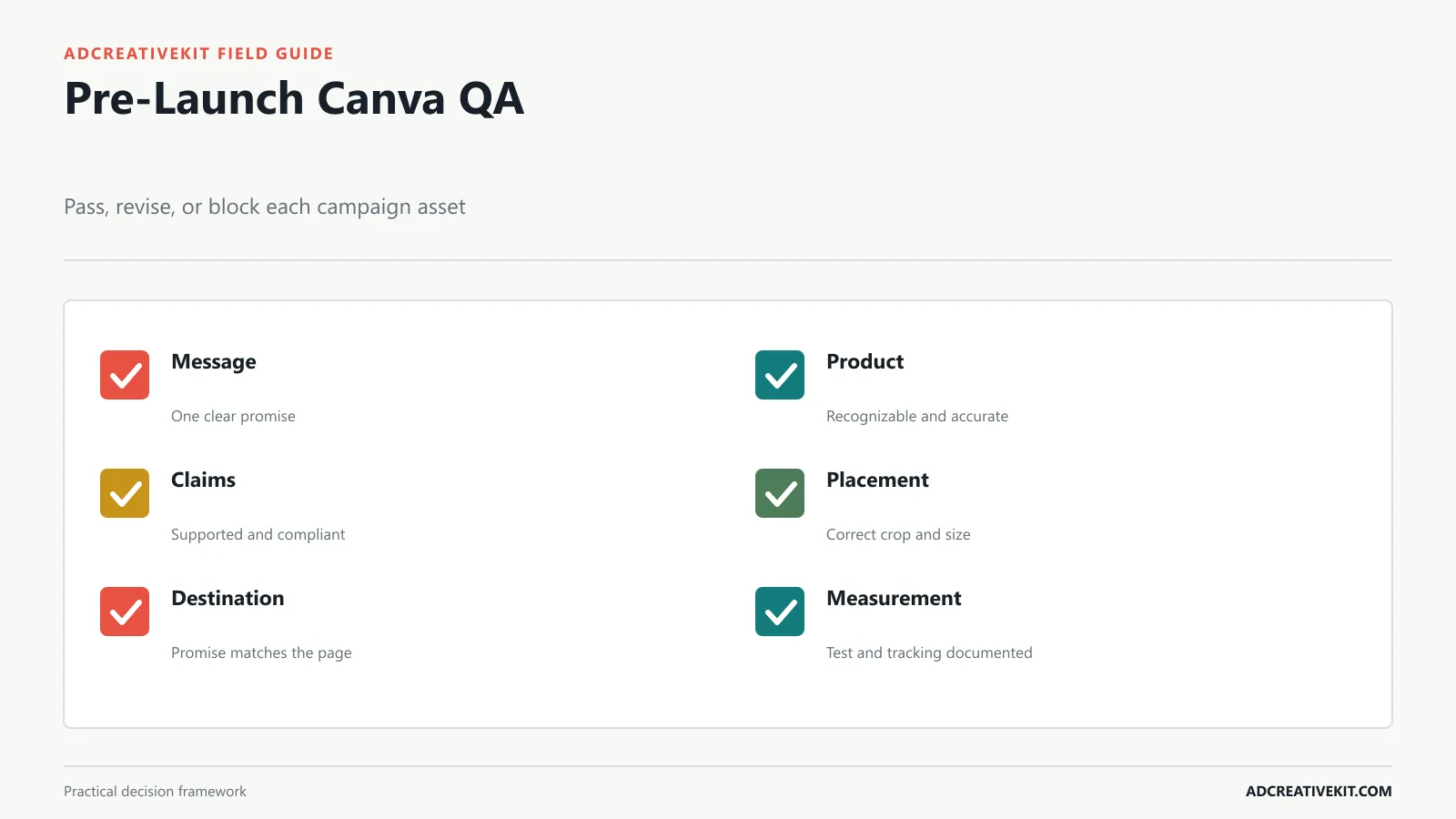
- Message: one audience, one primary promise, and a clear action.
- Product: recognizable at mobile size and represented accurately.
- Proof: real, current, legible, and supported.
- Offer: value, eligibility, conditions, code, and deadline agree everywhere.
- Placement: correct dimensions, safe zones, crop, and export format.
- Accessibility: sufficient contrast and no essential meaning carried by decoration alone.
- Rights: stock content, fonts, music, testimonials, and third-party marks are approved for this use.
- Destination: landing page repeats the promise and works on mobile.
- Measurement: naming, tracking, hypothesis, primary metric, and guardrails are documented.
Turn test results into a better Canva library
Do not judge this workflow only by whether the current asset won. Use results to improve future template selection. If proof-led variants attract fewer but more qualified visits, add a proof-first family to the library and record the audience conditions where it worked. If vertical crops repeatedly fail because the master leaves no safe space, change the photography and template brief instead of repairing every export.
Maintain a template record with its communication job, compatible product types, required assets, recommended placements, editable zones, known failure modes, and completed tests. Retire templates that force unclear hierarchy or cannot support priority compositions. A smaller library with named strategic uses is easier to operate than hundreds of visually distinct pages.
A worked Canva variant example
Imagine a compact coffee grinder sold to apartment residents. The control uses a clean product hero and the hook “Fresh coffee without giving up counter space.” A hook variant changes only the opening to “A grinder sized for small kitchens.” An image variant keeps the control copy but shows the grinder beside a common mug for scale. A proof variant keeps the hero image and adds verified dimensions. An offer variant adds free shipping with the real qualification.
That family answers four different questions: framing, visual context, factual reassurance, and commercial friction. If the scale image improves product-page engagement while the offer raises clicks but lowers conversion, the useful lesson is not “blue template beats red template.” It is that size uncertainty mattered and broad offer attention was less qualified.
Govern the library like a product
Review Canva templates quarterly or after a major brand, offer, product, or placement change. Sample real exports rather than editor thumbnails. Ask whether the system helped creators reach a clear first draft, reviewers identify the test, and analysts connect results to a decision. Track duplicate concepts, missing source assets, repeated crop failures, and templates that require excessive exceptions.
Assign one owner to approve structural changes. Contributors can propose a new family, but the proposal should state the communication job it adds, the gap in the current library, required assets, placement behavior, and evidence from prior campaigns or customer research. This protects the library from growing through taste alone.
Decision rules for choosing a starting template
If the audience cannot identify the product, reject templates that reduce it to a decorative thumbnail. If the claim requires explanation, reject layouts whose only proof zone is a tiny badge. If the test variable is the hook, select a family where headline length can change without moving every other element. If the campaign needs stories and feed, require source photography that supports both ratios.
For team review, ask four questions in order: Is the communication job correct? Is the product and promise clear at placement size? Is the tested variable isolated? Does the destination keep the expectation? Styling feedback comes after those decisions. This order prevents a color preference from consuming review time while the ad still answers the wrong buyer question.
Frequently asked questions
Are Canva ad templates suitable for paid campaigns?
Yes, when you adapt them to the audience, message, placement, policy, and destination. Editability is useful; it is not evidence of performance.
Should every placement use the same design?
Use the same campaign idea, but compose it deliberately for each priority ratio. Automated resizing is a starting point, not final art direction.
How many variants should I create?
Create only the variants your budget and decision window can evaluate. A smaller, interpretable set is more useful than dozens of uncontrolled changes.
The next step is to connect this workflow to a broader creative operating system, including briefs, approvals, naming, tests, and learning history.