Email Marketing Graphic Templates: A Modular Design System
Email marketing graphic templates should accelerate communication without turning every send into a fragile poster. The inbox is not a web browser: images can be blocked, dark mode can alter colors, clients interpret HTML differently, and a beautiful desktop composition can become unreadable on a narrow screen. The practical answer is a modular email system in which each visual has a job, essential meaning survives without images, and campaign results improve the next version.
Quick answer: Choose email design by campaign job and subscriber context. Use live text for essential information, modular blocks for repeatability, restrained imagery for speed, and a pre-send review across rendering, accessibility, compliance, links, tracking, and downstream conversion quality.
Important implementation claims in this guide are grounded in primary guidance, including Mailchimp Email Design Reference and Google email sender guidelines. The frameworks below translate those requirements into decisions a working creative or growth team can review.
What counts as a template here: The diagrams are modular email patterns rather than single-image posters. Recreate them with live text, accessible links, reusable content blocks, and image fallbacks inside your email platform. That distinction preserves the template-seeking intent while avoiding a design that fails when images are blocked or the client changes the layout.
Choose an Email Template by Campaign Job
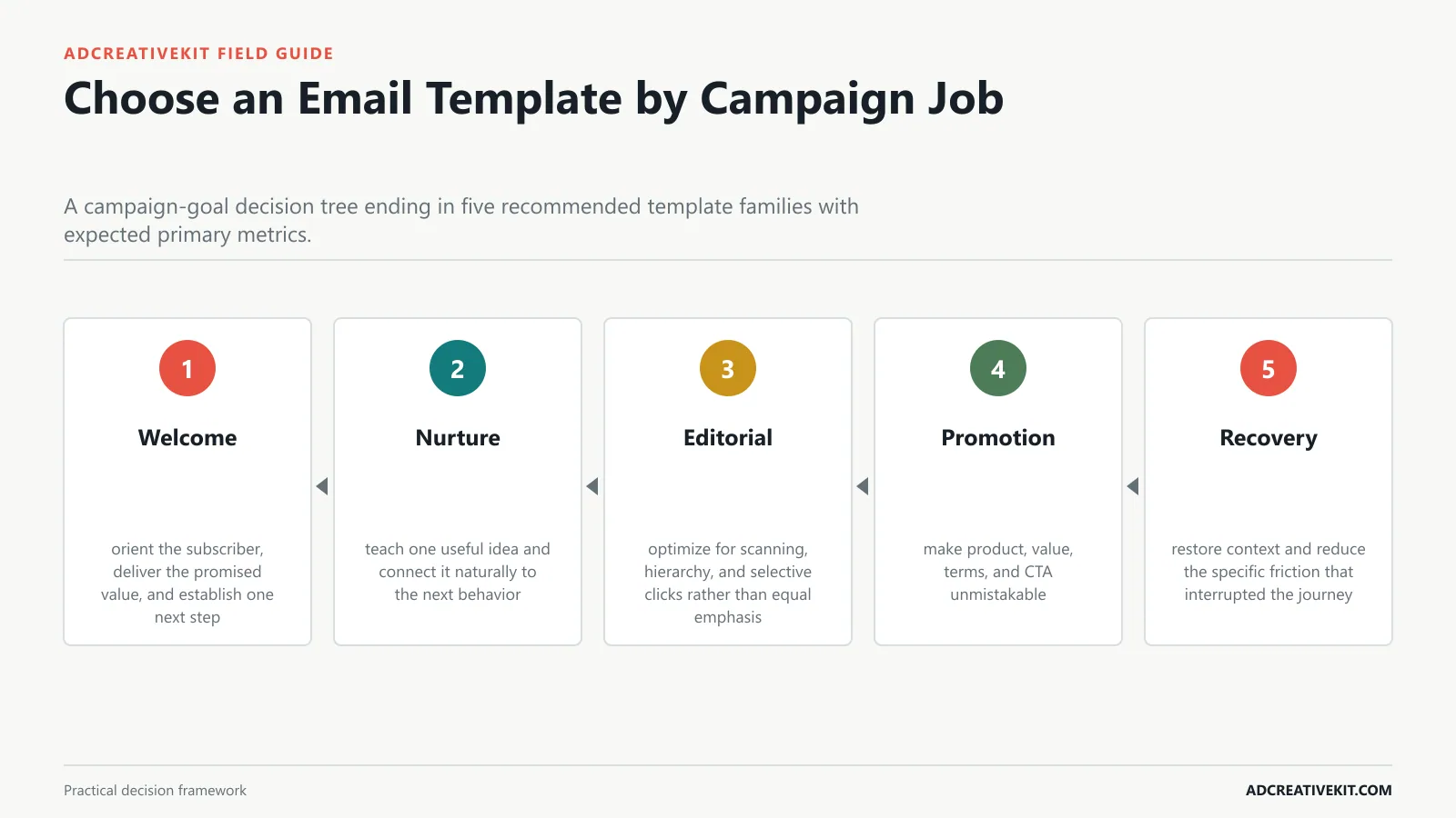
Map welcome, nurture, editorial, launch, promotion, cart recovery, and re-engagement goals to appropriate visual density and structure.
Campaign test
Begin with welcome: orient the subscriber, deliver the promised value, and establish one next step. Then inspect nurture: teach one useful idea and connect it naturally to the next behavior.
- Welcome: orient the subscriber, deliver the promised value, and establish one next step.
- Nurture: teach one useful idea and connect it naturally to the next behavior.
- Editorial: optimize for scanning, hierarchy, and selective clicks rather than equal emphasis.
- Promotion: make product, value, terms, and CTA unmistakable.
- Recovery: restore context and reduce the specific friction that interrupted the journey.
The Reusable Anatomy of a Marketing Email
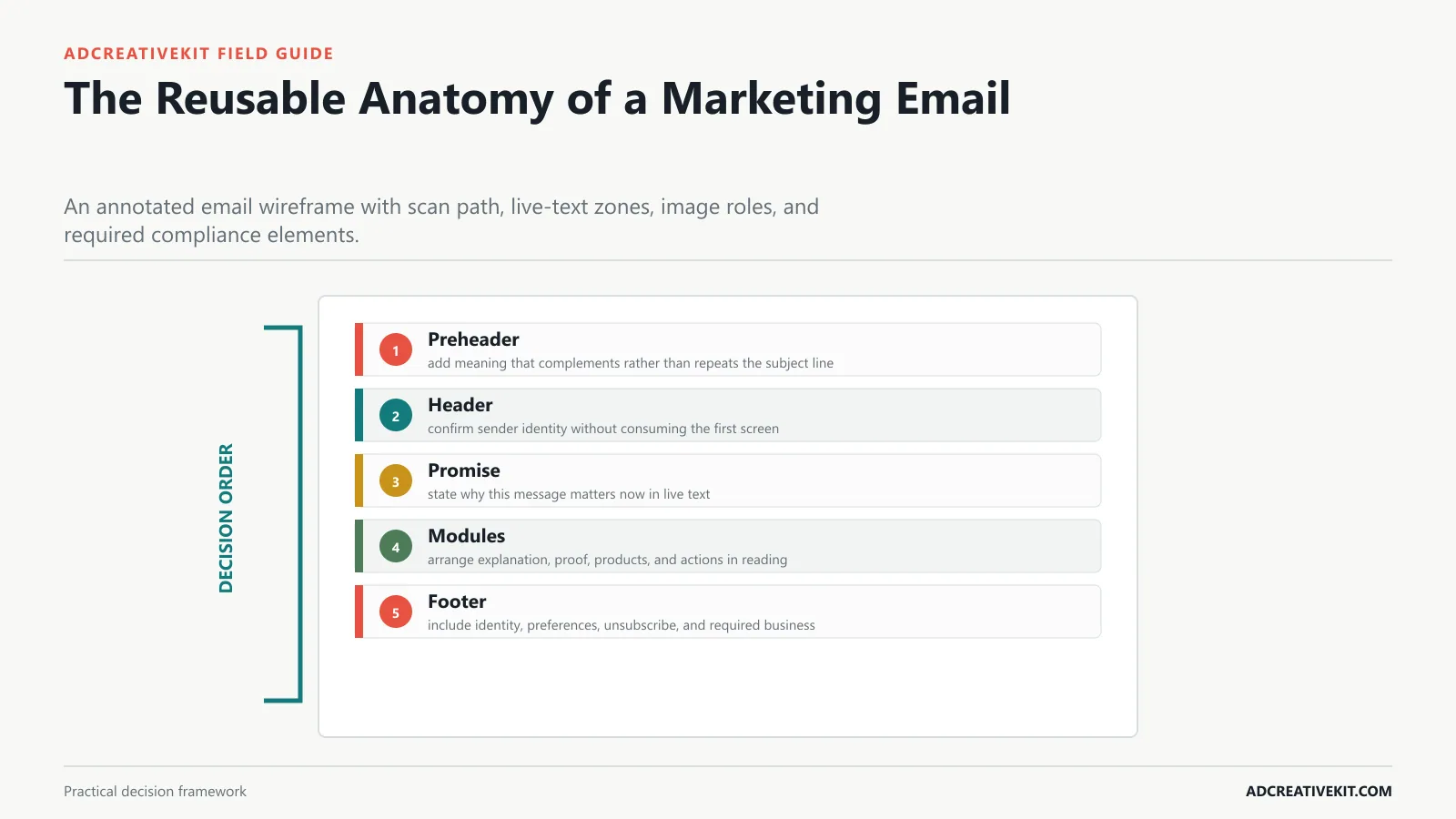
Explain the hierarchy of preheader, header, promise, body modules, proof, CTA, utility links, and footer.
Inbox hierarchy
Begin with preheader: add meaning that complements rather than repeats the subject line. Then inspect header: confirm sender identity without consuming the first screen.
- Preheader: add meaning that complements rather than repeats the subject line.
- Header: confirm sender identity without consuming the first screen.
- Promise: state why this message matters now in live text.
- Modules: arrange explanation, proof, products, and actions in reading order.
- Footer: include identity, preferences, unsubscribe, and required business information.
| Inbox hierarchy element | Practical requirement | Review question |
|---|---|---|
| Preheader | add meaning that complements rather than repeats the subject line | Record the observable evidence, any failure, and the owner of the next action. |
| Header | confirm sender identity without consuming the first screen | Record the observable evidence, any failure, and the owner of the next action. |
| Promise | state why this message matters now in live text | Record the observable evidence, any failure, and the owner of the next action. |
| Modules | arrange explanation, proof, products, and actions in reading order | Record the observable evidence, any failure, and the owner of the next action. |
| Footer | include identity, preferences, unsubscribe, and required business information | Record the observable evidence, any failure, and the owner of the next action. |
Welcome and Onboarding Graphic Templates
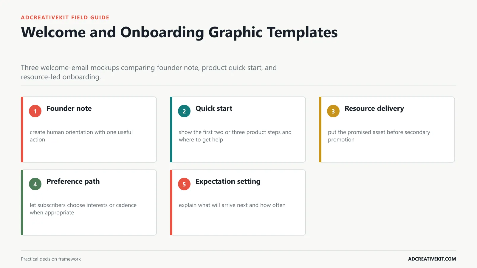
Show layouts that orient new subscribers, deliver value quickly, and establish the next action.
Subscriber orientation
Begin with founder note: create human orientation with one useful action. Then inspect quick start: show the first two or three product steps and where to get help.
- Founder note: create human orientation with one useful action.
- Quick start: show the first two or three product steps and where to get help.
- Resource delivery: put the promised asset before secondary promotion.
- Preference path: let subscribers choose interests or cadence when appropriate.
- Expectation setting: explain what will arrive next and how often.
For the adjacent workflow, use the customer testimonial templates. When this section reveals a broader conversion or production issue, continue with the ecommerce CRO checklist.
Newsletter and Educational Templates
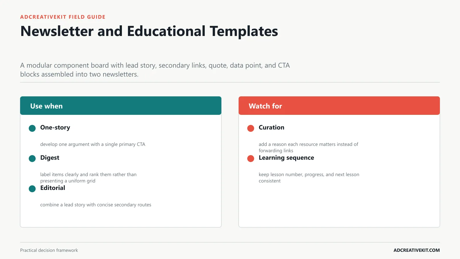
Present modular layouts for one-story, digest, editorial, and content-curation emails.
Editorial rhythm
Begin with one-story: develop one argument with a single primary CTA. Then inspect digest: label items clearly and rank them rather than presenting a uniform grid.
- One-story: develop one argument with a single primary CTA.
- Digest: label items clearly and rank them rather than presenting a uniform grid.
- Editorial: combine a lead story with concise secondary routes.
- Curation: add a reason each resource matters instead of forwarding links.
- Learning sequence: keep lesson number, progress, and next lesson consistent.
Product Launch and Promotional Templates
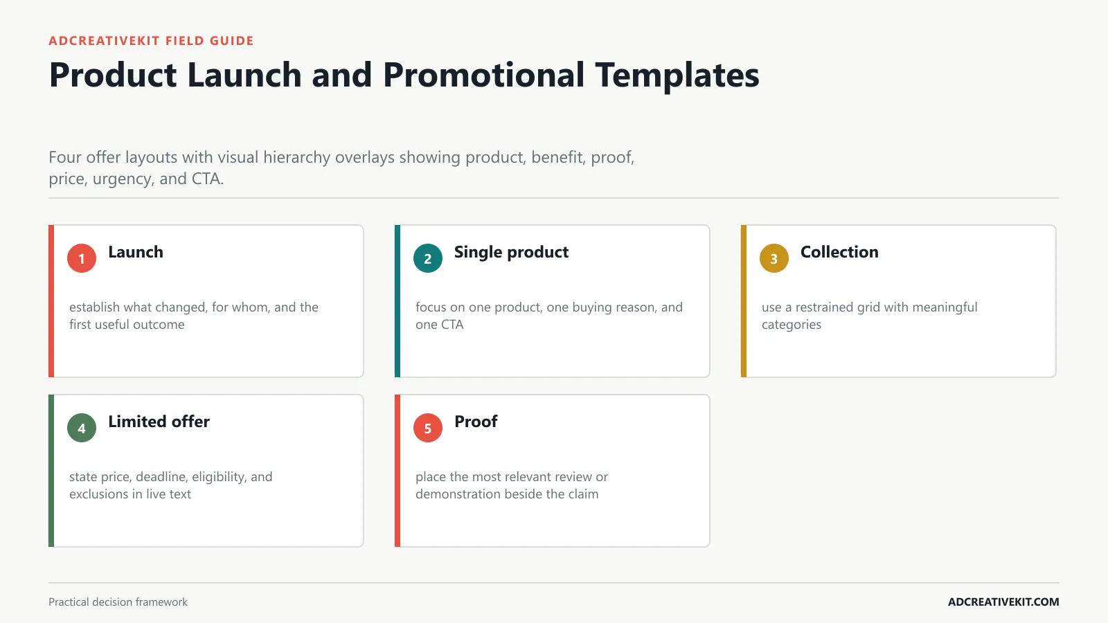
Teach layouts for launches, limited offers, collections, and single-product promotions without overwhelming the CTA.
Offer discipline
Begin with launch: establish what changed, for whom, and the first useful outcome. Then inspect single product: focus on one product, one buying reason, and one CTA.
- Launch: establish what changed, for whom, and the first useful outcome.
- Single product: focus on one product, one buying reason, and one CTA.
- Collection: use a restrained grid with meaningful categories.
- Limited offer: state price, deadline, eligibility, and exclusions in live text.
- Proof: place the most relevant review or demonstration beside the claim.
Plain-Text Style vs Designed Email
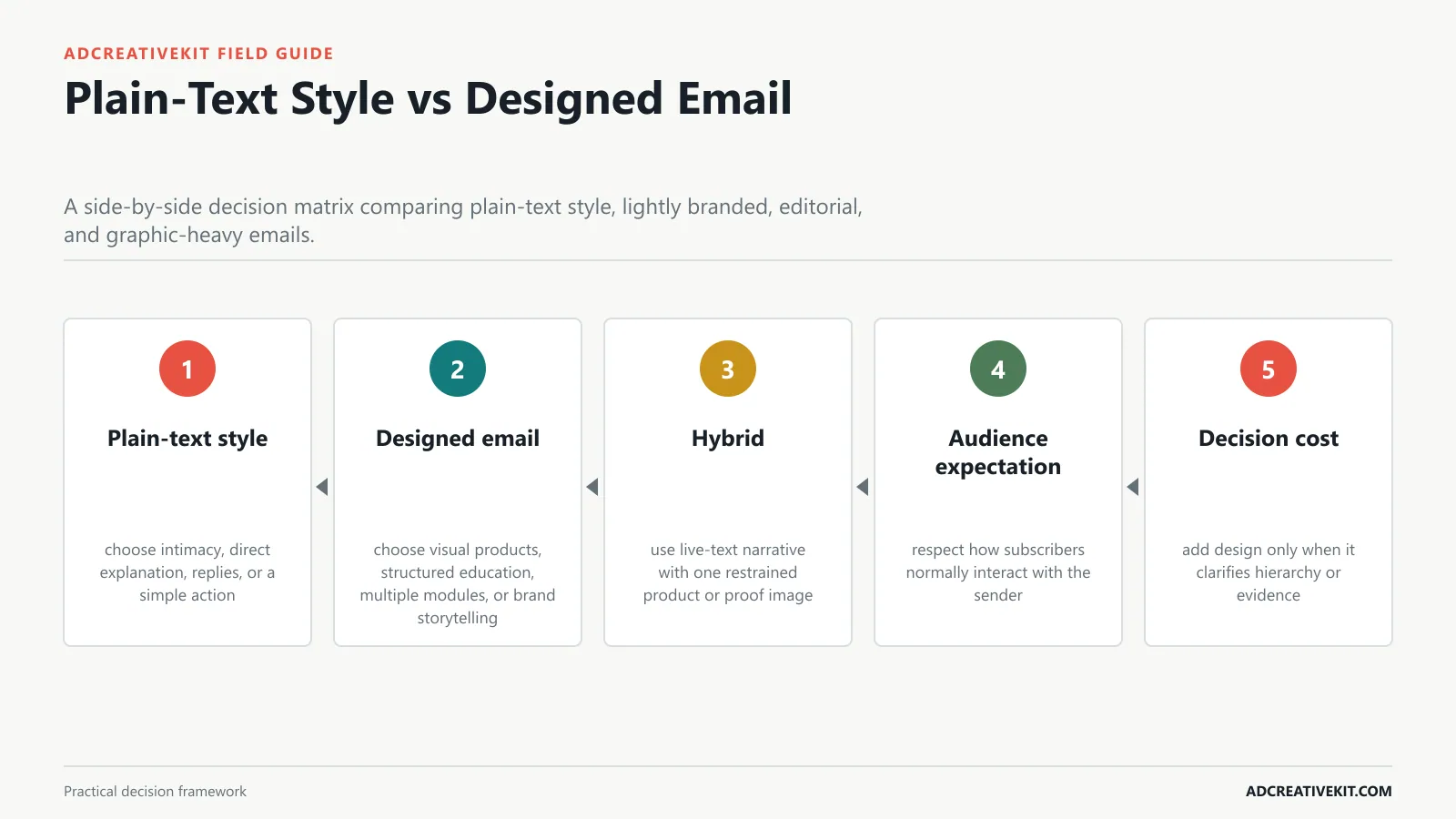
Help readers choose an appropriate level of polish according to message intimacy, complexity, audience expectation, and conversion path.
Design choice
Begin with plain-text style: choose intimacy, direct explanation, replies, or a simple action. Then inspect designed email: choose visual products, structured education, multiple modules, or brand storytelling.
- Plain-text style: choose intimacy, direct explanation, replies, or a simple action.
- Designed email: choose visual products, structured education, multiple modules, or brand storytelling.
- Hybrid: use live-text narrative with one restrained product or proof image.
- Audience expectation: respect how subscribers normally interact with the sender.
- Decision cost: add design only when it clarifies hierarchy or evidence.
For the adjacent workflow, use the marketing hooks guide. When this section reveals a broader conversion or production issue, continue with the customer testimonial templates.
Build Graphics That Survive the Inbox
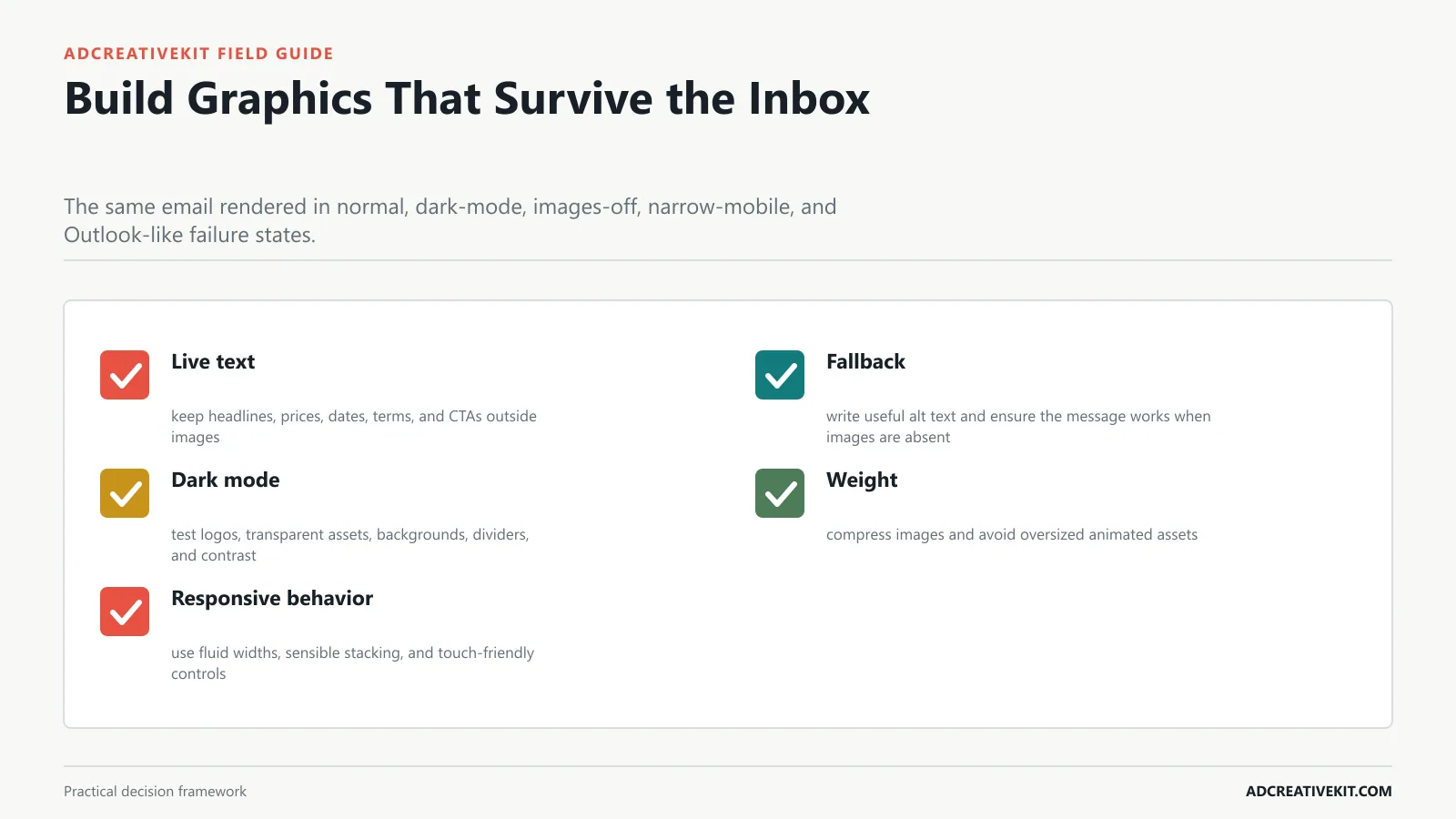
Cover live text, blocked images, alt text, image weight, responsive widths, dark mode, and unsupported design behavior.
Failure-state test
Begin with live text: keep headlines, prices, dates, terms, and CTAs outside images. Then inspect fallback: write useful alt text and ensure the message works when images are absent.
- Live text: keep headlines, prices, dates, terms, and CTAs outside images.
- Fallback: write useful alt text and ensure the message works when images are absent.
- Dark mode: test logos, transparent assets, backgrounds, dividers, and contrast.
- Weight: compress images and avoid oversized animated assets.
- Responsive behavior: use fluid widths, sensible stacking, and touch-friendly controls.
Turn One Design Into a Modular Email System
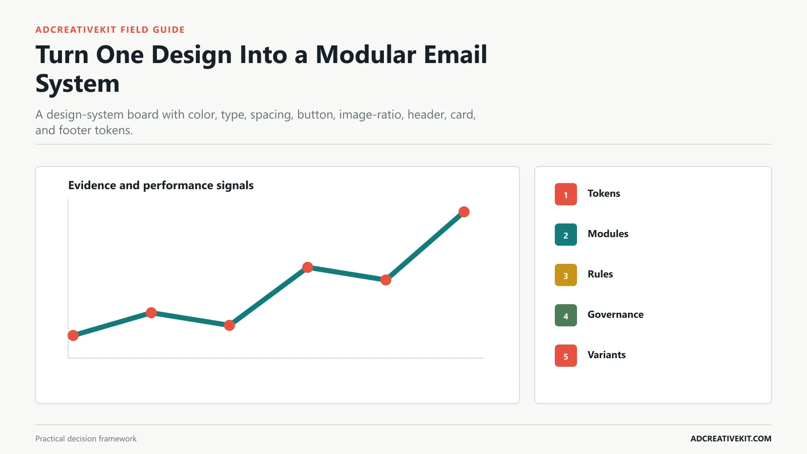
Show how to create locked brand tokens and reusable blocks without cloning fragile past campaigns.
System rule
Begin with tokens: lock approved colors, type sizes, spacing, buttons, and container widths. Then inspect modules: maintain reusable hero, story, product, proof, divider, and CTA blocks.
- Tokens: lock approved colors, type sizes, spacing, buttons, and container widths.
- Modules: maintain reusable hero, story, product, proof, divider, and CTA blocks.
- Rules: document when modules may repeat, stack, or disappear.
- Governance: assign an owner for updates and deprecate broken blocks.
- Variants: create deliberate density options instead of cloning old campaigns.
For implementation details, consult Mailchimp’s email accessibility guidance. Requirements and platform behavior change, so review the current primary documentation before launch rather than relying on a static checklist alone.
Pre-Send QA and Accessibility Checklist
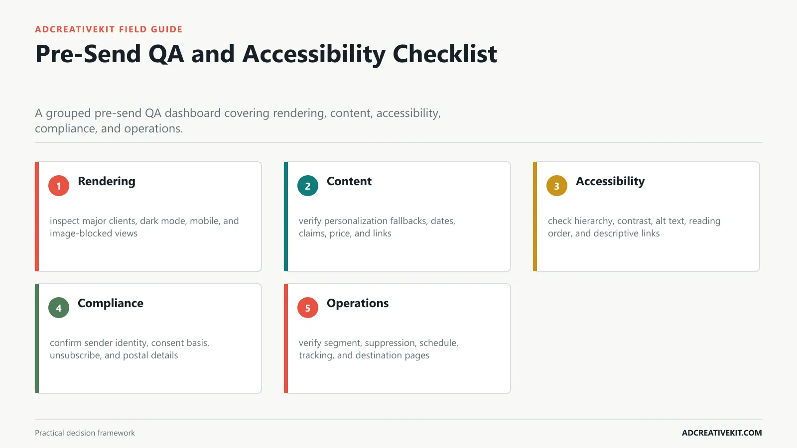
Provide a practical review process for rendering, links, personalization, tracking, contrast, reading order, and unsubscribe details.
Send gate
Begin with rendering: inspect major clients, dark mode, mobile, and image-blocked views. Then inspect content: verify personalization fallbacks, dates, claims, price, and links.
- Rendering: inspect major clients, dark mode, mobile, and image-blocked views.
- Content: verify personalization fallbacks, dates, claims, price, and links.
- Accessibility: check hierarchy, contrast, alt text, reading order, and descriptive links.
- Compliance: confirm sender identity, consent basis, unsubscribe, and postal details.
- Operations: verify segment, suppression, schedule, tracking, and destination pages.
| Send gate element | Practical requirement | Review question |
|---|---|---|
| Rendering | inspect major clients, dark mode, mobile, and image-blocked views | Record the observable evidence, any failure, and the owner of the next action. |
| Content | verify personalization fallbacks, dates, claims, price, and links | Record the observable evidence, any failure, and the owner of the next action. |
| Accessibility | check hierarchy, contrast, alt text, reading order, and descriptive links | Record the observable evidence, any failure, and the owner of the next action. |
| Compliance | confirm sender identity, consent basis, unsubscribe, and postal details | Record the observable evidence, any failure, and the owner of the next action. |
| Operations | verify segment, suppression, schedule, tracking, and destination pages | Record the observable evidence, any failure, and the owner of the next action. |
For the adjacent workflow, use the lead magnet promotion templates. When this section reveals a broader conversion or production issue, continue with the marketing hooks guide.
Measure and Test the Template
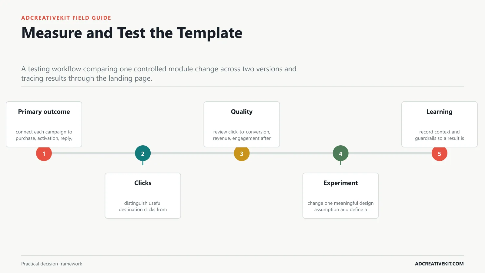
Connect design hypotheses to clicks, click-to-conversion rate, revenue, unsubscribes, and downstream quality rather than open rate alone.
Outcome test
Begin with primary outcome: connect each campaign to purchase, activation, reply, booking, or qualified visit. Then inspect clicks: distinguish useful destination clicks from navigation or utility clicks.
- Primary outcome: connect each campaign to purchase, activation, reply, booking, or qualified visit.
- Clicks: distinguish useful destination clicks from navigation or utility clicks.
- Quality: review click-to-conversion, revenue, engagement after click, and complaints.
- Experiment: change one meaningful design assumption and define a decision rule.
- Learning: record context and guardrails so a result is not generalized beyond its audience.
Run an Images-Off and Failure-State Review
Send the template to real inboxes, disable images, and read it from top to bottom. The sender, promise, price or date, offer terms, CTA, and unsubscribe route should remain understandable. Then inspect dark mode, narrow mobile stacking, long translated copy, missing personalization data, and a product image with an unusually tall aspect ratio.
Record failures at the module level. If one product card breaks, repair that component in the master rather than patching a single campaign. This is how a visual template becomes a maintainable email system: every pre-send review improves the reusable block that caused the problem.
Frequently asked questions
Should marketing emails be one large image?
No. Essential copy and actions should remain live text so the message survives blocked images, scales accessibly, and can be understood by assistive technology.
Is plain-text email always more personal?
It can feel direct, but authenticity depends on the message and sender. Use it when visual structure adds little, not as a performance superstition.
What should be tested before sending?
Test links, personalization, rendering, dark mode, mobile stacking, image-off behavior, tracking, segment rules, unsubscribe, and the destination experience.
Turn this guide into an operating asset
Save the framework with the evidence, owner, date, and decision attached. That turns a one-time article into a repeatable review system and prevents future teams from treating an old output as a universal rule.