Product Image Ad Templates: Show What Shoppers Need to See
Product image ad templates are not interchangeable frames for the same packshot. A clean hero image answers “what is it?” A lifestyle scene answers “how does it fit?” A detail crop answers “what is it made from?” A scale reference answers “how large is it?” The useful template begins with the uncertainty the image must resolve.
Quick answer: Select the shot from the buyer question, prepare a flexible and accurate photo library, choose a layout that keeps the product inspectable, art-direct every important crop, add only proof and offer modules that support the image’s job, and interpret test winners as clues about information needs.
Choose the Product Image by Buyer Question
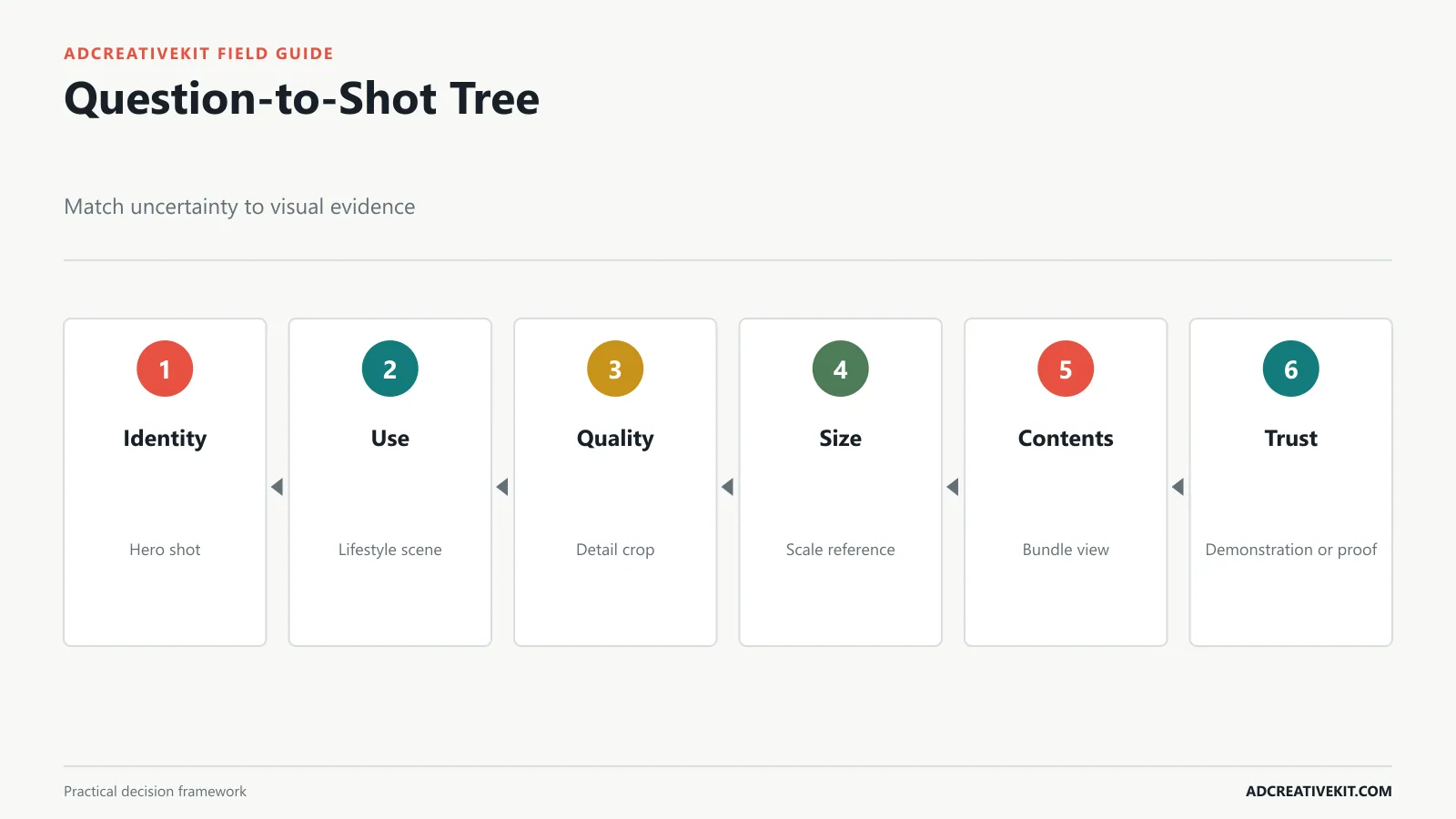
Use a hero packshot when recognition, shape, color, or premium presentation matters. Use an in-use image when operation or context is unfamiliar. Use a detail image when material, finish, controls, texture, or construction reduces doubt. Use a scale reference when dimensions are difficult to imagine. Show the full bundle when customers may misunderstand what is included. Use demonstration or before-and-after imagery only when it accurately represents normal use and the implied result can be supported.
| Buyer asks | Best starting shot | What it must show | Failure to avoid |
|---|---|---|---|
| What is it? | Hero | Recognizable complete product | Abstract crop |
| How is it used? | In use | Person, action, and context | Decorative lifestyle scene |
| How well is it made? | Detail | Relevant material or mechanism | Beauty crop with no information |
| How large is it? | Scale | Honest reference or dimensions | Misleading perspective |
| What arrives? | Bundle | All included items | Showing optional accessories |
| Can I trust the result? | Demonstration or proof | Supported evidence and context | Atypical outcome |
Write the intended question into the asset metadata or brief. This makes the library searchable and prevents teams from defaulting to whichever photo already has a transparent background.
Prepare the Product Photo Library
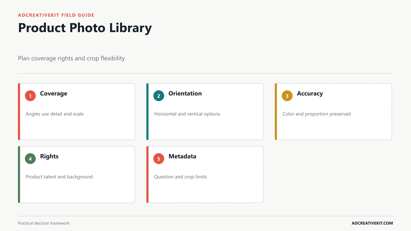
Create a shot list before photography: front and alternate hero angles, in-use scenes, key details, scale, packaging, included items, variations, and credible proof. Capture horizontal and vertical compositions with additional negative space so designers can place copy without covering the product. Photograph products consistently enough for comparison and collection creative.
Store the master file, product or SKU, angle, orientation, colorway, background, rights, talent release, retouch status, crop limits, and question answered. Keep color and proportion accurate. Document which elements can be removed, composited, or recolored and which changes would misrepresent the item.
Use adequate resolution for the largest intended crop, then export channel versions. Do not repeatedly edit compressed files. Google’s current responsive display ad requirements explain horizontal, square, and vertical image specifications, while Meta’s photo-ad guidance emphasizes image quality and a clear focal point.
Select the Right Product Image Layout
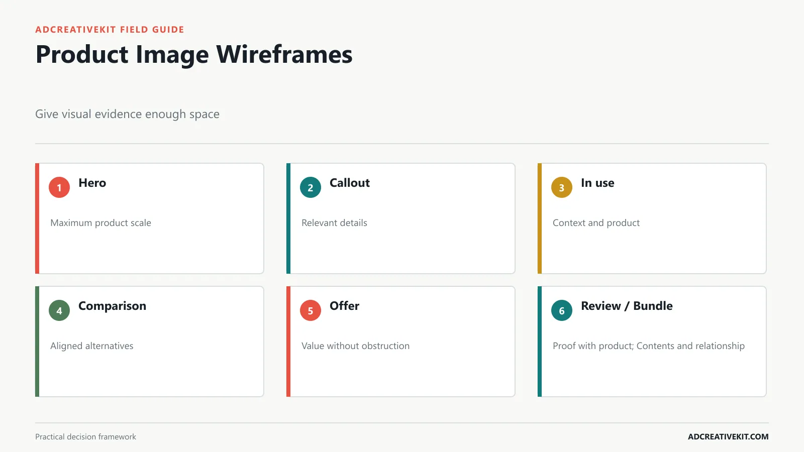
A clean hero layout gives the product maximum scale. A callout layout points to two or three meaningful details. An in-use layout keeps context visible while protecting the product. A comparison layout aligns alternatives or states without distorting them. An offer layout adds price or promotion without burying the item. A review layout joins a concise credible quote with a clear product. A bundle layout shows contents and their relationship.
Define minimum product scale and a protected zone in the template. Set optional modules for proof, offer, and CTA rather than making them permanent. A layout that works for a simple bottle may fail for a multi-part kit or a product whose function depends on the environment.
For wider story selection beyond photography, the product promotion template framework maps product clarity, benefit, use case, proof, comparison, and offer jobs.
Keep the Product Inspectable
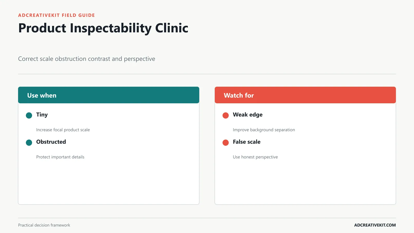
Set the focal product large enough for real feed conditions. Protect important edges and controls from text, badges, shadows, and interface overlays. Use background contrast that separates the silhouette without creating an artificial product color. Apply shadows consistently with the scene. Avoid extreme perspective that makes one component appear larger or smaller than reality.
Run a thumbnail check, a full-size quality check, and a destination comparison. The thumbnail reveals recognition. Full size reveals retouching, halos, resolution, and inaccurate compositing. The destination comparison reveals whether the ad and product page show the same variant, packaging, included items, and finish.
If text must enter the image, separate it from the product and preserve contrast. Do not place essential product information only inside a graphic when the ad copy and landing page can provide accessible equivalents. W3C’s images tutorial explains how alternatives should reflect an image’s informative function.
Adapt Product Images for Every Placement
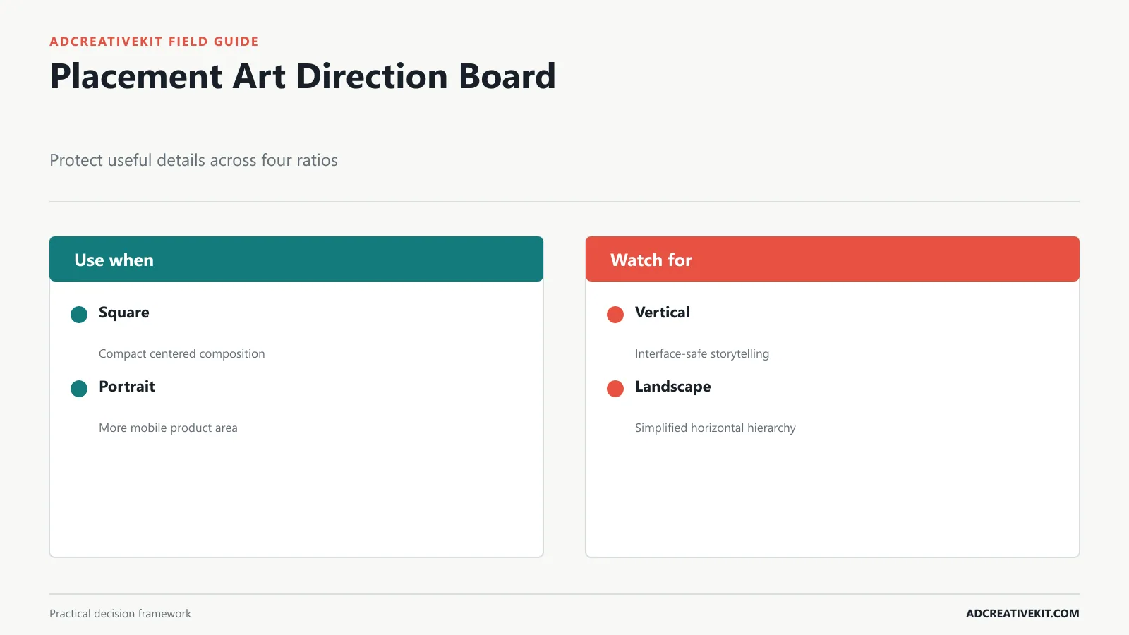
Square can support a centered product and compact copy. Portrait creates more mobile product area and can preserve a taller lifestyle scene. Full vertical requires top and bottom safe zones and often a separate composition. Landscape has limited height, so simplify text and protect horizontal breathing room.
Do not let automated cropping decide which product information survives. If the original image cannot support a ratio, use another shot or extend the set during photography. Record a focal point and protected detail for each asset. For example, the lid mechanism might be the protected detail in a product-demonstration campaign.
Preview the creative inside the actual placement, including interface overlays and responsive combinations. Google’s responsive display best practices recommend supplying varied assets and reviewing previews. Treat the preview as QA, not as proof that every automated combination is strategically equal.
Add Proof and Offers Without Clutter
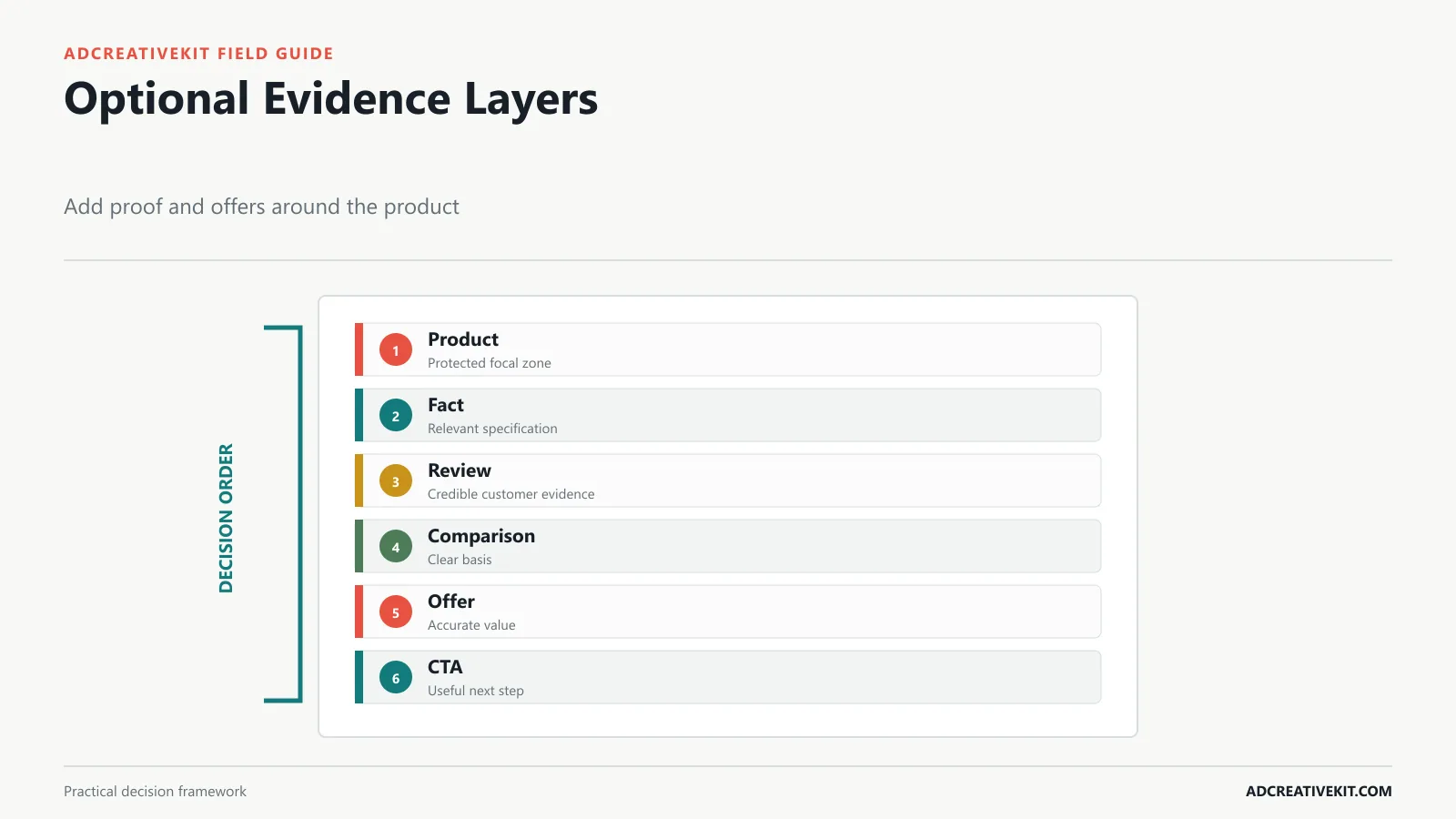
Add a review when the buyer needs confidence and the excerpt is authentic, representative, and permitted. Add a factual callout when the specification matters. Add comparison only when the alternatives and basis are clear. Add price or discount when the commercial reason is central. Add a CTA when the platform or format benefits from an explicit action.
Use one proof mode per compact asset. A star rating, testimonial, award, certification, and feature list together do not create stronger evidence; they create a competition for attention. Keep supporting modules outside the protected product zone and verify readability at mobile size.
The FTC’s advertising guidance is an authoritative starting point for substantiation and endorsements. For proof-led layout options, see the customer testimonial ad templates.
Run Product Image QA
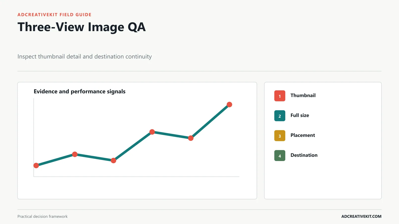
- Recognition: the product and relevant variant are identifiable at mobile size.
- Accuracy: color, scale, contents, accessories, use, and results are represented honestly.
- Quality: resolution, edges, retouching, shadows, and compression pass at full size.
- Hierarchy: product, message, proof, offer, and CTA have a deliberate order.
- Placement: ratio, crop, safe zones, and protected product details survive.
- Accessibility: contrast is adequate and informative imagery has an equivalent description where supported.
- Rights: product, talent, background, review, and third-party marks have appropriate usage approval.
- Continuity: the landing page shows the same product reality and supports the claim.
Assign owners for product truth, design, claims, rights, and destination. A single “approved” checkbox does not show which responsibility was actually reviewed.
Test What Shoppers Need to See
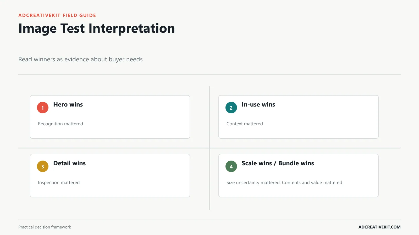
Compare hero versus in-use to test recognition against context. Compare detail versus proof to test product inspection against reassurance. Compare single product versus bundle to test simplicity against value completeness. Keep the hook, offer, audience, placement, and destination stable where practical.
State the mechanism: “In-use imagery will improve qualified product-page engagement because new audiences cannot infer how the device fits a small kitchen.” Then choose the primary metric and guardrails. Click-through rate can show immediate interest; product engagement, conversion, average order value, returns, and support questions reveal whether the image set accurate expectations.
Interpret carefully. If scale imagery wins, shoppers may have had size uncertainty in that market and placement. It does not mean every future ad should contain a hand or ruler. Record the audience, product, ratio, context, and result in the creative testing matrix.
Worked example: resolve size uncertainty
A storage brand notices shoppers asking whether a container fits standard refrigerator shelves. The current hero packshot is clean but offers no scale. The team photographs the container beside a common shelf reference, adds verified dimensions near rather than over the product, and creates square and portrait crops that protect the lid and height.
The test keeps audience, hook, offer, and destination stable. The primary question is whether scale evidence improves qualified product-page engagement and purchase. Returns mentioning size and support questions are guardrails. If the scale image wins, the team also improves the product page and shot requirements; it does not simply add rulers to every future ad.
Build an image evidence record
For every testable image, store product, variant, shot type, buyer question, photographer or source, rights, retouch limits, orientation, protected detail, compatible placements, claim dependencies, and approved destination. Connect each exported ad to that source record. This prevents a similar but materially different file from being substituted later.
After testing, add audience, placement, offer state, dates, primary metric, guardrails, result, and interpretation. Record what the image may have clarified instead of labeling it only winner or loser. An in-use image that improves conversion among cold audiences may solve unfamiliarity; the same scene could add no value for returning customers.
Let customer uncertainty shape photography
Use search terms, support transcripts, reviews, product-page behavior, and return reasons to expand the shot list. If shoppers repeatedly ask whether an item fits a shelf, create measurement and scale evidence. If returns mention unexpected texture, capture a truthful detail shot and revise the product description.
Creative testing becomes more valuable when its lessons improve merchandising, photography briefs, and product information beyond the ad account. Give the image-library owner a regular route for receiving these signals.
Decision rules for image selection
If shape and category are unfamiliar, begin with a complete hero view. If operation cannot be inferred, show a person or environment performing the relevant action. If material quality carries value, use a detail crop with honest lighting. If dimensions influence fit, show verified measurements and a familiar reference. If several pieces arrive, show the complete set and distinguish included from optional items.
Reject an image when its crop hides the feature named in copy, when retouching changes product truth, when accessories imply an incorrect package, or when the focal item cannot be recognized at placement size. If no existing photo answers the buyer question, add it to the next production shot list instead of forcing an unrelated image into the template.
Photography brief rule: require one sentence beneath every planned shot explaining the customer uncertainty it resolves. If the team cannot write that sentence, the shot may still be useful for brand atmosphere, but it should not displace the evidence images required for product decision-making.
When an image is replaced, archive its usage history rather than deleting it. The older file may explain past campaign results and reveal why the new photography brief changed.
Frequently asked questions
What is the best image for a product ad?
The best starting image answers the most important unanswered buyer question while keeping the product accurate and recognizable.
Should product ads use white backgrounds or lifestyle scenes?
Use white or simple backgrounds for recognition and inspection; use lifestyle scenes for context and operation. Test the information need, not an aesthetic preference.
How much text belongs on a product image?
Only the text necessary for the image’s current job. Keep detailed explanation in platform copy and on the destination when possible.
To connect product photography with hooks, proof, comparison, offers, channel adaptation, and complete campaign stories, move to the broader promotion framework.