Product Promotion Templates: Choose the Story to Test
Product promotion templates are most useful when they help a team decide what the shopper still needs to understand. One customer may not recognize the product. Another understands it but doubts the benefit. Another needs proof, comparison, an offer, or a reminder. Producing the same sale card for all of them wastes the information available in creative.
Quick answer: Diagnose the buyer question first. Capture the product story in a concise brief, select a layout and image that answer that question, write one coherent message, translate it deliberately across channels, test story variables rather than random decoration, and review the complete ad-to-page experience before launch.
Identify the Product Promotion Job
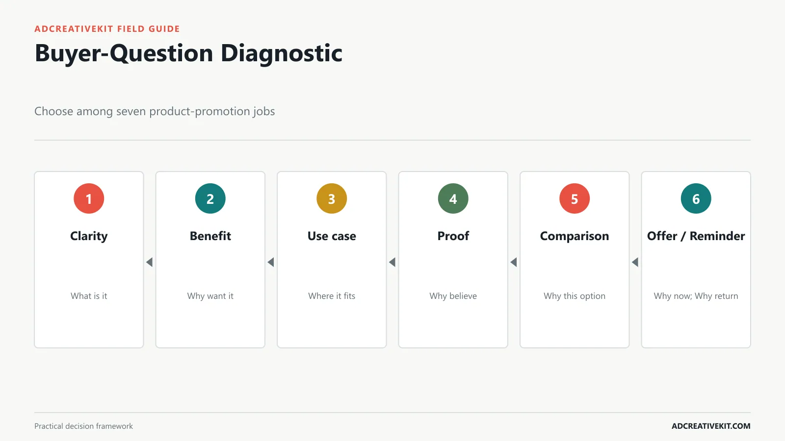
Use product clarity when a shopper cannot quickly identify what the item is. Use a benefit story when the category is known but the outcome is not. Use-case creative shows where the product fits into life. Proof reduces doubt with demonstrations, facts, reviews, guarantees, or expert evidence. Comparison explains meaningful differences. Offer creative clarifies commercial value. Reminder creative reconnects a known shopper with the product and the reason they considered it.
| Buyer question | Promotion job | Evidence | Likely destination |
|---|---|---|---|
| What is it? | Clarity | Product, category, basic function | Focused product page |
| Why would I want it? | Benefit | Outcome and product bridge | Benefit-led page |
| Where does it fit? | Use case | Context and demonstration | Use-case collection or PDP |
| Can I believe it? | Proof | Supported fact, review, demo | Page with matching evidence |
| Why this one? | Comparison | Relevant differences | Comparison section |
| Why buy now? | Offer | Value, condition, timing | Exact promotion page |
Write the question at the top of the production ticket. This forces the team to explain why the template exists and makes post-launch interpretation more useful.
Write a Product Promotion Creative Brief
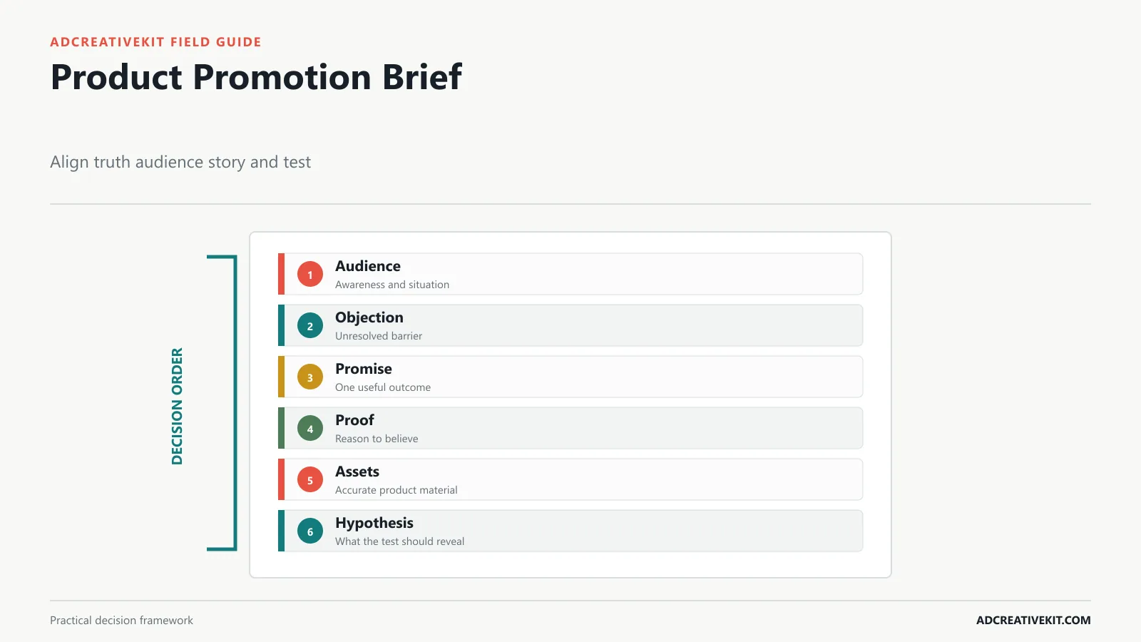
Capture audience and awareness, current situation, unresolved objection, primary promise, supporting proof, product assets, offer, CTA, destination, placement, hypothesis, and guardrails. Separate verified facts from testable assumptions. If the product team has confirmed dimensions and materials, those are facts. If the team believes portability is the strongest angle, that is a hypothesis.
A brief should contain exclusions. For example: do not imply medical results, do not show an accessory that is not included, and do not promote an unavailable color. List required review owners for product accuracy, claim support, design, and destination.
Keep the brief short enough to use. A dense brand document is not a campaign decision. The ad creative brief template includes a reusable structure for hypotheses, deliverables, and approvals.
Choose the Right Product Promotion Layout
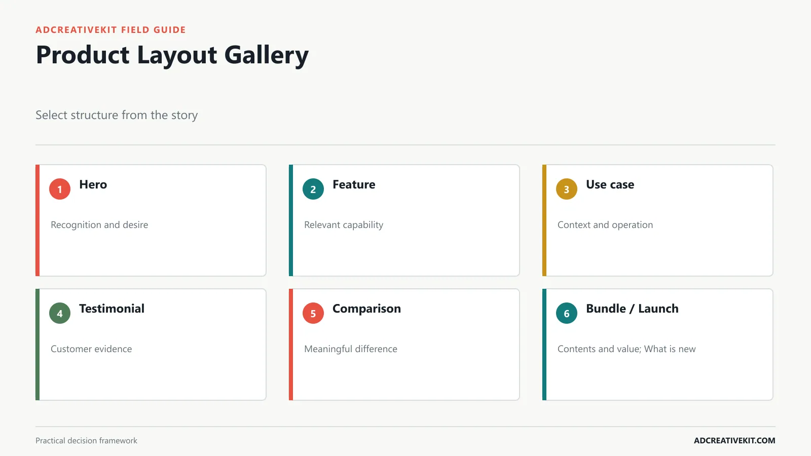
A clean hero layout makes recognition and desire the priority. Feature callouts work when a few concrete details matter, but they should translate features into buyer relevance. Use-case layouts show context and outcome. Testimonial layouts lead with credible customer language and keep the product visible. Comparison layouts reduce selection difficulty. Bundle layouts show contents and joint value. Launch layouts create novelty while still explaining what is new.
Choose one layout family for the control, then make variations that preserve hierarchy. Avoid comparing a minimal hero ad with a dense testimonial collage while also changing product, hook, and offer. That result will not tell you which story moved demand.
For static Meta-specific examples, review the Facebook ad template layouts. If a sequence is needed, the carousel template guide explains how each slide can advance the decision.
Build Product Images That Explain
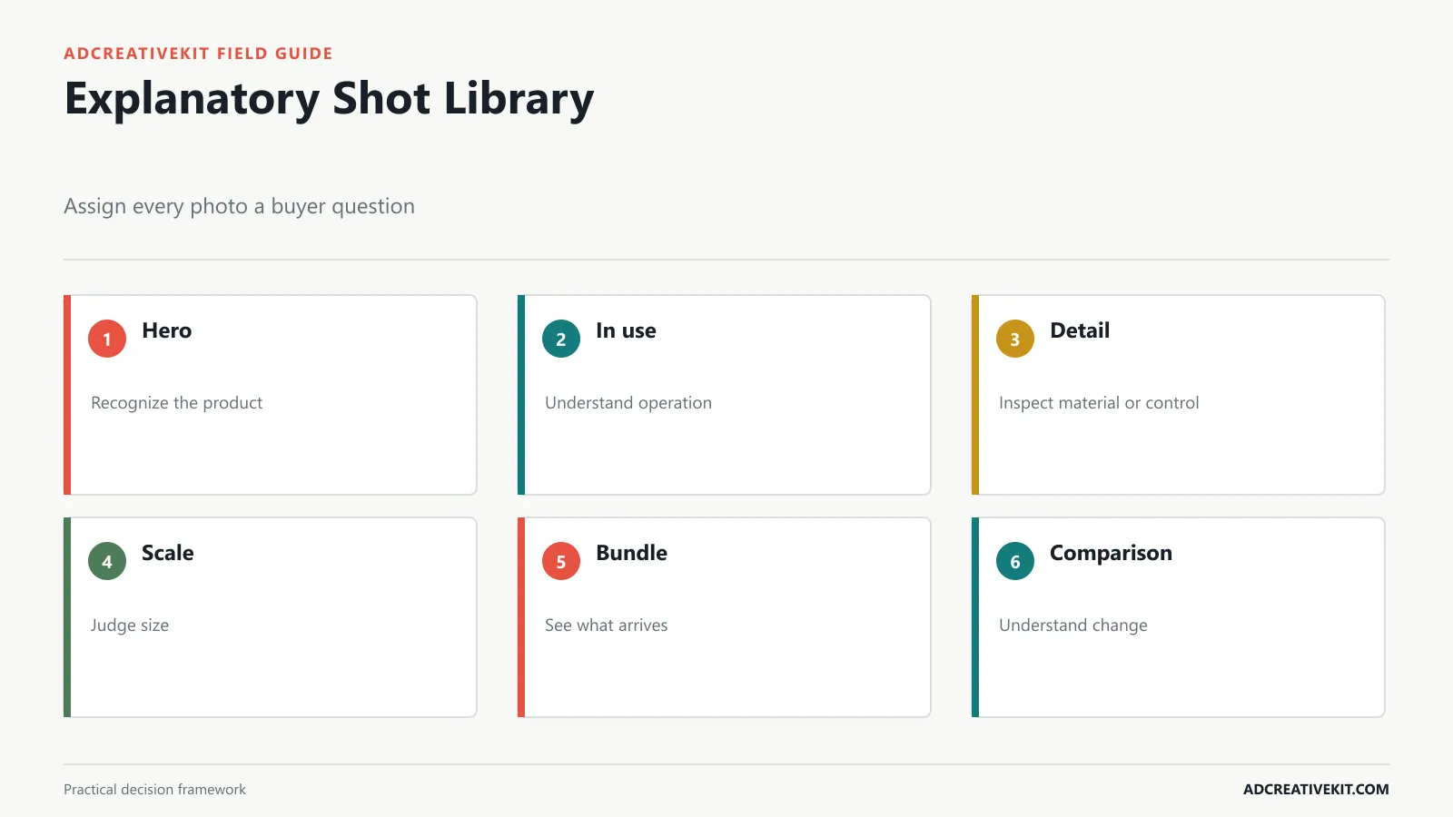
A hero image establishes recognition. An in-use image shows context and operation. Detail images expose material, finish, controls, or construction. Scale images help customers judge size. Bundle images clarify what arrives. Before-and-after images can explain a change when the comparison is truthful, representative, and appropriate for the category.
Build a shot library before designing templates. Record orientation, background, crop flexibility, usage rights, color accuracy, retouching limits, and which buyer question each file answers. Use high-resolution masters and create deliberate crops for square, portrait, vertical, and landscape placements.
Do not distort product size, remove material limitations, invent accessories, or use an image that implies a result the product cannot reliably deliver. Meta’s photo-ad guidance recommends a strong focal point, high-quality visual, restrained text, and visual consistency. W3C’s image guidance helps determine appropriate alternatives when product imagery carries information.
Write Copy Around One Product Story
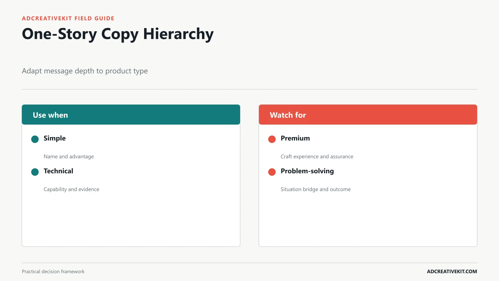
Use a five-part hierarchy: hook, useful benefit, proof, offer if relevant, and CTA. These are modules rather than mandatory text blocks. A simple product may need a product name and one advantage. A technical item may need a specific capability and evidence. A premium product may benefit from material, craft, warranty, or experience. A problem-solving product needs a recognizable situation and a credible bridge to the outcome.
Keep claims proportionate to evidence. Replace vague superlatives with concrete, supported distinctions. Reviews should be real and represented fairly. The FTC’s advertising and marketing guidance is a primary source for claims and endorsements.
Match the CTA to the next decision: “See how it works,” “Compare sizes,” “Build your bundle,” “Shop the new color,” or “Read verified reviews.” The ecommerce ad copy templates provide adaptable structures for hooks, offers, proof, and CTAs.
Adapt the Promotion Across Channels
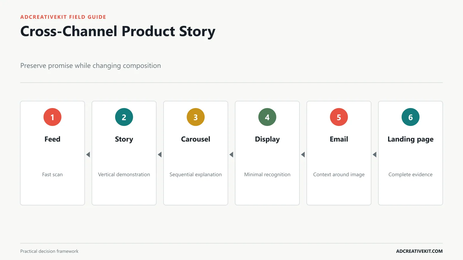
Feed creative must communicate in a fast scan. Stories and vertical placements need safe zones and less copy. Carousels can decompose the story into problem, product, features, proof, and action. Display requires minimal hierarchy across varied sizes. Email can add context around a supporting product image. The landing page must continue the same promise with fuller evidence.
Translate the idea rather than duplicating the canvas. An in-use concept might become a portrait feed image, a vertical three-step demonstration, a carousel of use cases, a display crop focused on product and one benefit, and a landing-page section with the complete explanation.
Create a channel map with audience, message job, asset ratio, copy depth, CTA, destination, tracking, and owner. This prevents channel adaptation from becoming unplanned strategic change.
Test Product Stories, Not Random Designs
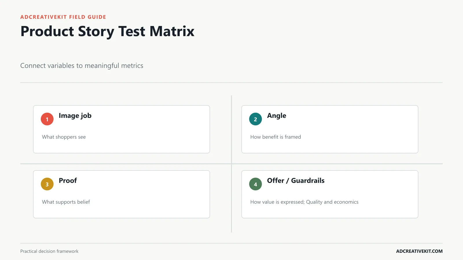
Test image job, angle, proof, comparison, or offer as distinct questions. “Does in-use imagery improve qualified visits because the product’s operation is unfamiliar?” is interpretable. “Does the new design win?” is not. Keep audience, offer, placement, and landing experience stable where possible.
Use a primary metric tied to the hypothesis and guardrails that protect quality. For upper-funnel clarity, consider qualified click and landing engagement. For proof or offer, include conversion, acquisition cost, order value, margin, and returns. A higher click rate paired with poorer conversion can mean the creative created curiosity without accurate expectation.
Record context and retain the losers. A losing comparison ad may show that the audience did not need comparison at that stage, not that comparison is universally ineffective. Use the ad testing matrix to maintain variable and result history.
Review Product Promotion Quality Before Launch
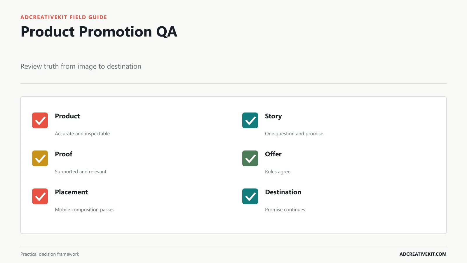
- Product: recognizable, accurate, unobstructed, and shown at honest scale.
- Story: one buyer question, one promise, and a coherent action.
- Proof: current, supported, legible, and relevant to the claim.
- Offer: value, eligibility, conditions, code, and deadline agree.
- Brand: visual roles and voice remain recognizable across variants.
- Placement: crop, ratio, safe zones, contrast, and mobile text pass.
- Destination: the same product, promise, proof, offer, and next step appear.
- Experiment: hypothesis, control, variable, metric, guardrails, and owner are documented.
Worked example: promote a technical product
Consider a compact air-quality monitor. Cold audiences may first need clarity: what it measures and where it sits. A hero layout can show the device with three supported readings. Use-case creative can place it in a bedroom and explain the quiet nighttime context. Proof creative can show a verified specification or demonstration. Comparison creative can clarify which model suits a single room versus a larger space.
The brief prevents unsupported health outcomes and identifies the product-page section for each message. The test sequence begins with clarity versus use case, then tests proof within the better story. It does not compare eight unrelated designs. Qualified page engagement, model selection, conversion, returns, and questions about readings provide a fuller result than clicks.
Build a product-story library
Store stories by the buyer question they answer rather than campaign date alone. A useful record includes product, audience, awareness state, job, promise, proof, image type, layout, channel adaptations, offer state, destination, hypothesis, result, and interpretation. This makes prior learning discoverable when a similar objection appears.
Separate reusable modules from finished ads. A verified material fact, demonstration sequence, customer objection, approved product shot, comparison basis, and warranty explanation can support several campaigns. Keep approval and expiry status with every module so creators do not reuse outdated packaging, unsupported claims, or reviews without permission.
Use business evidence to request new creative
Review the library with merchandising, support, product, and performance teams. Support conversations reveal misunderstood features; return reasons reveal expectation gaps; search terms reveal customer language; tests reveal stories that attracted qualified action. Translate those signals into briefs instead of requesting “more variations.”
Retire a template when it repeatedly obscures information, cannot adapt to priority placements, or encourages too many messages. Preserve its lesson. The goal is not a growing count; it is faster access to well-defined product stories the team can test responsibly.
Decision rules for selecting the next product story
If new visitors leave before interacting, test product clarity or use case before adding urgency. If product engagement is high but purchase is low, investigate price, proof, comparison, delivery, and destination friction rather than assuming the hero image failed. If support questions concentrate on one feature, create a demonstration or factual callout. If returns reveal expectation mismatch, prioritize accurate scale, contents, or use limitations.
Choose the smallest creative question that could change a decision. A single story can have several placement adaptations, but it should not carry every objection. Sequence messages across ads, carousels, retargeting, email, and the product page. This gives each asset enough room to teach while preserving a coherent campaign narrative.
Implementation checklist for the first test
Select one audience and one buyer question. Confirm the product fact and supporting evidence. Choose a control layout, one alternate story, and matching destinations. Produce required ratios, validate product accuracy and mobile readability, define the primary metric and two guardrails, and set the decision window. Afterward, write the interpretation in plain language and name the next action: scale, refine, investigate, or stop.
Review sequence: first confirm product and claim truth, then the buyer question, then the message hierarchy, placement composition, destination continuity, and experiment design. Review styling last. This order prevents subjective design feedback from approving an attractive asset whose story is inaccurate or strategically unnecessary.
Include the product-page owner in the final review whenever the creative introduces a new story. The destination needs enough evidence to complete the expectation set by the ad.
Frequently asked questions
What is a product promotion template?
It is a reusable message and layout structure for a specific product-selling job, such as clarity, benefit, proof, comparison, bundle, or offer.
Should one ad include every product benefit?
Usually not. Choose the benefit most relevant to the current audience and decision, then let the destination provide complete detail.
How many product stories should I test?
Test only as many as the budget and decision window can evaluate. Begin with strategically different stories before producing many cosmetic versions.
When the image itself carries most of the selling work, use the dedicated guide to shot selection, product scale, crop protection, proof overlays, and image-test interpretation.